Accessibility Settings

color options

monochrome muted color dark

reading tools

isolation ruler

Tag

election

36 posts

GIJN Webinar — The US Election: What’s at Stake

United States’ government actions and policies at home and abroad affect people’s lives around the world. The outcome of the upcoming November election — not only for president but for the US Congress — will have global impact. In this GIJN webinar “The US Election: What’s At Stake”, the first of two focusing on the US Election, we bring together three American journalists who are digging into American politics to find out what’s at stake and what journalists need to investigate.

Data Journalism

GIJN’s Data Journalism Top 10: Sigma Awards, Campaign Trail Food, Data Cleaning Nightmares, Massive Leaks

What’s the global data journalism community tweeting about this week? Our NodeXL #ddj mapping from February 10 to 16 finds The Guardian US analyzing food expenditure on the Democrats’ campaign trail, The Washington Post’s Steven Rich sharing the pains of cleaning spelling permutations in data, The International Consortium of Investigative Journalists explaining the process of handling the massive #LuandaLeaks records, and the Sigma Awards announcing its shortlist.

Data Journalism

GIJN’s Data Journalism Top 10: Your Health Data for Sale, Music & Politics, Predictive Journalism, AI Accountability, Data Women

What’s the global data journalism community tweeting about this week? Our NodeXL #ddj mapping from November 11 to 17 finds an investigation by The Financial Times uncovering how private health information is being traded online by health sites to big advertisers, The Economist looking at the correlation between Americans’ music preferences and political leanings, The Bureau of Investigative Journalism investigating the government’s algorithmic decision-making, and the data community coming together to highlight excellent female data journalists.

Data Journalism

GIJN’s Data Journalism Top 10: Visualizing Philosophy, El Salvador’s Violence, the UK’s John Bercow, Mexican Bikes, and Russian Data

What’s the global data journalism community tweeting about this week? Our NodeXL #ddj mapping from October 28 to November 3 finds The Economist’s summary of a great year in print data journalism, an interesting visualization by Deniz Cem Önduygu of key arguments in Western philosophy, Datajournalism.com’s guide to editing data journalism, and BBC News’ analysis of outgoing House of Commons Speaker John Bercow’s career in numbers.

Data Journalism

GIJN’s Data Journalism Top 10: Hong Kong Protests, Migration Waves, Democratizing Dataviz

What’s the global data journalism community tweeting about this week? Our NodeXL #ddj mapping from July 22 to 28 finds The New York Times analyzing the catalyst behind Hong Kong’s recent protests, National Geographic visualizing human migration in the past 50 years, Ellery Studio’s fun and informative renewable energy coloring book, and The Economist’s findings that Hillary Clinton could have won the 2016 US election if all Americans had turned up to vote.

Data Journalism

GIJN’s Data Journalism Top 10: Amazon.com, the Menstrual Cycle, Canadian Sex Crimes, Nonsensical Diagrams

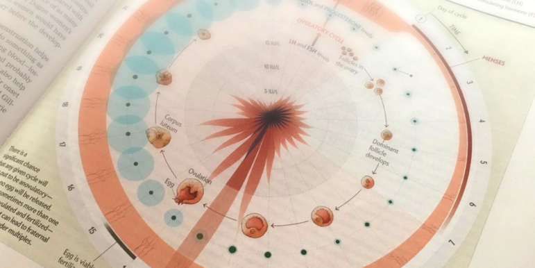
What’s the global data journalism community tweeting about this week? Our NodeXL #ddj mapping from July 8 to 14 finds BBC News analyzing Afghan election results as well as graphing the milestones of the 25-year-old Amazon empire, Federica Fragapane visualizing the female menstruation cycle for Scientific American, and Bloomberg taking a closer look at China’s domination of the South China Sea. We also have a fun piece by Alberto Cairo on nonsensical diagrams.

Data Journalism

GIJN’s Data Journalism Top 10: European Election, Data via Audio, Tax Fraud & Parserator

What’s the global data journalism community tweeting about this week? Our NodeXL #ddj mapping from May 27 to June 2 finds immense buzz around the recent European Parliament elections, with @SZ explaining the EU political landscape, @morgenpost looking at the results in Berlin, and @journocode collecting data journalism pieces related to the election. There’s also @datajournalism’s tips on presenting data through audio and @BIRNSrbija’s data investigation into major corporate tax fraud in Serbia.

Data Journalism

GIJN’s Data Journalism Top 10: History of Infographics, Colorism in Fashion, Weather Trends

What’s the global data journalism community tweeting about this week? Our NodeXL #ddj mapping from April 22 to 28 finds an interesting breakdown of colorism in fashion by @puddingviz, a series of gorgeous maps on natural disasters and extreme weather trends in the United States by @PostGraphics, a preview of a book on the history of infographics by @srendgen, and @UpshotNYT’s recap of its best articles from the past five years.

Data Journalism

GIJN’s Data Journalism Top 10: DRC’s Election Fraud, San Francisco’s Interactive Art, Ultimate Data Viz List

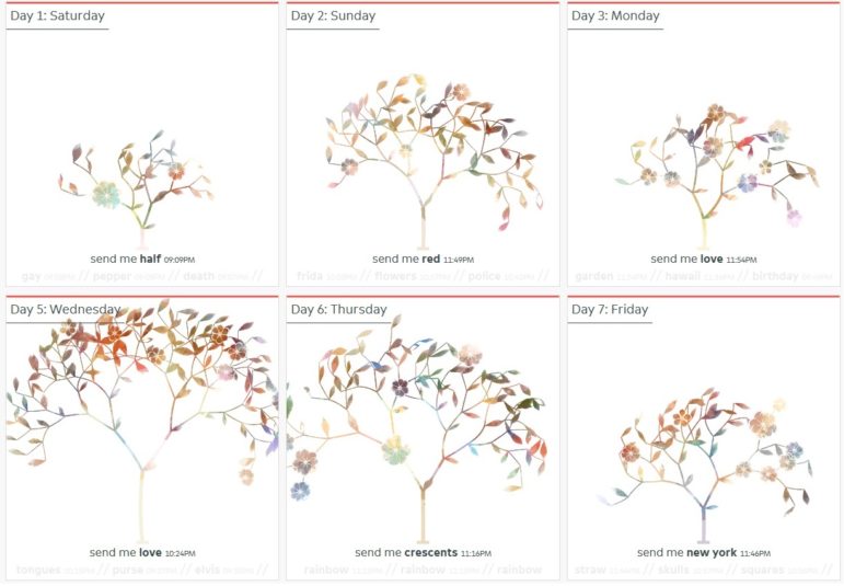
What’s the global data journalism community tweeting about this week? Our NodeXL #ddj mapping from January 14 to 20 finds a @FinancialTimes exposé of possible electoral fraud in Congo, @sxywu’s beautiful visualization of interaction data between a museum and the public, and @maartenzam’s the ultimate data visualization list to end all lists.