Data Journalism
Data Journalism Top 10: Viral Dataviz, DIY Masks, Breaking the Wave, China and US Response to COVID
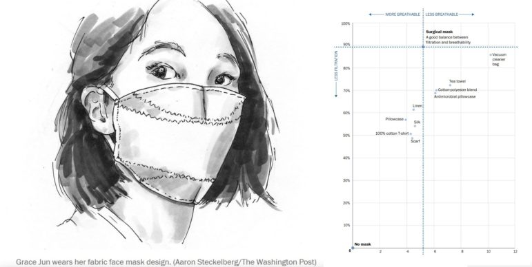
From “flattening the curve” to “social distancing,” and now “breaking the wave,” the global data journalism community is using new terminology in its attempts to explain the intricacies of COVID-19 to the masses. Our NodeXL #ddj mapping from April 6 to 12 finds Reuters Graphics explaining their “breaking the wave” chart, The Washington Post helping readers figure out the best material to use to make their own masks, the Financial Times comparing the response of China and the United States in handling the pandemic, and Press Gazette highlighting the huge appetite for data-driven visual journalism about COVID-19.