Data Journalism Top 10: Where Raindrops Go, Spiral Chart Debate, Prenatal Tests, Death Threat Dataviz
Read this article in


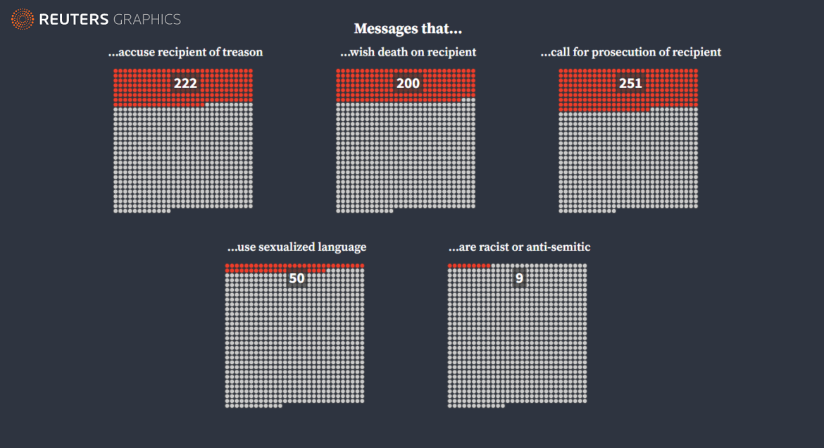
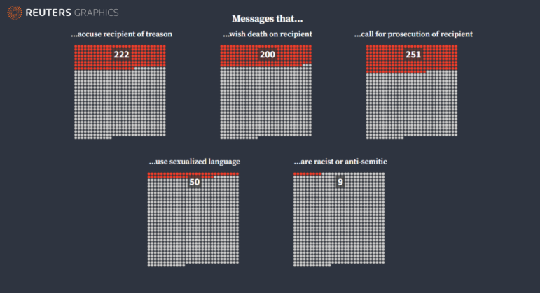
Reuters analyzed threatening messages sent to staff working on the 2020 US election. Image: Screenshot (Reuters Graphics)
As we roll into the third calendar year of the pandemic, the debate about how journalists present data on the coronavirus continues to rage. Just six days into 2022, a spiral chart divided the data journalism community into two camps. Our weekly NodeXL curation of the most popular data journalism stories on Twitter highlights a fierce debate about a chart depicting COVID-19 rates over time in a New York Times opinion piece. This edition also features a Times investigation into the prenatal testing industry, a visualization by Reuters of death threats received by election staff, a dynamic river flow tracker by dataviz developer Sam Learner, and Texty.org.ua’s interactive map of the Russian military build-up on Ukraine’s border.
Prenatal Test Failings
The New York Times examined the prenatal testing industry in the United States and found that many of the new, expanded tests on the market that screen for rare chromosomal abnormalities can be strikingly inaccurate. The journalists interviewed researchers and analyzed data from multiple studies to determine how well the five most common prenatal tests performed. Their findings showed that the tests gave false positives about 85% of the time. Investigative journalist Sarah Kliff talks about the investigation in this podcast.
Analyzing Death Threats
Reuters analyzed and visualized more than 850 death threats and hostile messages targeted at election officials during the 2020 US presidential race. The team categorized the messages — “virtually all” of which came from supporters of former President Donald Trump — into several types (racist, “wish death on the recipient,” accuse staff of treason, and more) and determined which were “true threats” and which were “protected speech” under the US First Amendment. The threats were obtained through public records requests, interviews, and an examination of hundreds of online posts.
Where Do Raindrops Go?
Data visualization developer Sam Learner created an interactive river flow tool, which depicts the likely journey of a single raindrop in any part of the world flowing down streams and rivers to its final destination. Find the code and more details behind the project’s data here, and use the site to check out the trajectory of the Seine in France, the Amazon in Brazil, or the Nile through northern Africa.
Tracking the Wildebeest
The changing climate and seasonal rains at the Serengeti National Park in north-central Tanzania spur more than a million wildebeests to travel up to 1,750 miles (2,800 kilometers) annually across the plains in search of food and water. National Geographic used data from GPS trackers fitted on six wildebeests to visualize their migration routes. Want to follow the movements of the wildebeests and other animals? Check out the Serengeti Tracker project, led by scientists at Scotland’s Glasgow University.
Graphic Controversy
A spiral graph featured in a New York Times 0pinion piece became a hotly debated topic among the data journalism community. The graph, which depicts the number of COVID-19 cases over time in the United States, has both supporters and critics. Some took the initiative to rework the visualization to convey the information more clearly, including Github’s research engineer Amelia Wattenberger and Sourya Shrestha, an infectious disease modeler at Johns Hopkins School of Public Health. Statistician Nathan Yau offered up a helpful tutorial to make your own spiral chart. Not sure what the fuss is about? Catch up on the furor with two summaries written by data analyst Nicole Lillian Mark and data professional Neil Richards.
The List of 2021’s Best Visualization Lists
Many media organizations round up their favorite graphics and charts into a year-end best-of list. And for seven years running, data journalist Maarten Lambrechts has compiled them into an annual mega-list, which serves as a handy reference for the entire data journalism community. (His latest edition for 2021 includes GIJN’s own picks of the year’s top 10 data journalism projects.)
Tracking Russia’s Military Build-Up
For weeks, Russia has steadily massed armed forces near its border with Ukraine, prompting concern that the Kremlin may be planning an invasion. Texty.org.ua, an online site in Ukraine (and GIJN member) is using satellite imagery to monitor the situation and estimate the amount of Russian military equipment near the Ukrainian border and in the “temporarily occupied territories” of Crimea and Sevastopol. The interactive database is regularly updated.
How Fast Do Germans Drive?
In German city centers, many people drive faster than the speed limit. This is according to a Der Spiegel analysis of data covering 40 German cities from the TomTom navigation provider. Traffic analysts attribute speeding to poor road design, low fines, and a lack of government control. You can explore the profiles of German metropolises, and how drivers speed through them, street-by-street in this interactive piece.
Fortress Europe
Europe prides itself on championing freedom of movement, but countries across the region are increasingly fortifying borders and building barriers. The UK’s Telegraph published a long-form scroll story documenting the walls built and how high-tech security (for example cameras, sound cannons, and heat sensors) has been deployed along the borders to keep migrants out. Using data from public records, government information, and news reports, the Telegraph reports that there are now 1,800 kilometers (approx. 1,100 miles) of walls and fences either built or under construction on Europe’s borders. That’s nearly as long as 12 Berlin Walls.
Mekong Data
As part of the Earth Journalism Network’s 2021 Mekong Data Journalism Fellowship, 30 journalists from Cambodia, Laos, Myanmar, Thailand, and Vietnam accessed and analyzed public data sets related to the Mekong River Basin in Asia on renewable energy, dams, fish catches, mangrove forests, erosion, and more. As a result, reporters in the group have produced a series of data-driven stories revealing the water security challenges and solutions in the region.
Thanks again to Marc Smith and Harald Meier of Connected Action for gathering the links and graphing them. The Top Ten #ddj list is curated weekly.
 Eunice Au is GIJN’s program manager. Previously, she was a Malaysia correspondent for Singapore’s The Straits Times, and a journalist at the New Straits Times. She has also written for The Sun, Malaysian Today, and Madam Chair.
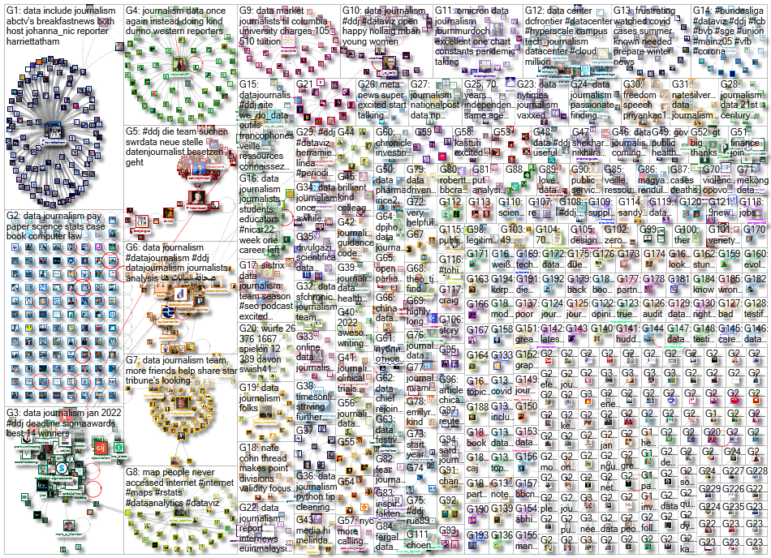
For a look at NodeXL’s mapping on #ddj and data journalism on Twitter, check out this map.

This work is licensed under a Creative Commons Attribution-NoDerivatives 4.0 International License
Republish our articles for free, online or in print, under a Creative Commons license.
Republish this article
This work is licensed under a Creative Commons Attribution-NoDerivatives 4.0 International License
Read Next

Data Journalism News & Analysis
Lessons Learned: 10 Common Mistakes in Data Journalism
GIJN asked speakers and attendees in the NICAR conference hallways for the data journalism gaps they see, and for under-covered topic areas and under-used skills that newsrooms can address.

Data Journalism News & Analysis
From Space to Story in Data Journalism
Over the past 10 years satellite imagery has become an important component of data journalism. In the next 10, it will likely evolve further, from a tool used primarily for illustrating stories to an integral part of research and investigative reporting.

Data Journalism
10 Outstanding Data Projects Win the 2024 Sigma Awards
There were 52 data journalism entries from 22 countries in shortlist for the 2024 Sigma Awards. Here are the top 10 winning projects.

Tipsheet Data Journalism Reporting Tools & Tips
Tipsheet for Using Ocean Data in Your Investigations
Investigations into what happens on, under, and around the ocean can often be answered thanks to the vast amount of data available online.