
Climate GIJC25
Overcoming Four Big Challenges to Investigating the Water Crisis
Journalists reporting on water scarcity often face a lack of transparency, limited access to sites and sources, unwieldy data, and a resistant media environment.
Journalists reporting on water scarcity often face a lack of transparency, limited access to sites and sources, unwieldy data, and a resistant media environment.
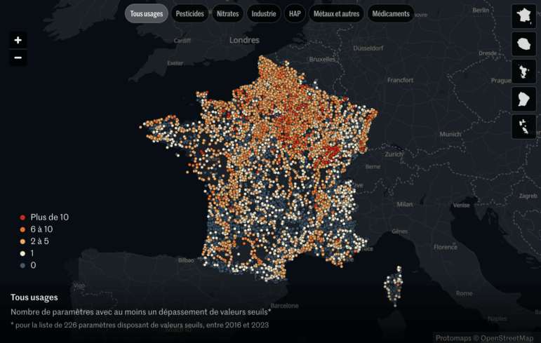
The French investigative reporter and data journalist shares the methods behind her team’s major investigation into Europe’s polluted groundwater crisis.
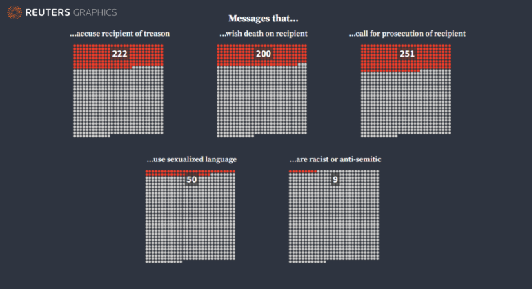
We have rolled into the third calendar year of the pandemic, but the debate about how journalists present data on the coronavirus continues to rage. Just six days into 2022, a spiral chart divided the data journalism community into two camps. Our weekly NodeXL analysis and curation of the most popular data journalism stories on Twitter also features an investigation into the prenatal testing industry, a visualization of death threats received by election staff, and an interactive map of Russian military bases near the Ukraine border.

Our NodeXL #ddj mapping from June 7 to 13, which tracks the most popular data journalism stories on Twitter each week, focused in on this major investigation by ProPublica, which offers an unprecedented look inside the financial lives of US billionaires. In this edition, we also feature a detailed look at India’s faltering vaccination campaign, a data project exploring Argentina’s news deserts, and an investigation of The Gambia’s water paradox.