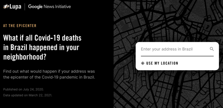
The data visualization At the Epicenter was created by the Agência Lupa team, with support from the Google News Initiative. Image: Screenshot
How We Built the Data Visualization That Brought Brazil’s COVID Deaths Close to Home
Read this article in
Editor’s note: When the COVID-19 pandemic first hit Brazil, a team of data journalists set out to illustrate the country’s death toll so that the growing figures meant something tangible to their readers. The result was the data visualization At the Epicenter. As the crisis continues to deepen, the team has continually updated the project with the latest available data. Here’s a behind-the-scenes look at how the project was created.
If all the COVID-19 fatalities in Brazil were your neighbors, your neighborhood would probably no longer be on the map. There is a strong possibility that your entire city would vanish.
This hypothetical scenario should help you understand the scale of the health crisis in Brazil, but visualizing your neighborhood deserted is not easy.
A partnership between the Google News Initiative and Agência Lupa has managed to turn the idea into reality. Using geolocation and the 2010 census maps, the interactive data visualization we made creates a kind of devastation radius, making each reader’s home the epicenter of the COVID-19 crisis in Brazil.
Along with the three journalists who have written this story (Rodrigo Menegat, Tiago Maranhão, and Vinicius Sueiro), the project involved: Alberto Cairo and Marco Túlio Pires, from Google, and Natália Leal and Gilberto Scofield Jr., from Lupa. Their work was motivated by the conviction that by placing the public in the eye of the storm, even if hypothetically, it would be possible to show the scale of the tragedy more clearly.
But why did we think that and how did we make it work? We’ll explain here, in detail, how we got the idea off the ground.
The Beginning
An Invisible Tragedy
When we started work in June 2020, 58,390 Brazilians had died of the coronavirus.
Despite the irrefutable nature of these numbers, the experience with the disease by each of us — as journalists, designers, and developers in different parts of Brazil — has been very different.
Those of us who live in São Paulo, the city with most cases, lived through a strict quarantine that lasted from the end of March until the middle of June 2020.
Those who live in the Distrito Federal, where the Brazilian capital is located, saw how the pandemic impacted the political sphere, and how the virus spread more rapidly than in any other state.
Lastly, there are those of us who live in a more isolated community in the countryside of Paraná, where, even after four months of the coronavirus in Brazil, only one death had been registered.
For those living in the first two places, the experience of living in the country that has become the global epicenter of the greatest pandemic of the century was more gripping and intense than for those living in the latter, who experienced the most dramatic moments of the crisis far from their own backyard.
Yet, in some ways, the social isolation caused by lockdowns and the sight of empty streets have been more palpable for everyone than the huge numbers of lives lost. Even those who live in the midst of the crisis have experienced it from within their homes, through their television screens or the internet.
However, tens of thousands of Brazilians are already dead and thousands more die every week. There are also those who are sick inside hospitals all over the country, who are invisible to us.
This project began with us asking these questions: How can we make people really see these victims? How can we make the human cost of this disease more visible, more relevant to people experiencing hours of boredom, closed shops, and empty sidewalks?
Familiar References
Sixty thousand people dead (at the time the project started; by April 2021, the figure was 321,000). To offer a comparison, it is as if a crowded Arruda Stadium, in Recife, suddenly disappeared, or two Sambódromos do Anhembi, in São Paulo, had vanished. Shocking, right?
It certainly is for those familiar with the places mentioned above. If you live in the state of Pernambuco’s capital, you know the Arruda Stadium is huge; but what if you’ve never been near it?
For those living in the town of Ponta Grossa, in the state of Paraná, the size references are different. The idea of the São Paulo’s sambadrome doesn’t evoke much. The city’s soccer stadium, for instance, is not the Arruda but the Germano Krüger.
Drawing parallels with places like these makes more sense to Ponta Grossa residents than any other supposedly universal parameter.
The exact same logic applies to those living in São Paulo, Brasília, or any other place: The more familiar the reference, the easier it is to understand the scale of the crisis. And is there anything more familiar than the place where we live?
The fundamental idea of this project was to make the victims of COVID-19 suddenly more connected to the reader. Reading the graphic, the 60,000 dead are no longer just people who live thousands of miles away; they become neighbors and acquaintances. The references are no longer a soccer stadium on the other side of the country or some distant historical event; they are the streets that the reader walks on every day.
It was from this concept that we planned and developed our methods, gathered data and, finally, built the article’s narrative.
Brainstorming
The Basics
Team members had a weekly meeting. At the very first one, we agreed that two elements would be essential if we were going to be successful with the concept.
The most crucial was personalizing and individualizing the reader’s experience — a point that was, from the start, emphasized by Alberto Cairo, who came up with the idea of taking the deaths to the reader’s neighborhood.
By making readers feel personally affected, we could break the feeling of distance between the life of those not yet directly affected and the reality of the increasing number of deaths.
In addition, the language used in the data visualization would have to be as direct as possible, avoiding excessive abstraction. A graph showing the evolution of the disease curve is informative, but still hides its own turning point. The lines are, actually, just a representation of a large group of people. To avoid this distancing, the language adopted would need to be as tangible as possible in order to emphasize the nature of the data.
With our concept policies noted, we dove into the practical part by doing what everyone striving for creativity does: gathering content that we would like to “imitate.” Originality is nothing more than taking inspiration from the right people.
Inspiration
We decided to begin the search by seeking visual metaphors that would mirror our editorial proposal.
One of the first references that came to mind was a project by The New York Times after the 2016 presidential elections in the US.
In the project, the map of the US disappears according to voting results. It is as if two countries are placed side by side: one of them is composed only of the states where Donald Trump won. In the other, only Hillary Clinton’s domains can be seen.
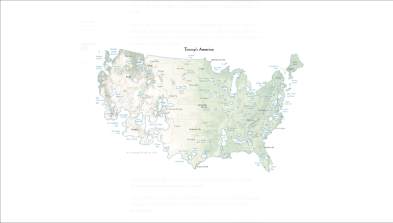
The NYT map that “erases” the areas of the US where Hillary Clinton won more votes than Donald Trump. Image: Screenshot

The counter-map which erases parts of the US where Donald Trump won more votes than Hillary Clinton. Image: NYT/Screenshot
The metaphor used by The New York Times here is strong because it distorts objects — in this case, a map — familiar to the reader, which causes discomfort. Beyond that, the representation is in line with the concept of our own reporting: fading, disappearing, vanishing.
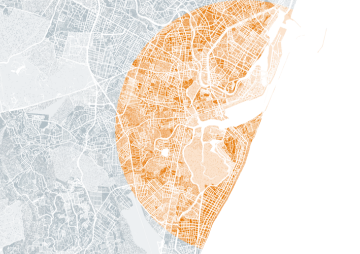
A similar reference was found in Brazil in the project “Aqui não mora ninguém” (“Nobody lives here”) made by Plano C, a geospatial consulting company.
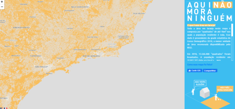
In the map for the project Aqui não mora ninguém, the orange areas represent uninhabited regions of Brazil. Image: Screenshot
In the image above, areas of the country where not a single person lives are painted orange. Again, we see the metaphor of emptiness and absence, but this time in the same space in which we would be working: the Brazilian territory.
However, the data displayed in both examples overlooked an important aspect: demographic density.
Both the erased areas on The New York Times’ map and the orange squares on the Plan C map show ‘boolean’ values (the idea being that the values were either true –Candidate A won here — or false, Candidate A didn’t win here) and contain somewhat superficial data: Did the candidate win in that region? Is there anyone living there?
As our goal was to represent the total number of COVID-19 deaths in Brazil at a given time, we also needed to show the number of people living in a given area.
Without this element, there was a risk of mistaking a large space with a densely populated area, which isn’t always the case. More people live in a block in downtown São Paulo than in an area spanning dozens miles in the north of the country, for instance.
We also searched for references in projects that focused on emphasizing this geographical dimension. Among those was one developed by The Pudding, in which the number of people living in a given area is represented as a bar on top of a map, generating “mountains.”

A population density map produced by The Pudding. Image: Screenshot
The result is an unusual view of the global population distribution, which is more intuitive and easier to read than the classical color or heat maps.
Another important reference was an interactive graphic published by the newspaper Nexo, which is now inaccessible due to technical problems.
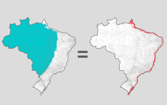
A map which shows population distribution in Brazil. The same number of people live in the blue as the red areas. Image: Screenshot
In Nexo’s graph, after participants revealed where they lived, they would see a map of Brazil highlighting several municipalities, whose combined population would match the number of people living in the participant’s own hometown.
To match the number of people living in a city like São Paulo, for example, it was necessary to paint most of the north and midwest regions of Brazil. Thus, the unequal distribution of the territory’s population was represented from a very personal point of view.
Both The Pudding’s and Nexo’s works depend, however, on a degree of abstraction. The first is, in practice, a bar graph with implicit scales. The second paints polygons in a certain color whenever a condition is met.

Racial Dot Map where each dot represents a single person. Each color, a race. Image: Screenshot
We were also inspired by the notion of simplified population depiction, where every person is represented by a single dot, called a Racial Dot Map, and which was an idea developed by researchers at the University of Virginia.
This data visualization uses census units to show where people of different ethnicities live in the US. Each one is represented by a color. Nexo also produced a similar map, but with Brazilian data.
In addition to the visual representation references, we also looked for pieces that personalized the reading experience to the maximum. Two more reports from The New York Times were used as good practice examples.
The first was about rising temperatures in several global cities, personalized to always start from the reader’s location.

This custom graphic shows annual temperature rise in a reader’s hometown. Image: Screenshot
The second uses a similar strategy to address air pollution.
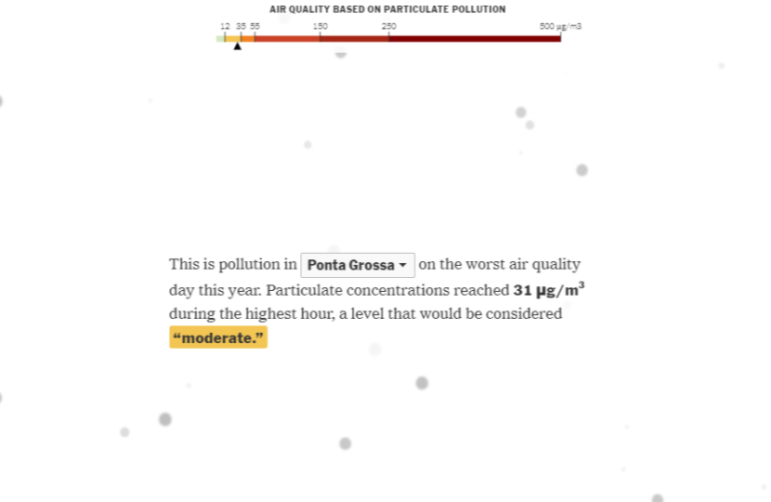
This graphic shows the amount of air pollution micro particles in a reader’s city, with the figure represented by small circles. Image: Screenshot
Lastly, we also surrounded ourselves with stories and images that had a strong aesthetic and emotional impact.
Among them were the pictures of the shallow graves that made the cover of many newspapers during the height of the crisis in Manaus and São Paulo. The number of tombs could serve as an indicator of the evolution of the pandemic, with a strong and somber visual appeal.

Image: Open graves in São Paulo. Screenshot of a photo by José Antonio de Moraes/Anadolu Agency/Getty
Both tributes and name lists, such as the Memorial Inumeráveis (Innumerable Memorial, in English) were also important in the process.

This project gathers obituaries for COVID-19 victims in Brazil. Image: Screenshot
That initiative gathers small obituaries for some of the victims of COVID-19, highlighting that each and every number represents a unique and irreplaceable person.
The above list, of course, is not exhaustive. But it shows some of the pieces that gave us inspiration.
We referenced a lot more content during some of our informal chats. We were able to refine our initial concept from these countless influences.
Starter Ideas
We knew our task would be to show the distribution of COVID-19 deaths by creating a perimeter that would surround the reader. However, there were many ways to do this.
To choose the best way to tell the story, we decided to create an inventory of ideas and then choose the best among them. So we listed 11 proposals. Several were very similar to each other, with differences only in methods or visual representation. Others tried to be so creative that they veered too far from the original concept. All of them are listed on the graphic below.

A hand-drawn note showing 11 of the designs that were considered, before the final format was chosen. Image: Courtesy
These scribbles are difficult to understand — a few weeks after these doodles were made, even we had a hard time remembering exactly what each of them meant.
To help us solve these riddles, we considered the following ideas:
- Drawing a circle around the geographical coordinates provided by the user. The size of the radius would be calculated by utilizing the region’s demographic density as an estimate, which would also be used to fill the area with dots.
- A similar concept, but one that emphasizes the relationship between cases and deaths. The circle depicting cases would be huge, devouring entire cities and revealing that the disease is much more widespread than it appears.
- Instead of worrying about the demographic density that surrounds the user, in this proposal we would transform the entire landscape into a crowded cemetery; its dimension would then be the same regardless of the user’s location.
- This idea involved finding large and familiar areas close to the reader, such as parks and squares, and filling them with enough graves to bury all of the COVID-19 fatalities in Brazil.
- A similar idea as in item 1, but now we would simply add the population from adjacent sectors based on census data.
- A similar idea to the previous proposal, but with another source of data: a statistical grid from the Brazilian Institute of Geography and Statistics — IBGE. We’ll go into a detailed explanation later, but the method would make the map look like a grid.
- Here, the idea was to erase several cities close to the user from the map; those in which the number of inhabitants is less than the total number of COVID-19 deaths in Brazil.
- Another proposal similar to item number 1, but this time it’s with a 3D map with more details about the affected areas and buildings instead of a simple street map.
- Expanding on the item 8 idea, this map would show the user’s city buildings in even more detail.
- More unconventional and artistic, this proposal would use augmented reality to shed a tear for each and every COVID-19 victim on the reader’s screen.
- In an attempt to combine the originality of proposal 10 and the individualized geographical references of all the other points, this proposal would show how a reader’s surroundings would have been affected by the pandemic on the user’s cell phone camera.
Our list revealed the depths of our creativity. But in the end we chose a proposal very similar to the original concept and somewhat more grounded. Why?
The criteria for choosing which project to pursue were data availability, technical feasibility, aesthetics, and the possibility of sending a message that made sense to as many people as possible.
How did each of the proposals rank on this criteria? Let’s look at them individually.
- The proposals involving augmented reality would be difficult to execute with a small team and in a short timeframe.
- Those that depended on 3D models would only be interesting for those in the few Brazilian cities with a lot of tall buildings.
- The proposal to transform public spaces into cemeteries would depend on whether large enough areas existed near the user, which might not happen in regions far from the largest urban centers.
- Distributing graves around the reader would minimize the personalization of the experience since the result would be similar for all, regardless of the characteristics of the region.
We were left only with items 1, 2, 3, and 4. In the end, we didn’t choose just one idea to work on; the final product was built with elements taken from all of them.
Script
After throwing the ideas around, we decided that the best option would be to populate the user’s neighborhood to reflect all the COVID-19 deaths in the country.
The material, however, couldn’t just be reduced to that. Even though the interactive element was captivating by itself, the report needed a real narrative.
Telling a story, linking ideas, and evoking a sequence of images is essential for memorable content. Without that, we would have a beautiful and interactive virtual creation but one incapable of providing useful information.
Because we wanted to develop a narrative structure capable of leaving an impression, we wanted to offer more than just a shiny, fun, digital object.
We started the report from the most personal point of view possible — literally above the user’s home. However, as the story progresses, we gradually moved away from the “reader’s navel” point of view.
- First, we moved through a neighboring city that would vanish from the map.
- Then, we went for a nearby capital.
- Lastly, we reminded the readers that the victims were not actually scattered around their houses but that they remain real, nonetheless.
Without noticing, we created a structure that evokes the concept of “near view” and “far view,” written about by US researcher Nikki Usher. In the 2016 book “Interactive Journalism,” Usher states that one of the possibilities of data journalism is to offer a scope that is both personalized and close to the reader’s reality, and broad, in exposing subjects that affect society as a whole. Summing it up, this is what we tried to do: Tell a story that starts in the user’s backyard, but reveals a wider social landscape.
Hands-on
By now, we knew what we wanted to build. But we were still unsure how we would do it. The best way to figure it out was to get our hands dirty. Based on the results from small prototype projects, we would be able make an informed decision and then move to the full scale project. The first thing to decide on was obvious: which data source to use.
Population Distribution
The most critical database for this project would be showing Brazil’s population distribution, from which all the calculations would be made. We had two options, both produced by IBGE.
The most detailed was the statistical grid, which was used in one of the projects listed as a reference: the map “Aqui não mora ninguém,” from the consulting company Plan C.

Image: Each rectangle on the map is an item in the IBGE statistical grid. The darker colors represent more densely populated areas. Screenshot
It divides the Brazilian territory into a series of rectangles of 200 square meters (2150 square feet) in urban areas, and one square kilometer (247 acres) in rural areas, without tracking administrative limits such as municipalities or states. The data shows how many people live in each of these polygons areas.
The other alternative was the census tracts, which are territorial divisions made to organize the 2010 census. They come in different sizes and obey state and city limits, unlike the first option.
Despite being less granular, the sectors database provides more dense information. In addition to the number of people living in each polygon, we also know the age of each person and the inhabitants’ average income, for example.

Census tracts are usually smaller in densely populated areas and much bigger in areas with lower demographic density. Screenshot
To start with, we began with the most detailed database, so we ran some tests with the statistical grid. However, problems soon arose.
There were a lot of large files, which made processing a lot harder and slower. The complete database has 13.5 million polygons, meaning there were too many items to compute effectively.
The script had to be executed in a maximum of three seconds. A second more and the site would take too long to load; there is nothing more frustrating to readers than a slow loading page. So we started testing with census tracts instead.
Although the 2010 census geographic base is large, it divides the country into far fewer segments; about 350,000, which decreased the complexity of computing by an order of magnitude. Besides, two of the team members had already worked with census tracts.
The Deaths
The second database needed to make the app work should be quite simple in theory. We needed to know the number of COVID-19 deaths in Brazil. However, the figures disclosed by the authorities were confusing.
During the first weeks, data was released in an erratic manner and would have low granularity. More recently, methodological changes had eroded confidence in the health department’s official information.
To get around the lack of data, several independent entities were collecting and publishing their own statistics. So, once more, we needed to choose a source.
Among the options was data from the National Council of Health Secretaries (CONASS, in Portuguese,) the numbers gathered by a media consortium, and statistics published by independent researchers and journalists, such as Lagom Data or Brasil.io.
The essential element was publishing the database in a consistent format, ensuring continuity and accessibility. Again, we evaluated each option.
Neither CONASS nor the media consortium data were published in an accessible format. Lagom Data publishes the numbers in an open format through a download link, instead of through the API system that would make our data collection easier. By a process of elimination, only Brasil.io remained. With about 40 volunteers, the team led by developer Álvaro Justen had been compiling daily COVID-19 case and casualty numbers in every Brazilian city since March.
In addition, the project had GNU and Creative Commons licenses, which allows the content to be reproduced. These principles are close to the ones we’ve adopted for this project, which is also open source and tries its best to be replicable.
With both the maps and the number of deaths in hand, we now needed to develop a formula to calculate the areas that we would highlight around each user.
Backstage
Only one of the elements was difficult to develop — calculating the area around the user. Once ready, this function would also serve to simulate the disease effects in state capitals.
The rest of the work involved sorting trivial workarounds: for instance, discovering the nearest vanishing city on our map was solved by a pair of filters.
Calculating the highlighted area, however, would be computationally complex. With that, technical questions came up: What programming language should we use? How could we ensure the fastest execution possible? How could we develop an efficient solution in a few weeks?
For the sake of familiarity, we decided to use Python to develop the project’s back-end. The language is not the fastest available but it compensates for its slowness with flexibility and a series of useful modules.
Most computations use the geo-spatial analysis package GeoPandas and other related programs, such as Shapely.
The technologies used, however, were a secondary issue. Before writing the code, we needed to define an algorithm — that is, a detailed step-by-step calculation.
Algorithm: Plan A
First we tried an approach that was based on selecting adjacent polygons until we reached the required population. We did this with the following steps:
- With the geographic coordinates sent by the users, we were able to find out their census sector.
- Then we could select the neighboring census tracts and check if they had the necessary population.
- If they did not, the neighbors of neighbors were selected, and so on.
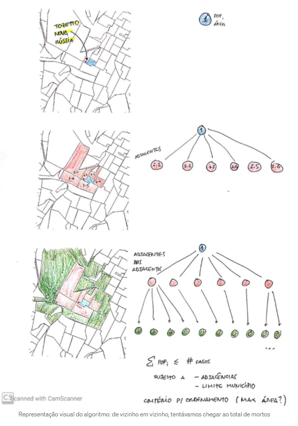
Visual representation of the algorithm: going from neighbor to neighbor, we tried to reach the death toll. Screenshot
After implementing this solution and testing the program by using some coordinates, we faced a problem.
Although the performance was fast and the logic simple, the result was a series of amorphous areas. The figures looked arbitrary and made no sense to anyone not familiar with the calculation method.

This was the result of using the algorithm in the Barra Funda neighborhood in São Paulo. But could we explain the meaning of this strange red area? Screenshot
Explaining how we reached the displayed contours would be difficult and could compromise the effectiveness of the message. So, we tried an alternative method.
Algorithm: Plan B
Now we knew that the results of the final calculation needed to be understood easily and immediately. We also realized that the idea of placing the user at the center of the pandemic suggested a specific shape: a circle around the reader’s location.
We put aside concerns about computational complexity, code elegance, and performance. First, we would have to calculate the radius. Then, we would optimize the program, if necessary.
Briefly, the steps for the new calculation were the following:
- Pin a dot on the map, representing the user’s coordinates.
- Increase the radius of said dot and find out which census sectors crossed this new circle.
- Add the population of each census sector according to the percentage intersection. If a census sector with 100 residents was 100% within the circle, for example, we would include all of them. If it was 30% inside, we would only count 30.
- If the number of people inside the circle was between 90% and 110% of the total deaths by COVID-19 in Brazil, we would wrap up the calculation.
- If the population within the circle was less than the total death toll in the country, we would increase the radius of the circle and repeat the calculation.
- If the population inside the circle was bigger than the total death toll, we would reduce the radius of the circle and repeat the calculation.
Even though this method is more complex than the previous example, it generated more easily-understood results. The COVID-19 cases no longer spread arbitrarily, but in uniform directions around the user.
The mortality radius as viewed from the historic center of Recife. The circular format sends a more effective message. Screenshot
However, these good results came with a price: a much longer run time. The challenge now was to get the script running fast enough to power a cloud-based application.
Performance Issues
We had already estimated that the maximum acceptable calculation time was three seconds. A longer delay would make the reader impatient. And in any case, who waits three seconds for content to load nowadays?
In the original format — not optimized, nor developed for better performance — the program took 10 times longer than that. After some tests, we identified the main bottlenecks. They were as follows:
- Because all census sectors were loading to the memory.
- Because we were calculating the percentage of intersection between each census sector and the radius of the circle.
- And because we were finding out which census sectors intersected with the circle.
That was when a handful of Python modules saved our skin: Feather, Rtree, and PyGEOS. They all expand and optimize the functionality of Geopandas. In addition, we realized we would have to pre-process the base census tracts data.
But how exactly did these tools help and what kind of pre-processing was needed? Let’s see, one by one:
- Brazil has more than 300,000 census sectors. However, we only needed a small number of sectors around each reader’s location. So, we had to find a way to load only the relevant data.
In order to do this, we divided the Brazilian territory into 10,000 rectangles and saved each of them, with their respective sectors, in a different file.
That way, we were able to examine only the rectangle representing the dot location relayed by the user — or also the neighboring rectangles, in cases where the previous sector didn’t have the required population for our calculation.
This strategy significantly reduced the loading time, but there was still a way to make the process faster. Instead of using files in the shapefile format provided by IBGE, we chose the feather format, which was created especially to speed up reading operations.
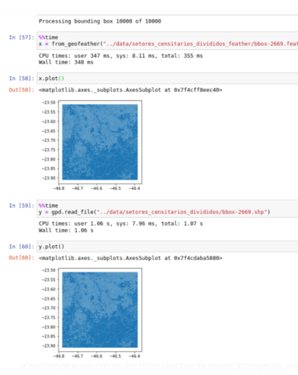
A comparison between the time required to read a file both in shapefile and feather formats: the latter is almost three times faster. Screenshot
- To compute how many people live within a given radius, we needed to calculate the intersection between each census tract and the area of the circle. Usually, GeoPandas uses a lower level package called Shapely for this kind of operation.
The problem is that Shapely is not fast enough to process hundreds of polygons simultaneously as it doesn’t support vectorized operations. These operations are what make statistical packages execute the codes fast.
However, there is a package called PyGeos that, although less flexible, uses vectors to do the same as Shapely.
The latest GeoPandas version includes optional support for these functions. With an extra line of code, the program’s speed increases substantially: gpd.options.use_pygeos = True
- Finally, we needed to discover the fastest way to calculate which census sectors intersected with the circle.
The solution came from an old concept of geospatial analysis that we still didn’t know about: the spatial indexes, implemented in GeoPandas through the Rtree package.
This concept is somewhat similar to item 1: in practice, there would be few census tracts that intersected with the circle around the reader. So what was the point of computing all the polygons, even those that were very far away?
By using a spatial index we could avoid this unnecessary work. Instead of individually checking whether each element was touching the circle, we were instead able to create “envelopes” around small groups of sectors.

A specific type of spatial index called an R-tree. See how smaller red polygons are encapsulated by larger polygons. Screenshot
These envelopes act as prefilters. First, we could check which one touched the circumference. If they didn’t, we could ignore all the census sectors inside; logically, none of them will intercept the circle.
Therefore, it is possible to discard a good number of entries beforehand and process only those that matter.
With all these tools together, we were able to achieve a good enough performance for all urban areas in the country.
On Stage
With the radius size calculated from the reader’s location, we could already position the individual on a map and draw an area around them, creating the circle.
The next challenge was to show each of the tens of thousands of inhabitants in that area as dots on the map, something potentially complicated due to the sad fact that the number of deaths were increasing daily.
In addition, the points would have to be drawn around the reader’s location, respecting the population of the census sectors intercepted by the circle. Finally, we still needed to prevent them from being displayed in places like streets, parks, and lakes.
Since none of us had much experience with data visualization on maps, we didn’t know which way to go. So, as in all the project’s phases, we considered a series of different outputs before reaching the final product.
We could, for example, draw a basic map using packages like D3.js or a static image of a map — an easier output, but which lacked the ambition of a project such as this.
We decided to create a “slippy map;” in other words, an interactive map that allowed the user to zoom in or slide the screen, for example. However, we still had other questions.
We could choose from a number of services like Mapbox, Leaflet, or Google Maps. Whichever tool was chosen, we still needed to decide how to implement the additional layers to draw the circle, the points, and any other visual elements — which, in turn, could be done using SVG, Canvas, or through some other functionality of the map service itself.

Deciding how to implement the project’s visual interface was not simple. Image: Screenshot
The task of choosing how to proceed fell to Tiago, the team’s engineer. Naturally, he made up his mind based on equations and mathematical conclusions that the rest of the team have yet to understand.
Estimating the Circle
Fortunately, Tiago had recently attended a presentation by US designers David Eads and Paula Friedrich where they explained how they had built an application that mapped COVID-19 evolution in Illinois. They used both Mapbox and a Javascript library called turf.js.
An interesting thing about these tools is that they offer the option to add data sources and build visual layers while the reader is using the map.
The flexibility to change the interface on the fly was exactly what we were looking for. So we decided to test them. The results couldn’t have been better.
To illustrate, the example below shows how we drew the circle in a location already calculated by the backstage algorithm.
- We used turf.js to calculate the distance between the coordinates of the reader’s location and the coordinates of a dot in the circle.
- With this distance, again using turf.js, we calculated the dimensions of the polygon to represent the circle.
- We added the information from this polygon to Mapbox, as a datasource, and, accordingly, also added a visual layer to the map.
So, the drawn circle became part of the interface itself; the user could move the screen and zoom in or out and the shape would adapt accordingly, behaving like a native element.
So we would avoid redrawing the image every time a user interacted with the map, which would be a huge limitation if we decided to use technologies such as SVG or Canvas.
200 Million Dots
With the circle element working properly, there was only one problem remaining: how to represent the inhabitants of the region.
Because the idea was to represent each person with a single element on the map, we would have to display at least tens of thousands of dots, always respecting the population density of each census sector.
In our first attempt, we tried to draw all the dots in the browser itself. The implementation was harder than it seemed. The Turf.js can generate random dots inside a rectangle, but not if the shape is irregular like the polygon of the IBGE’s territorial divisions.
Therefore, first we had to calculate the bounding box — something like a rectangular “envelope” around the polygon — for each census sector and only then fill it with dots. Then we checked which of these were inside the sector and discarded the others. But if we generated only one item for each inhabitant, we’d always be missing some items on the map, since most of them would be ignored. The solution was to estimate how many of the dots generated inside the rectangle would fall in or out the census tract. That way we could create additional dots to compensate for the difference. We were facing a problem of geometric probabilities; having an engineer among a team of journalists and designers made all the difference.
In the end, we achieved the following result:

One of the first prototypes, highlighting the deaths around a particular location in the county of Palhoça in the south of the country. Screenshot
As expected, calculating and rendering tens of thousands of dots requires a lot of processing power. The heavy lifting would likely crash many users’ browsers, especially on mobile devices and older computers.
So, facing the impossibility of executing the simulation and the calculation of the dot’s locations at runtime, we started to consider the alternatives. There was no way out without doing some preprocessing behind the scenes.
What seemed like a bump in the road, however, made a very ambitious idea that we already found more appealing: to generate and load onto the map a layer with 190 million dots — one for each person in Brazil, according to the 2010 data, beforehand.
Instead of only creating dots inside the circle, we would spread them throughout the national territory. The radius now serves only to emphasize the dots in the affected area, as in the image below.

Prototype map showing one dot for each inhabitant of Brazil, instead of showing only one point for each COVID-19 victim. Screenshot
The dots were processed in a similar way to our first experiment — randomly generated inside the bounding boxes of the census sectors, in enough numbers to guarantee that the total number of dots inside each polygon would be similar to their respective populations.
Thanks to Python, instead of redoing this each time a user interacted with the map, the calculation would be done only once. The resulting data — about 23 gigabytes of geographic information — were converted to tilesets using a program developed by the Mapbox team, called tippecanoe.
In practice, this means that all dots have been saved as an additional layer on the map, in the same format as the street grid, for example. With this, they can be displayed, loaded, and modified with minimal processing.
Ultimately, this mountain of data ended up being processed by a 10-year-old notebook computer. Probably, what prevented a fire was an improvised cooling system, “created” in the despair of the dawn…

A “cooler” made of Lego pieces prevented this poor computer from overheating. Screenshot
The fundamental pieces of the project were ready. But there was still a long way to go and meticulous work was needed to refine the interactions, script, aesthetics, and so many other details and challenges we were facing throughout the development of the project.
What Did We Learn?
At the end of a period with a heavy workload like this, it’s impossible not to learn some valuable lessons for your next project. As clichéd as it may be, we cannot think of a better way to end this text than listing some of these discoveries.
Split Tasks, Debate Together
While assembling the team for the project, we decided each of us should be devoted to a specific area. One person would process the data, another would work on the tools, and another would define the visual identity.
In theory, these are quite compartmentalized tasks.
Of course, at the end of the assembly line, the results would come together to function as a single system, technology-wise.
It would have been quite possible for each of us to sit at our computers and only talk to each other about the data processing. Luckily, our routine was very different. In regular meetings by video conference and, mainly, through a WhatsApp group that buzzed over the course of many late nights, we constantly talked about all of the different content dimensions.
Even though each member of the team had their specific tasks to deliver, everyone’s fingerprints are seen throughout the material.
We reached a perfect balance: operating with a strict division of tasks, but with the freedom to make suggestions on topics outside our respective responsibilities.
The first part of the equation ensured productivity and efficiency. The second, a greater source of creativity and critical thinking.
Endless Brainstorming
The WhatsApp group also served as a repository for disconnected links, half-thought-through concepts, and bad ideas.
When put it like that, it seems that the communication there only generated noise. But it was exactly the opposite.
Rather than confining the search for references to the initial stages of the creative process, this chaotic environment plunged us into a kind of constant brainstorming of ideas.
We shared it all, including suggestions for online courses on design and machine learning, discussions on the use of color on maps, pictures of church stained glass windows that resemble heat maps, and even images of dry trees in a Namibian desert.

Our WhatsApp group chat featured reference images, tests, memes, courses, and dry trees. Screenshot
All this “chaos” ended up indirectly contributing to the realization of the project. From there came ideas about color palettes, intriguing visual metaphors, and various ways of presenting content that we had not thought of before.
Learning on the Fly
Finally, we found that, in order to get a complex project off the ground in a short time, you need to be willing and able to learn new things quickly.
Again, WhatsApp illustrates this idea: our working group name is “Motivated Irresponsibles.” Why? The truth is that — even though we were familiar with many parts of developing an application like this — in practice, we had never worked with many of these ideas before. Since this project was everyone’s side job, we only had late nights to study and carry out our tasks. Such a commitment, we soon realized, wasn’t among the most responsible things we’ve done in life.
We soon learned how we would be compensated for this folly, though: through the ability to dive into a new topic and understand the essentials in a short time.
In the end, it didn’t matter if we had never worked with MapBox or heard about PyGEOS or even built an interactive app API before. Since these tools were necessary for the job, there was no alternative but to read the documentation, watch tutorials, and learn how to use them.
A skilled developer is likely to read our source code and grimace. They may be right. What are our thoughts on it? “Done” is better than “perfect!”
Additional Reading
10 Tips for Visualizing COVID-19 Data
My Favorite Tools: Alberto Cairo on Data Visualization
GIJN Resources: Data Journalism
 This story was written by data journalists Rodrigo Menegat, Tiago Maranhão, and Vinicius Sueiro and was originally published in Portuguese on Medium. The original post is here. This version was translated for GIJN by Raquel Lima.

Tipsheet on Partnering with Civil Society Organizations and Non-Governmental Organizations

AI Accountability Reporting Guide

Guide to Mapping Analysis Using QGIS

Open Source Databases by Country

How Data Journalism Is Changing the Face of Africa

Trump’s Disappearing Donors, Tracking the Mars Rover, and the Ongoing Wars in Gaza and Ukraine
Airplane Accidents, 2024 Elections, Europe’s Lost Snowfall, and Recycling Movies

Data-Driven Journalism: Roundup of Recent Standout Stories

This work is licensed under a Creative Commons Attribution-NoDerivatives 4.0 International License
Republish our articles for free, online or in print, under a Creative Commons license.
Republish this article
This work is licensed under a Creative Commons Attribution-NoDerivatives 4.0 International License
Read Next
Africa Focus Data Journalism
How Data Journalism Is Changing the Face of Africa
Data journalism in Africa has made a powerful impact, from holding leaders accountable to refuting myths around domestic violence. But the field faces formidable challenges.
Data Journalism Data Journalism Top 10
Trump’s Disappearing Donors, Tracking the Mars Rover, and the Ongoing Wars in Gaza and Ukraine
Our column of the best in data journalism also features stories on AI’s ability to forecast the weather, analyzing the Argentine president’s Tweetstorms, and apathetic EU voters.
Data Journalism Data Journalism Top 10
Airplane Accidents, 2024 Elections, Europe’s Lost Snowfall, and Recycling Movies
With pieces on the global campaign landscape, airplane accidents, European snowfall, and the toll of the ongoing Israel-Hamas conflict in Gaza.
Case Studies Data Journalism GIJC23
Data-Driven Journalism: Roundup of Recent Standout Stories
The best of modern data journalism tells powerful stories that test assumptions. At GIJC23, two experts discussed strong recent investigations and what makes them stand out.