Data Journalism
How We Built the Data Visualization That Brought Brazil’s COVID Deaths Close to Home
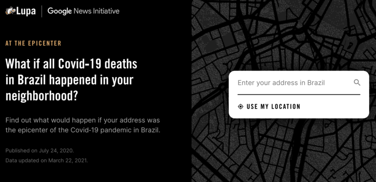
When the COVID-19 pandemic first hit Brazil, a team of data journalists set out to illustrate what the death toll looked like by creating a data visualization that presented something beyond the numbers. The team considered various ways of displaying the story. Here’s a behind-the-scenes look at how they created At the Epicenter.
