
My Favorite Tools: Alberto Cairo on Data Visualization
Read this article in

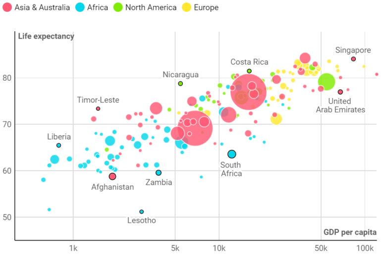
Screenshot: Created with Datawrapper, this scatterplot shows the correlation between wealth and life expectancy, by country and population size.
For GIJN’s series on journalists’ favorite tools, we spoke to Alberto Cairo, Knight Chair in Visual Journalism and director of visualization, data communication, and information design at the Institute for Data Science & Computing at the University of Miami in Florida.
A world renowned teacher, author, and practitioner, Cairo has been at the forefront of a movement to improve visual data and to make graphics more accessible to journalists everywhere.
He says that by using simple principles, and the user-friendly data visualization tools now available, even investigative reporters with no design background can create new data insights for their audiences, and themselves, by shaping their information visually.
“If you are able to both write and design the graphics on your piece, I believe you become a better journalist,” he said. “If you don’t have a graphics department, or if you want to take the first steps in visualization yourself — which I strongly recommend to any reporter — you become more valuable, and you find your work more satisfying.”
For Cairo, whose best-selling books include “How Charts Lie: Getting Smarter about Visual Information” and “The Truthful Art: Data, Charts, and Maps for Communication,” the important principles include these:
- There “are no bad graphical forms”: whether a simple pie chart, a complex non-linear graph, or a strange-looking cartogram, each form can be ideal, depending on the data and the audience.
- The old adage of “show, don’t tell” is wrong for data visualizations. “We need to show and tell,” he says, with a layer of clear text explanation.
- A visualization is an argument, not an image, and its purpose is insight, not illustration.

Some of the many data visualization forms that journalists and designers can choose from. Image: datavizcatalogue.com
Cairo lists many design tools and tutorials in this guide on his website, but here are some of his favorite tools:
R and Excel
“I don’t really use advanced tools — I’m sort of a dinosaur when it comes to tools — but I do use a little of the R programming language; probably the most advanced thing I incorporate into my toolkit.
“R is a programming language created specifically to clean up, manipulate, explore, and visualize data. It is very useful and not that hard to learn — at least its basics. There are many free tutorials and books out there, such as “R for Data Science.” R has many libraries that make using it easy and fun, such as the package known as the Tidyverse, which includes one of my favorite visualization tools, ggplot2.
“For print, I usually use R for data cleaning and data wrangling, though there is some limited cleaning that can be done with Excel, which is still super-useful.”
Datawrapper and RAWgraphs
“If you don’t have any experience with data visualization, it’s advisable to begin with tools that are based on graphical user interfaces that work on the browser. So my own preferences would be Datawrapper, Flourish (more below), or RAWGraphs, or a combination of all of them, because all are quite easy to learn, have good learning materials, and are good starting points to start practicing. Also Power BI from Microsoft, or Tableau Public; either of those options are fine. What matters is that you begin practicing. I don’t really have one favorite tool to recommend; I find myself using all of them depending on the project.”
Flourish or iNZight, plus Illustrator or InkScape
“After [data cleaning], what I do next is generate base charts or base graphics or maps, and I use a variety of tools — I may use Flourish, or iNZight, which is a graphical user interface that lets you design R graphics without writing the actual R code. If you want quick results, Flourish will give you very good results.
“I export those as vector files and bring them into Adobe Illustrator, where I do my final polishing and editing — I’ve been working with it for 25 years, and I feel super comfortable with it. Illustrator is a commercial tool, and there are non-commercial alternatives that will let you do something similar. There is one called InkScape, which is open source, and which is free.
“There are certain add-ons to Illustrator which let you export graphics ready to be published on the web. For example, The New York Times graphics team released a tool called ai2html, which generates an html file that separates the text and image layers on your Illustrator file, which is very convenient.”

Cairo says design choices and data sorting depend on the purpose of the graphic. Here, he reorganized COVID-19 data from a confusing bar graph from the Georgia Department of Health (left) into a new chart (right) grouped by county, and arranged chronologically.
The Phone
“Try to get your data right, so always consult the experts; never assume you understand what the numbers are measuring. Experts can help you understand the limitations and uncertainties with the data. Learn a little about visualization theory. Books can help you decide the most appropriate graphic form, depending on your purpose. Sometimes bar graphs or maps are appropriate. Each one has its own use cases.”
The Pen
“It’s important to be a good visualization writer. I’m a great believer in show-and-tell. A good graphic doesn’t just consist of visualization per se, but also of an added annotation later: a good title and intro, good explanatory text. Write the text of your graphic at the same time that you are designing it.
“Make words and visuals work together effectively — not just showing the data, but explaining the data; helping readers become more visually literate, and reinforcing the main messages the graphic is displaying.”

Screenshot: An example chart of workflow tools Cairo uses, from data to finalized graphic. Image: thefunctionalart.com
 Rowan Philp is a reporter for GIJN. Rowan was formerly chief reporter for South Africa’s Sunday Times. As a foreign correspondent, he has reported on news, politics, corruption, and conflict from more than two dozen countries around the world.

