Data Journalism
Data Journalism Top 10: Outlawing Abortion, Russian Disinformation, Dog Breeds, India Heat Wave
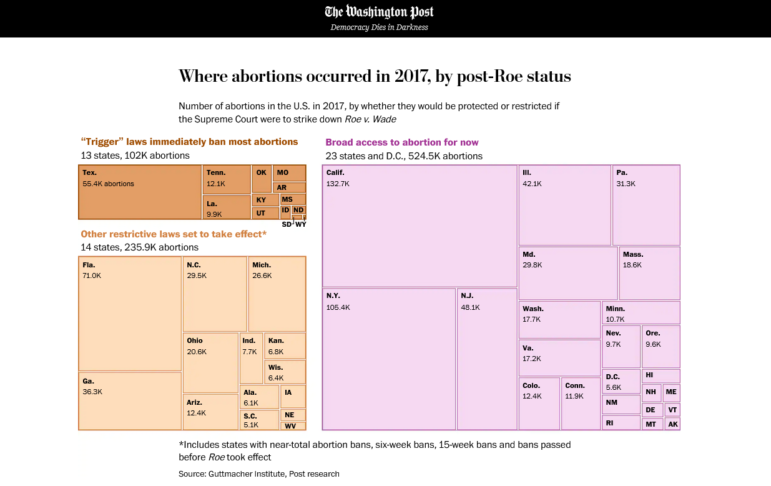
This week’s Top 10 in Data Journalism features an analysis of Russian military casualties, the heat wave scorching India, myths about the link between dog breeds and behavior, and the potential impact of overturning a key judicial ruling on abortion in the US.