
Data Journalism Top 10: National Geographic Maps, Capitol Riots, Flu vs. Coronavirus, Happiness Index, Black Market Data
Read this article in
Scenes of supporters of outgoing President Donald Trump storming the US Capitol building dominated news headlines and filled social media feeds last week. Our NodeXL #ddj mapping from January 4 to 10 found Reuters producing a play-by-play summary of what happened, and FiveThirtyEight examining the stark difference in reaction by the authorities to the Capitol mob compared to Black Lives Matter protesters. Also in this edition, we feature National Geographic’s cartography archive, Data Crítica’s investigation into under-counting of Indigenous COVID-19 infections, and The Markup’s analysis of the impact of Facebook’s political ads.
From the Archives: National Geographic Maps
In case you missed this announcement from 2018 which resurfaced on Twitter recently, National Geographic has digitized its archive of more than 6,000 maps from its 130-year history. The entire cartography collection includes every map published in the magazine since its first issue in October 1888 and is accessible only to subscribers.
How the Capitol Riots Unfolded
Hundreds of supporters of now twice-impeached US President Donald Trump stormed the Capitol building in Washington, DC, last Wednesday. Reuters neatly and chronologically summarized what occurred during the riots starting from Trump’s speech around midday, in which he urged his supporters to march on the Capitol, to the mob breaching the building, and finally to when order was restored.
US Protests from Left to Right
When pro-Trump supporters mobbed the Capitol building, one thing was notably absent: the kind of confrontations between police and protesters that occurred during the Black Lives Matter protests last summer. FiveThirtyEight spoke to the nonprofit Armed Conflict Location & Event Data Project, which documents detailed information about protests. It found that US authorities are more than twice as likely to break up a left-wing protest than a right-wing protest.
Comparing COVID-19 and Flu
Since the start of the COVID-19 outbreak, people have compared the pandemic to the what happens during a typical flu season. Using historical data on flu admissions in intensive care units of UK hospitals, John Burn-Murdoch, a senior data visualization journalist at the Financial Times, examines how the two viruses impact occupancy of intensive care beds.
Miscounting Indigenous COVID-19 Infections
For months, Mexico has been under-reporting thousands of suspected cases of COVID-19 in Indigenous communities in its official data, according to this investigation by Data Crítica, published by GIJN member Quinto Elemento Lab. Among the accounting failures: More than 3,000 people who were infected by the coronavirus were marked as “Indigenous language speakers” in the records but were classified as “non-Indigenous” elsewhere.
Facebook and Elections
Last November, Facebook clamped down on political advertising in an attempt to reduce the spread of misinformation in the US presidential election. However, it did allow sponsored posts about politics in the state of Georgia ahead of the recent Senate election. Nonprofit investigative newsroom The Markup found that the social media platform’s decision to switch on political ads again resulted in partisan content elbowing out information from news sites from users’ Facebook feeds. Check out their findings and investigative methodology.
COVID-19 Vaccinations in the UK
In a race to combat a faster-spreading variant of the coronavirus, the UK has launched a massive vaccination program with a target to distribute vaccines to more than 30 million people “by the autumn.” The BBC breaks down the details on how this vaccine roll-out will take place, including information on who will get the vaccine first, which vaccines will be distributed, and the differences between the various approved vaccines. Also, check out the BBC piece from last year paying tribute to COVID-19 victims by visualizing the losses as flower petals.
Measuring Happiness on Twitter
Peter Dodds and Chris Danforth, applied mathematics professors who run the Computational Story Lab at the University of Vermont, set out to measure people’s happiness in near-real time. The first version of the tool they created for the task, the Hedonometer, draws on Twitter data as a source and assigns a “happiness score” to a group of words collected from a sampling of roughly 500 million tweets daily. Some trends have emerged in their analysis through the years: Saturday is the week’s happiest day on Twitter, while Tuesday is the saddest. Read more on how their tool works here.
Germany’s Travel Boundaries
In Germany, the government has proposed that in counties with a seven-day incidence of over 200 new COVID-19 infections per 100,000, residents should not be allowed to travel beyond a 15-kilometer (nine mile) radius from their homes. German daily Berliner Morgenpost created an interactive tool for the public to input their place of residence to see how far they could venture from their household, if the proposal comes into effect where they live. Der Spiegel has a similar tool.
Ethics of Using Black Market Data
A blockbuster investigation by Bellingcat and The Insider Russia, in cooperation with Der Spiegel and CNN, implicated Russia’s Federal Security Service (FSB) in the attempted assassination of Russian opposition politician Alexey Navalny. The exposé was made possible through the purchase of flight manifests and cellphone metadata bought on the Russian data black market, which placed the FSB agents in proximity to Navalny at key moments. The Washington Post writes that this payment for material set off ethical alarm bells in the industry. Dive into the methodology here.
Thanks again to Marc Smith and Harald Meier of Connected Action for gathering the links and graphing them. The Top Ten #ddj list is curated weekly.
 Eunice Au is GIJN’s program manager. Previously, she was a Malaysia correspondent for Singapore’s The Straits Times, and a journalist at the New Straits Times. She has also written for The Sun, Malaysian Today, and Madam Chair.
For a look at NodeXL’s mapping on #ddj and data journalism on Twitter, check out this map.

Tipsheet: Latest Tools for Investigating with Telegram

Investigating Elections: Threat from AI Audio Deepfakes

Updated GIJN Databases (Poverty, Crime, Corruption, and Terrorism)

Updated Resources on Corruption

Data-Driven Journalism: Roundup of Recent Standout Stories
Data Journalism Top 10: Everest’s Deadly Legacy, Paris Metro Pollution, Migrant Worker Struggles in Singapore
Data Journalism Top 10: Bats and the Next Pandemic, China’s Electric Battery Dominance, and Brazil’s Healthcare ‘Holes’

Data Journalism Top 10: How COVID-19 Changed the US, Race for the North Pole, and Visualizing Coronation in the UK

This work is licensed under a Creative Commons Attribution-NoDerivatives 4.0 International License
Republish our articles for free, online or in print, under a Creative Commons license.
Republish this article
This work is licensed under a Creative Commons Attribution-NoDerivatives 4.0 International License
Read Next
Case Studies Data Journalism GIJC23
Data-Driven Journalism: Roundup of Recent Standout Stories
The best of modern data journalism tells powerful stories that test assumptions. At GIJC23, two experts discussed strong recent investigations and what makes them stand out.
Data Journalism Data Journalism Top 10
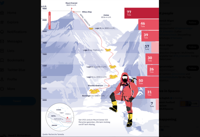
Data Journalism Top 10: Everest’s Deadly Legacy, Paris Metro Pollution, Migrant Worker Struggles in Singapore
This week, GIJN’s Top 10 in Data Journalism examines why the world’s tallest mountain has become increasingly deadly for those trying to climb it, pollution in Paris metro stations, US laws expanding gun access one year after the Uvalde mass shooting, and migrant worker struggles in Singapore.
Data Journalism Data Journalism Top 10
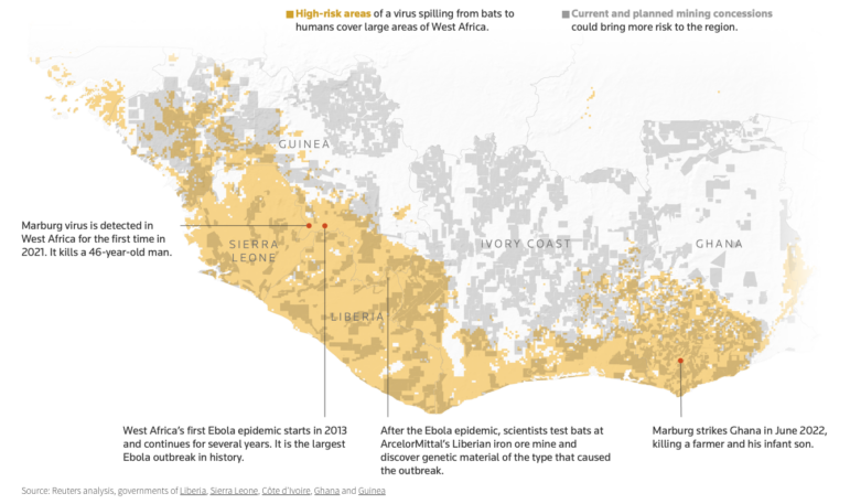
Data Journalism Top 10: Bats and the Next Pandemic, China’s Electric Battery Dominance, and Brazil’s Healthcare ‘Holes’
GIJN’s weekly, curated look at the Top 10 in Data Journalism highlights bats and predicting the location of the next pandemic, China’s electric battery dominance, and mapping out Brazil’s healthcare “holes.”
Data Journalism Data Journalism Top 10
Data Journalism Top 10: How COVID-19 Changed the US, Race for the North Pole, and Visualizing Coronation in the UK
This week GIJN’s Top 10 in Data Journalism features the Wall Street Journal’s dive into how COVID-19 changed the daily lives of Americans, the Straits Times on Singapore’s gold medal history at the Southeast Asian Games, and how data journalists visualized the coronation of King Charles III.