
Data Journalism Top 10: How US Infection Spread, Data Hires, Identity Theft, and Lightning Strikes vs. Lottery Wins

Step-By-Step Guide for Journalists on the Basics of Google Sheets

Tipsheet for Using Ocean Data in Your Investigations

No Coding Required: A Step-by-Step Guide to Scraping Websites With Data Miner

GIJC23 – The Future of Data Journalism: New Analytical Tools, Data Visualization, and AI
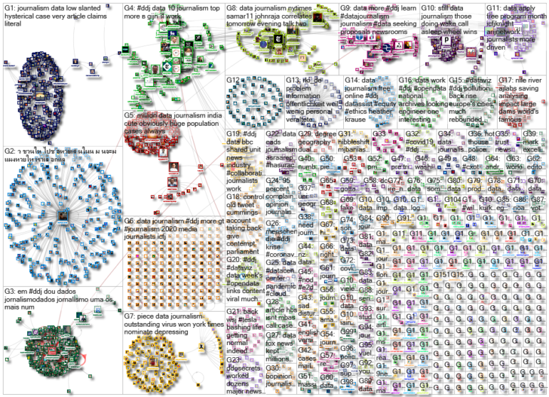
During the pandemic, data and graphics reporters are playing key roles in helping to communicate the threat posed by COVID-19. Our NodeXL #ddj mapping from June 22 to 28 finds The New York Times analyzing travel patterns and genetic data to show how the disease spread across the United States, and the impact it has had on nursing homes and elderly care facilities. The Washington Post is responding to the increasing importance of visual data communication by expanding its data and graphics team, the Google News Initiative announced its 2020 fellowships, and the Pulitzer Center is calling for data journalism story proposals.
How COVID-19 Spun Out of Control in the US
In mid-February, there were only 15 known cases of COVID-19 in the US. But that was only a small part of the picture. There were already an estimated 2,000 hidden infections in major cities. The New York Times analyzed travel patterns, hidden infections, and genetic data to show how the epidemic spun out of control in the country.
Coronavirus Deaths in Nursing Homes
The New York Times compiled a database of residents and workers who have died from COVID-19 in nursing homes and other long-term care facilities for older adults in the US, revealing alarming figures and trends. Danielle Ivory shares some behind-the-story information in this tweet thread.
Investing in Data Teams
During the pandemic, data and graphics reporters have been at the forefront of the media in helping to communicate clearly the threat and the spread of the coronavirus to readers. The Washington Post announced an expansion of its graphics and design teams with 14 new positions, reflecting the rising importance of visual data communication. The Los Angeles Times’ data graphics editor Ben Welsh chimed in to reiterate the value of data journalists.
Identity Theft
This 2019 investigation by Pointer, the Dutch data journalism group, began with a dodgy email. The team takes you on a journey into how they unraveled a murky world of identity theft and scams through online sleuthing. The story won the 2020 Sigma Award for Best Visualization (small newsrooms). Find out how they did it here.
Winning the Lottery vs. Struck By Lightning
This “Lottery” interactive that was created during a Visualize Corruption: Data Journalism Hackathon in Thailand in 2016 has resurfaced on Twitter recently. Using government lottery data, it shows the audience the slim probability of winning the lottery and dives into who really gets rich from lottery ticket sales.
Google News Initiative Fellows
The Google News Initiative Fellowship announced its 2020 cohort — 40 young journalists who will join data, product, audience development, and fact-checking teams across Europe.
Using Data to Tell Better Stories
The Bangalore International Centre brought together Indian data journalists Pramit Bhattacharya, Rukmini Shrinivasan, and John Samuel Raja to talk about the rise of data journalism to tell better stories in an attention-deficit, fake news era. The session was moderated by Samar Halarnkar, an editor from GIJN member organization IndiaSpend.
Data Journalism Opportunities
The Pulitzer Center is still seeking proposals for stories with original data collection or analysis and strong visuals. Contact Pulitzer’s senior strategist Steve Sapienza if you need more information. In other opportunities: Reuters is looking for a legal data reporter in the US, and Gênero e Número is offering a graphic design intern position in Brazil.
Data Journalism Podcasts
Check out Datajournalism.com’s Conversations with Data podcasts. There are nine episodes so far, featuring chats with data journalists and data scientists like Google’s Simon Rogers, Excella’s Amanda Makulec, the Centre for Humanitarian Data’s Leonardo Milano, and more.
Online Video Tutorials
The School of Data Kyrgyzstan organized a five-day online data journalism conference last month. Here — in Russian — is one of the sessions on new formats in data journalism, including scrolling, talkie, sonification, video, animation, and formats for social networks, featuring speakers Alexander Bogachev, Andriy Gazin, Savia Khasanova, and Kristina Shveda. For English resources, The Journalist’s Toolbox uploaded some 20 short training videos on digital tools on its YouTube channel, including tutorials on scraping data from web pages, and data scraping with Tabula.
Thanks again to Marc Smith of Connected Action for gathering the links and graphing them. The Top Ten #ddj list is curated weekly.
 Eunice Au is GIJN’s program coordinator. Previously, she was a Malaysia correspondent for Singapore’s The Straits Times, and a journalist at the New Straits Times. She has also written for The Sun, Malaysian Today, and Madam Chair.
For a look at NodeXL’s mapping on #ddj and data journalism on Twitter, check out this map.
Step-By-Step Guide for Journalists on the Basics of Google Sheets
Tipsheet for Using Ocean Data in Your Investigations
No Coding Required: A Step-by-Step Guide to Scraping Websites With Data Miner
GIJC23 – The Future of Data Journalism: New Analytical Tools, Data Visualization, and AI

This work is licensed under a Creative Commons Attribution-NoDerivatives 4.0 International License
Republish our articles for free, online or in print, under a Creative Commons license.
Republish this article
This work is licensed under a Creative Commons Attribution-NoDerivatives 4.0 International License
Read Next

Data Journalism
One Name at a Time: How Die Zeit Built a Searchable Database of Nazi Party Members
An online tool set up by the German newspaper Die Zeit, in cooperation with archives in Germany and in the United States, allows people to search several million Nazi Party membership cards.

Data Journalism
How the Hindu Is Embedding AI Into Its Data Journalism
LLMs are quietly reshaping data journalism workflows at The Hindu, helping reporters process vast document sets, write scripts and build interactive tools.

Data Journalism
Developing a Data State Of Mind: Key Tips for Editors
Data is woven into how journalists cover everything from local government spending to global climate change patterns, but for editors without a specialist background, it can be daunting.

Data Journalism
2026 Sigma Awards for Data Journalism Open for Entries – Deadline Extended
The Sigma Awards celebrate the best data journalism from around the world. Submissions are now open for data projects published in 2025.