GIJN’s Data Journalism Top 10: Open Source, Artificial Intelligence, Interactive Oceans, Bar Chart Races, EU Polling
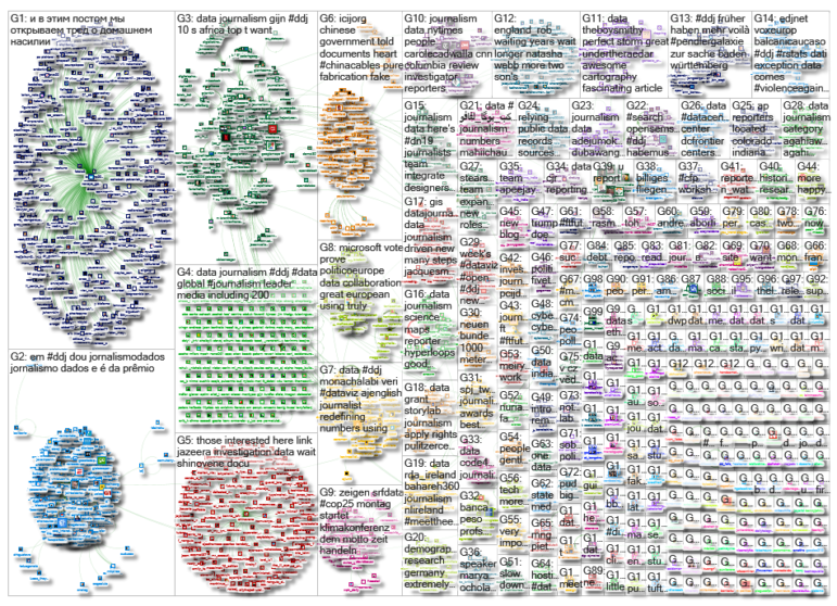
What’s the global data journalism community tweeting about this week? Our NodeXL #ddj mapping from November 25 to December 1 finds The New York Times profiling Bellingcat and its use of OSINT techniques; the International Consortium of Investigative Journalists and Stanford University collaborating to employ artificial intelligence to solve a journalistic problem; and the Science Communication Lab creating a beautiful interactive scientific poster to explore the world’s oceans.
Open Source Journalism
Open source journalism might just be the best antidote to spin: the transparency of its authors showing their work during each step of the investigative process helps earn readers’ trust. The New York Times profiles Bellingcat, an investigative news site that uses open source techniques.
https://twitter.com/Anthony/status/1201478206441820160
Complementing Journalism with AI
The collaborative Implant Files investigation exposed the lax regulation of the $400 billion medical device industry worldwide. But when the International Consortium of Investigative Journalists wanted to know if women suffered disproportionately from faulty medical devices, it hit a data roadblock. The journalists then turned to artificial intelligence to help their reporting.
Predicting Climate Change Consequences
How will climate change affect your place of residence? Schweizer Radio und Fernsehen (SRF) created an interactive to show Swiss residents potential effects in their communities, including the number of snow days, hot days, and tropical nights.
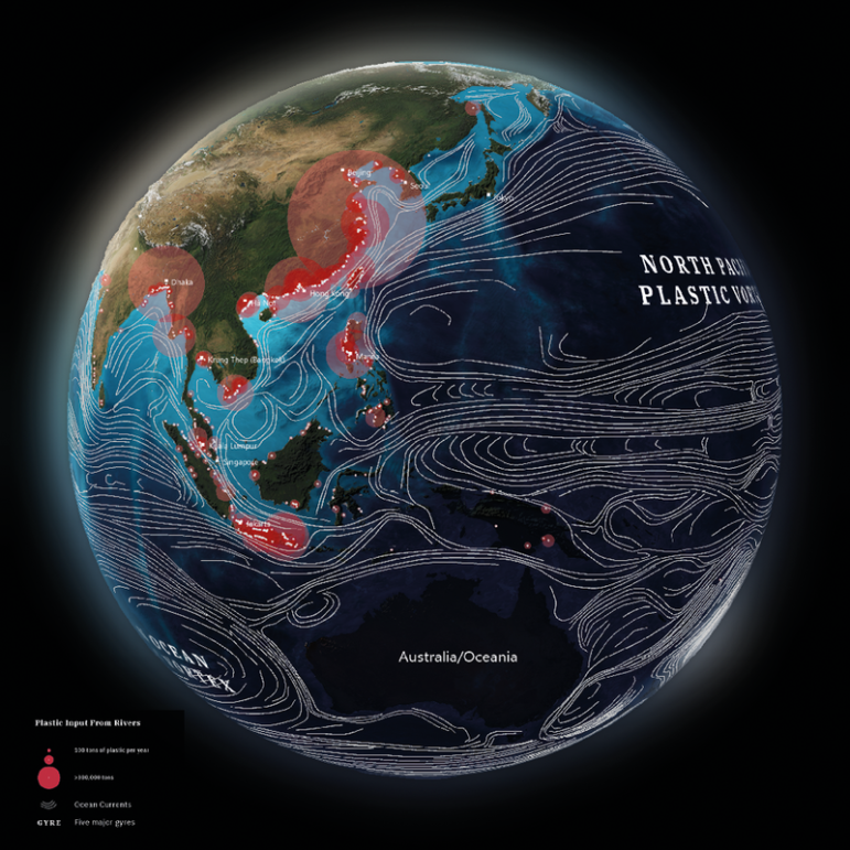
Interactive, Multi-Touch Approach to Science
The Science Communication Lab created a beautiful interactive and multi-touch scientific poster for users to explore the world’s oceans and get a better understanding of complex marine science. In this video, you will get a peek at the detailed 3D animations and extensive data visualizations that explain the processes in the oceans. This project was named one of the winners in the 2019 Information is Beautiful Awards.
Bar Chart Races
Visual analytics expert Andy Cotgreave created an animation of ranked bar graphs using Flourish. Calling these graph animations (also known as bar chart races) the “fidget spinner of data visualizations,” Cotgreave predicts that they will disappear over time. Alberto Cairo weighs in on whether using bar chart races is justifiable.
https://twitter.com/AlbertoCairo/status/1200279787106902021
European Parliamentary Elections
Politico Europe unveiled Poll of Polls, an election coverage hub, ahead of the 2019 European parliamentary votes in May. It gives citizens a deeper look at the democratic process using interactive data visualizations built with Microsoft Power BI.
https://twitter.com/BenThePCGuy/status/1199077481812070401
Digital Training for MENA Journalists
The International Center for Journalists (ICFJ) and the Google News Initiative are offering digital training webinars for journalists across the Middle East and North Africa. Participants will learn how to gather and source information, use data for stories, and embrace immersive storytelling. The program started in October but there are a few webinars left available for journalists from Saudi Arabia, Lebanon, and Tunisia.
2019 Information is Beautiful Award Winners
Winners of the 2019 Information is Beautiful Awards are out and the awarded works are glorious. Get inspired by the collection of data visualizations that pushes boundaries in categories ranging from science and technology to maps, places, and spaces.
Brazil’s First Data Awards
Brazil gave out the Claudio Weber Abramo Data Journalism Awards in São Paulo last month during the Coda.br conference. These are the first data awards in the country and are named after a pioneer of data journalism in Brazil, who was a mathematician and journalist. The awards included categories in open data, data visualization, and data-driven research.
Massive Data, Equal Burnout
With investigations increasingly involving vast amounts of data and requiring immense effort by journalists to clean, filter, and analyze it all, large-scale data-driven investigations could drive reporters to the point of burnout. Mar Cabra, who was one of five members on the leadership team for the International Consortium of Investigative Journalists’ Panama Papers project, shares her experience and suggests some guidelines to avoid such high personal costs.
Thanks again to Marc Smith of Connected Action for gathering the links and graphing them. The Top Ten #ddj list is curated weekly.
 Eunice Au is GIJN’s program coordinator. Previously, she was a Malaysia correspondent for Singapore’s The Straits Times, and a journalist at the New Straits Times. She has also written for The Sun, Malaysian Today, and Madam Chair.
For a look at NodeXL’s mapping on #ddj and data journalism on Twitter, check out this map.

Document of the Day: Visual Vocabulary

Reporter’s Guide to Investigating Cryptocurrency

Tipsheet on Partnering with Civil Society Organizations and Non-Governmental Organizations

AI Accountability Reporting Guide
Airplane Accidents, 2024 Elections, Europe’s Lost Snowfall, and Recycling Movies
Data Journalism Top 10: Bats and the Next Pandemic, China’s Electric Battery Dominance, and Brazil’s Healthcare ‘Holes’

Data Journalism Top Ten: Turkey’s Toxic Rubble, Eurovision History, and a Rare Climate Victory
Data Journalism Top 10: Hollywood Blockbuster Diversity, Climate Inequities, Election Deniers, Toxic Twitter

This work is licensed under a Creative Commons Attribution-NoDerivatives 4.0 International License
Republish our articles for free, online or in print, under a Creative Commons license.
Republish this article
This work is licensed under a Creative Commons Attribution-NoDerivatives 4.0 International License
Read Next
Data Journalism Data Journalism Top 10
Airplane Accidents, 2024 Elections, Europe’s Lost Snowfall, and Recycling Movies
With pieces on the global campaign landscape, airplane accidents, European snowfall, and the toll of the ongoing Israel-Hamas conflict in Gaza.
Data Journalism Data Journalism Top 10
Data Journalism Top 10: Bats and the Next Pandemic, China’s Electric Battery Dominance, and Brazil’s Healthcare ‘Holes’
GIJN’s weekly, curated look at the Top 10 in Data Journalism highlights bats and predicting the location of the next pandemic, China’s electric battery dominance, and mapping out Brazil’s healthcare “holes.”
Data Journalism Data Journalism Top 10 News & Analysis
Data Journalism Top Ten: Turkey’s Toxic Rubble, Eurovision History, and a Rare Climate Victory
This week’s Top 10 Data Journalism stories curated by GIJN includes projects on Turkey’s toxic earthquake rubble, Eurovision song metrics, US migration from coastal cities, and world leaders’ heights.
Data Journalism Data Journalism Top 10
Data Journalism Top 10: Hollywood Blockbuster Diversity, Climate Inequities, Election Deniers, Toxic Twitter
Our weekly curation of the most popular and engaging data journalism stories looks at Hollywood blockbuster diversity, how climate change drives global inequity, tracking US election deniers, and toxic tweets aimed at UK politicians.