
Image: Screenshot, Reuters
Data Journalism Top Ten: Turkey’s Toxic Rubble, Eurovision History, and a Rare Climate Victory
Read this article in

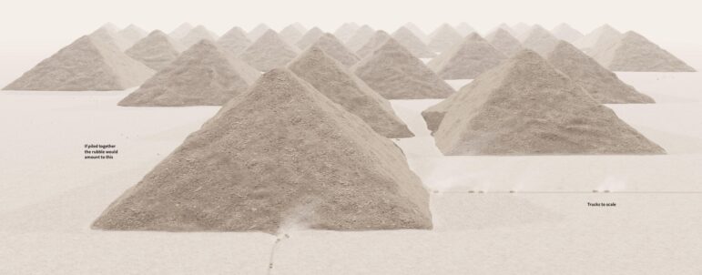
Reuters offers a graphic visualization of the rubble pile left from the Turkey earthquake in February — estimated by the UN to be 100 million cubic meters (130 million cubic yards) — as the equivalent to 38 enormous heaps, each the size of the Great Pyramid in Giza, Egypt. Image: Screenshot, Reuters
From a visual exploration of the bombing of the Ukrainian city of Kharkiv to a project looking at the health impact of toxic debris from Turkey’s earthquake, data reporters have been examining the question of “what happens next.” Our Data Journalism Top 10 has been curated by GIJN, and features stories from May 8 to 14, 2023. Also featured: pop data from the Eurovision song contest, Latin American inflation, and a look at the height of world leaders through history. Plus, a game to ask readers how they would reduce the US national debt.
How Russia’s Invasion Transformed Kharkiv
To show how Russia’s invasion of Ukraine has transformed “everyday places” such as parks, universities, and city squares, a collaboration from Vox and The Pudding traced a route through the city of Kharkiv to show before-and-after damage to various community spaces. Readers can also compare the map of damaged landmarks in Kharkiv to US cities to consider how, for instance, a theater in Chicago would look if it suffered similar attacks. To create these maps and comparisons, the team pulled data from Google Trends and the Google Places API, and collected images from Google Streetview, Google Maps, and Getty Images.
Also interesting: Using satellite imagery, RFE/RL’s Ukrainian service mapped over 200 military objects located in Crimea, such as bases, fuel depots, and air defense systems.
Turkey’s Secondary Disaster
Turkey’s February earthquake — which killed over 54,000 people in Turkey and Syria — may have “unleashed a health catastrophe for a generation” according to Reuters. It gathered data from various agencies and spoke with environmental health professionals and experts, some of whom believe a “secondary disaster” caused by toxic debris could be more severe than the quakes. Through satellite imagery and a striking visualization of the more than 300,000 damaged buildings — which are releasing poisons such as asbestos into the air and water — Reuters provides a new understanding of the scale of the catastrophe.
Also impressive is this deep dive — and 3-D model — by The New York Times exploring why one luxury building collapsed in Turkey.
Priced Out of Major US Cities
After years of lower-wage residents being priced out of coastal and “superstar” US cities, now higher-paid workers and graduates are leaving too. The New York Times’ The Upshot created a bespoke dataset on place-to-place migration, broken down by metropolitan area and education level with help from the University of Missouri’s geographic correspondence engine and public-use census microdata. Among the headlines: San Francisco has recently lost more educated workers than have moved in, and a similar pattern holds for major metro areas in other parts of the country — a startling reversal of a decades-long trend.
Eurovision History, Visualized
The Reuters Graphics team distilled 67 years of Eurovision song contest data to visualize the most frequent winners, how world events have influenced scoring, and how the staging has evolved from manual scoreboards to the light show spectacle it is today. They also used Spotify audio and metrics to create an “audio archive” for each country, breaking down every song to core elements (such as “acousticness,” “tempo,” and “danceability”). Readers can explore by country and click on each song to listen to a sample — and see at-a-glance what kinds of song elements countries favor or discern which kinds of songs tend to be popular.
Germany’s Not-So-Green State Pension Funds
German taxpayer money is fueling the climate crisis, according to the independent site CORRECTIV. Its reporters requested lists of pension fund investments from the finance ministries — who decide what assets to invest — in all 16 German federal states. Breaking down the results by state, they found that 10 of them invest hundreds of millions of euros in climate-damaging industries, companies, and banks. The biggest investors in fossil fuel industries are Saxony-Anhalt and Bavaria. These problematic investments, CORRECTIV notes, will prevent Germany from achieving its climate goals.
Spain: Where Has the Money Been Spent?
As the country gears up for elections at the end of the month, reporters at Spanish newspaper El País designed an interactive budget tool for voters interested in the past priorities of local leaders. Using data from the Treasury — the Ministerio de Hacienda — reporters dug into where different citizens have spent taxpayers’ money in the past to show expenditure per inhabitant and reveal how each municipality’s spending on topics like security, public transport, education, and fire services compares to others across Spain.
A Rare Climate Success Story
This week experts warned that there is now a 66% chance it will pass the 1.5 degrees Celsius (just under 3 degrees Fahrenheit) global warming threshold by 2027. But this resource updated from Our World in Data shows how there still can be progress on intractable, global problems when it comes to the climate. The team uses data from the UN Environment Program and NASA Ozone Watch to show the huge drop in emissions of ozone-depleting substances since the late 1980s, as a result of coordinated action to limit the release of halons, CFC’s, and other substances. It also mapped the countries that are party to the Montreal Protocol that helped address the issue.
Ranking World Leaders (and Readers) by Height
Did you know that North Korea’s Supreme Leader Kim Jong-un and Nazi Germany’s Adolf Hitler measure the same height? So too former UK Prime Minister Boris Johnson and Argentine revolutionary Che Guevara. This interactive data project from Marcelo Duhalde at the South China Morning Post features dozens of current and former world leaders — it even features Roman ruler Julius Caesar and England’s King Henry VIII. Readers can input their own height to see how they measure up, and toggle between leaders dead and alive.
Soaring Prices in Brazil and Argentina
Reporters at Brazil’s Folha newspaper created an inflation data tool to measure how the prices of food, services, and other products vary across the country. Looking at a basket of more than 300 products, and data going back to 2007, the team explores how inflation has impacted living costs, and flags which shopping basket items have risen (and fallen) the most. That “makes it possible to know if inflation is higher in Belo Horizonte or in Recife.” Meanwhile, the Argentine newspaper La Nación charted how much a family needs to earn in Buenos Aires to be classified as middle class, finding that inflation is creating a “constant race against rising prices that wages can barely keep up with.”
Words of Wisdom
The latest book from data journalist Alberto Cairo is out this November. On his blog, the journalist/designer, who holds the Knight Chair in Visual Journalism at the University of Miami, has given a few clues about “The Art of Insight,” promising that it is his “quirkiest, most personal, and most meandering book to date.” One reviewer — Professor Isabel Meirelles — says the book “presents a broad overview of contemporary visualization practices through a plurality of voices that are diverse and culturally rich.” Cairo has interviewed a number of the data journalists whose work has appeared in GIJN stories, including Federica Fragapane, Gurman Bhatia, and Deniz Cem Önduygu.
Bonus Game: Tackling the National Debt
Washington is facing a national debt dilemma and a characteristic lack of agreement on the best way to handle it. So reporters at the Washington Post created a game for readers to assess how they would make the hard decisions: find out if you are a Diligent Deficit Hawk, Mindful Moderate, or Money-Printing Maverick (or something in between). You might want to read the New York Times’ primer — which explores how cuts proposed by the Republican party could impact different government departments — before you play.
 Laura Dixon is an associate editor at GIJN and a freelance journalist from the UK. She has reported from Colombia, the US, and Mexico, and her work has been published by The Times, The Washington Post, and The Atlantic. She has received fellowships from the IWMF and the Pulitzer Center.
 Alexa van Sickle is an associate editor at GIJN. She was previously a senior editor for the foreign correspondence magazine Roads and Kingdoms. She has also been an editor at the International Institute for Strategic Studies and a publisher at an international law non-profit in London. She lives in Vienna, Austria.


