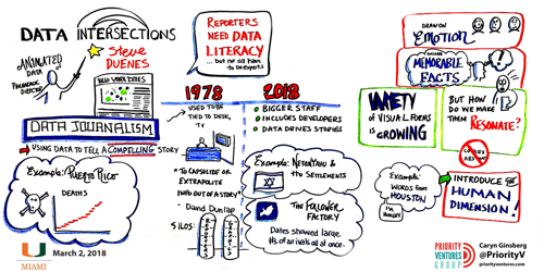
Data Journalism
Data in the Desert: 4 Projects from the Middle East that Are Digging In
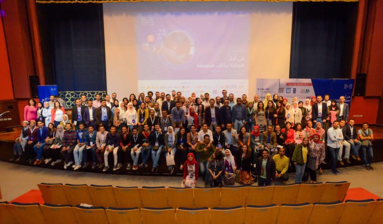
Representatives from several data projects in the MENA region made their way to Cairo last month to attend the first Arab Data Journalism Conference. They were there to share their initiatives to help data other Arab journalists — as well as academics and researchers — access reliable data that’s easy to find and delivered in usable formats. A GIJN original.