News & Analysis
Puerto Rico Journalists Expose Reality of Hurricane Damage
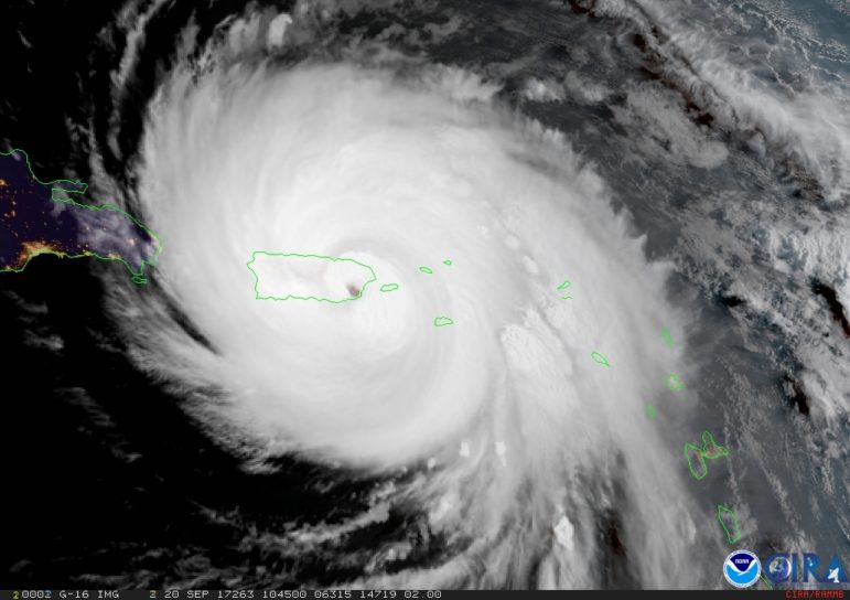
Late last year, the number of official deaths during Hurricane Maria were at a surprising low. That’s when the journalists at Puerto Rico’s Centre de Periodismo Investigativo kicked into high gear, forcing government to be more transparent and accountable.