Reporting Tools & Tips
How to Expose Lies from the Skies Using Satellites and Drones
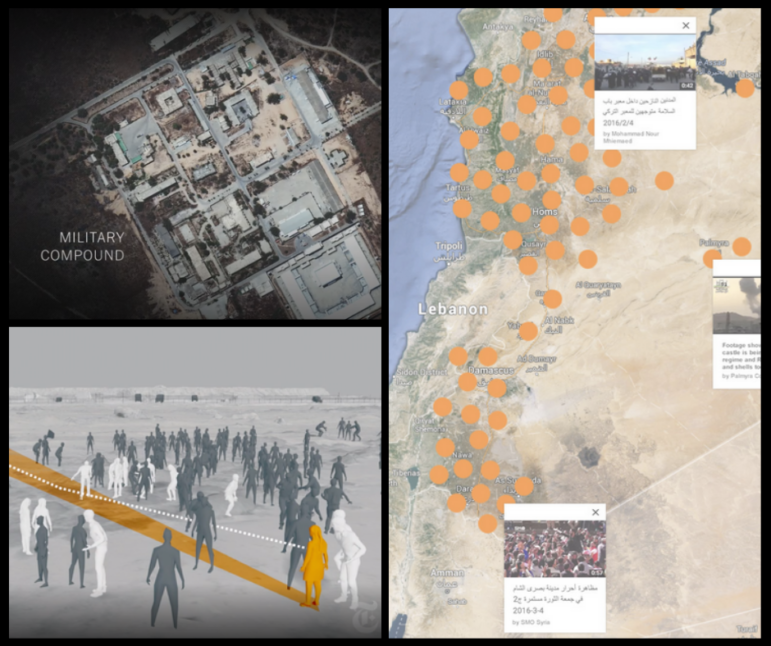
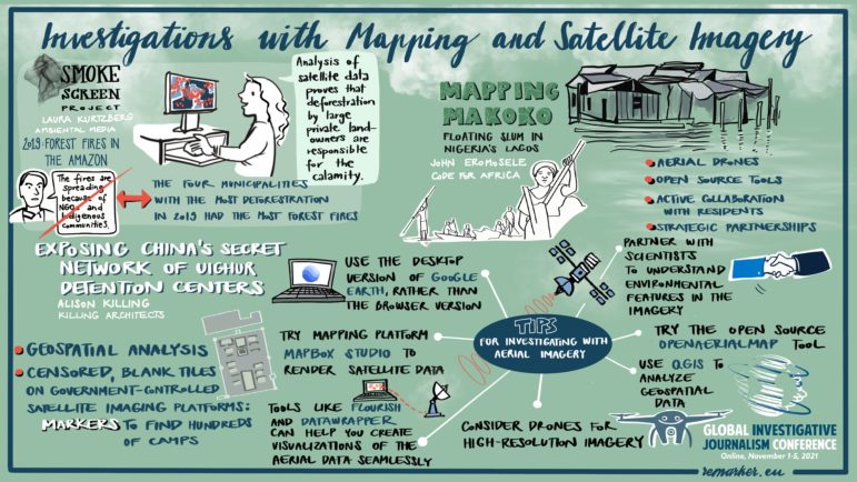
In a GIJC21 session on using maps and satellite imagery for investigations, three experts explained their approaches to analyzing satellite and drone images, and using open source tools. One of the innovative techniques described led to a Pulitzer Prize this year — for exposing China’s network of Muslim detention centers — while another exposed government deception about fires in the Amazon, and a third literally put a vulnerable community in Africa on the map.