News & Analysis
What We’re Reading: Exposing China’s Prisons from Space, Protecting Protesters, Russian Dirty Tricks
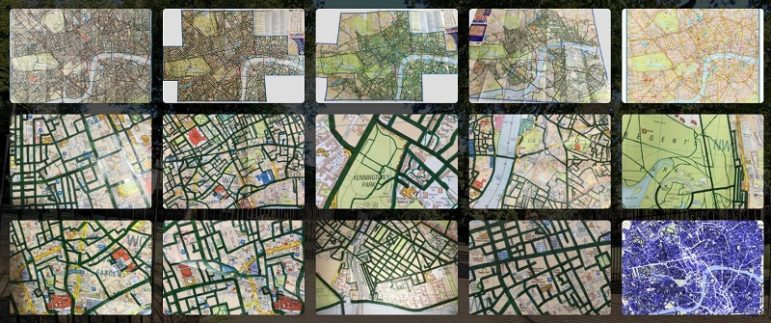
For this week’s Friday 5, where GIJN rounds up key reads from around the world, we’re looking at the latest in mapping and satellite imagery, including some clever sleuthing by Buzzfeed News; how to protect protesters in your photos; buried secrets in a US Senate report; and a rescue fund for Lebanese media hurt by the big blast.