Accessibility Settings

color options

monochrome muted color dark

reading tools

isolation ruler

Tag

elections

53 posts
Pandora Papers image 2

Data Journalism

Data Journalism Top 10: Pandora Papers, Data Podcasts, and COVID-19 in Scottish Care Homes

Tracking the most popular data journalism stories on Twitter from September 27 to October 3, we found a series of articles based on discoveries from the Pandora Papers offshore leak. In this edition, we also feature reporting on the damage caused by the eruption of the volcano on La Palma, data journalism podcasts, and a roundup of the German election results.

Data Journalism

My Favorite Tools: Indian Journalist and Data Designer Gurman Bhatia

For GIJN’s My Favourite Tools series, we spoke with Indian journalist and information designer Gurman Bhatia. She has worked at the Hindustan Times in Delhi and been a part of the award-winning team at Reuters Graphics, where she worked on visualizations for topics as diverse as election fraud in India, use of force during protests in Hong Kong, and bushfires in Australia.

Data Journalism

Data Journalism Top 10: Merkel’s Legacy, Russia’s Politics, Korea’s Missiles, Melting Ice Archives

Tracking the most popular data journalism stories on Twitter from September 13 to September 19, using NodeXL mapping and our own human curation, we found projects by Reuters and the German newspaper Morgenpost analyzing Merkel’s legacy in numbers. In this edition, we also feature a story looking into North and South Korea’s missile programs, a piece on school segregation in the United States, and more worrying climate change revelations.

Data Journalism

Data Journalism Top 10: The Taliban’s March, Border Walls Quadruple, Kenyan Corruption, White Men Like the Office

Two decades after US-led troops invaded Afghanistan to topple the Taliban regime, the organization has retaken control of the country. Our NodeXL mapping from August 9 to 15, found an animated map by the Financial Times showing how the Taliban captured various districts across the country before surging into the capital Kabul earlier this week. In this edition, we also feature an investigation into America’s diabetes crisis by Reuters, a look into Lionel Messi’s legacy at Barcelona by The Economist, and a piece on the history of data journalism by the Guardian.

Forbidden Stories' Pegasus Project exposé

Data Journalism

Data Journalism Top 10: Pegasus, Silencing Reporters, Europe Flooding, Diversity Mapping, K-pop

Our NodeXL mapping from July 12 to 18, which tracks the most popular data journalism stories on Twitter each week, found a series of articles resulting from the collaborative project that analyzed an unprecedented leak of more than 50,000 phone numbers selected for surveillance. In this edition, we also feature an insight into Facebook’s data wars by The New York Times, an interactive piece by Al Jazeera on how the holy city of Mecca has expanded, and a colorful project by the Washington Post on the rise of K-pop.

Data Journalism

Data Journalism Top 10: Refugee Trails, Sri Lanka’s Eco-Disaster, Pandemic Poachers, German Voters, Sigma Awards

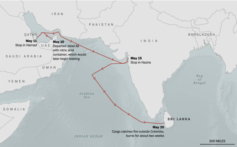
A sunken ship with a toxic cargo threatens to cause one of the worst environmental disasters in the history of Sri Lanka. Our NodeXL mapping from June 14 to 20 found a story by The Washington Post examining what caused the incident and evaluating the potential damage to marine wildlife. In this edition we also feature a piece by Al Jazeera evaluating 70 years of journeys made by refugees, an investigation into recyclable waste by Brazilian news outlet Metrópoles, and take a look at the winners of the 2021 Sigma Awards recognizing the best data journalism around the globe.

News & Analysis

How iFact Is Transforming Investigative Reporting in the Republic of Georgia

When Nino Bakradze was growing up in Georgia in the ’90s, the country was embroiled in a civil war and a post-USSR economic crisis. In a media landscape dominated by state TV, investigative journalism just didn’t happen. The situation hadn’t changed much when she graduated, so she set up iFact to turn the tables. GIJN’s Alexandra Tyan spoke to the team.

Data Journalism

Data Journalism Top 10: Scented Candles, COVID Risk Simulator, Trump’s Final Regs, Sigma Awards

Are scented candles a casualty of the coronavirus crisis? Our NodeXL #ddj mapping from November 23 to 29 found researcher Kate Petrova’s data analysis revealing that scented candles have suffered a blow in online reviews and a decrease in ratings, possibly linked to the coronavirus’ ability to affect people’s sense of smell. Elsewhere, Germany’s Zeit Online created a COVID-19 infection risk calculator, the COVID Tracking Project explained how holidays and weekends disrupt the recording and publishing of virus data, and Reuters analyzed the shortcomings of the coronavirus contact tracing system in England. Meanwhile, the Sigma Awards, which celebrate the world’s best data journalism, have opened for entries.

Data Journalism

Data Journalism Top 10: Musical Taste by Politics, Podcasts, Polling Problems, COVID Tweet Analysis

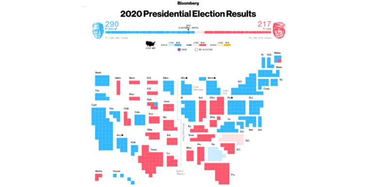
The US presidential election dominated the Twitter chat waves last week. Our NodeXL #ddj mapping from November 2 to 8 found data journalists sharing live election results trackers by Bloomberg, The Washington Post, and The New York Times, while The Atlantic and Slate weighed in on the problems of polling. Elsewhere open source platform Mapbox is organizing an election mapping contest, and Lazer Lab created a dashboard to explore 29 million tweets related to COVID-19 shared by over half a million Americans.

Data Journalism

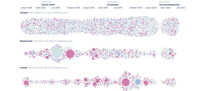
Data Journalism Top 10: Animating COVID Masks, Mapping US Campaign Cash, Homeless Arrests, Berlin Protests

Research shows that masks are an essential defense against the coronavirus. Our NodeXL #ddj mapping from October 26 to November 1 finds The New York Times using animation and augmented reality to show just how masks work to filter and trap air particles that may carry the virus. This edition also includes several pieces on the United States presidential election: FiveThirtyEight founder Nate Silver talks to Vox about polling errors and uncertainties, freelance journalist Betsy Mason explains common shortcomings of US election maps, and NYT analyzed more than 25 million donations to Trump and Biden’s presidential campaigns.