Data Journalism Top 10: Russia’s Achilles’ Heel, Baby Names, Bike Shortage, Dataviz Color Guide
Read this article in

Step-By-Step Guide for Journalists on the Basics of Google Sheets

Tipsheet for Using Ocean Data in Your Investigations

No Coding Required: A Step-by-Step Guide to Scraping Websites With Data Miner

GIJC23 – The Future of Data Journalism: New Analytical Tools, Data Visualization, and AI
From day one, logistical problems have plagued Russia’s invasion of Ukraine. The Washington Post details the many supply issues that contributed to the Russian military’s slow advance. Our weekly NodeXL and human curation of the most popular data journalism stories on Twitter also features Bloomberg’s analysis of the ongoing gaps in sanctions against Russian oligarchs, FiveThirtyEight’s look at Europe’s selective support for refugees, The Courier’s historical analysis of Scottish baby names, and a dive into how organizations should choose their data visualization color palettes.
Russia Military’s Achilles’ Heel
Moscow attempted to overwhelm Ukraine’s defenses with a lightning-fast invasion, but its attack has faltered due to weak logistics support. The Washington Post analyzed the myriad problems plaguing the Russian military: lack of convoy protection, scattered command structure, shortages of critical supplies, a lack of guided missiles, and excessive vehicle breakdowns, to name a few. Also worth a look: The New York Times produced a visual explainer exploring the reasons why Russia failed to conquer Kyiv, Ukraine’s capital city.
Unsanctioned Oligarchs
A flurry of sanctions have hit Russian oligarchs worldwide since Moscow’s invasion of Ukraine. But a Bloomberg analysis of thousands of sanctions imposed by the United Kingdom, European Union, and the United States revealed that half of Russia’s 20 richest tycoons were still free to operate their businesses without legal restrictions. The report also found a lack of coordination, with only 294 sanctions in common among the more than 2,000 economic penalties imposed. Journalist Raeedah Wahid shares snippets of the story in this tweet thread.
Speeches: Zelenskyy vs. Putin
IStories examined the public speeches and appearances made by leaders in Russia and Ukraine from February 24 to March 24. This includes defense ministers, senior officials in the presidential administration, ministers of foreign affairs, and heads of the security council, from both sides. It found that Ukrainian President Volodymyr Zelenskyy addressed Ukrainians 3.6 times more often than Russian President Vladimir Putin had spoken to his own people. The story also reported that during the first month of the war Russia’s FSB director, secretary of the Security Council, and chief of the General Staff of the Armed Forces were conspicuously absent from making public addresses.
Selective Support for Refugees
Recent polls have found that people in European countries overwhelmingly approve of taking in Ukrainian refugees. This level of support, however, is noticeably much higher than for the last influx of displaced persons, who came from Middle Eastern and African countries in 2015. Five Thirty Eight examined the attributes of asylum seekers that make Europeans more or less willing to accept refugees. Some of the factors include the refugee’s previous occupation, religion, country of origin, and language ability.
Fashionable Baby Names
What are the most fashionable baby names in Scotland? The Courier analyzed data from the National Records of Scotland since 1974 and found “Emma” and “David” to be the most popular names in the country over the decades. The piece also looked at how the popularity of celebrities and royals influence baby names, and how the birth of the unflattering Karen meme may have resulted in no babies being named Karen for the first time in 2018. Want more? The Courier’s baby name series includes a piece on baby names inspired by Scottish places, and another on unique baby names such as Kieywyn, Jgordenna, and Winkie. (Database included!)
Does Twitter’s Algorithm Hate Your Friends?
Have you painstakingly curated your Twitter feed to follow only the most interesting people you want to hear from? Well, Twitter is not showing you the content that you want to see, according to a data dive by accessibility designer Tyler Freeman. Freeman wrote an app that scanned all the tweets on his Twitter feed before saving it to a database. By analyzing that data, he found that only one-third of his feed were tweets from friends, and the rest were either from strangers or ads. It gets worse; he discovered that 90 percent of the people he followed never appeared in his feed.
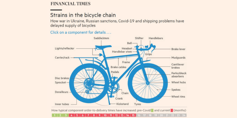
Bicycle Supply Chain Disruptions
The Financial Times looked at how the Russia-Ukraine war, Russian sanctions, COVID-19, and shipping problems have all contributed to the delayed supply of bicycle components to Europe. The piece includes a cool bicycle interactive: click on a bike part and it will show you its top producing countries, and how long more one has to wait for its delivery now compared to a pre-COVID era.
Gerrymandering in Hungary
Hungary’s parliamentary elections last Sunday saw the incumbent, right-wing populist party Fidesz secure a two-thirds majority and cement Prime Minister Viktor Orban’s fourth consecutive term in office. A day before the election, The Economist took a look at how Fidesz would secure a majority even if its opponents got more votes. This imbalance can be traced back to gerrymandered districts, which Fidesz drew up in 2014, radically redistributing its voters among lots of small districts. Data journalist G. Elliott Morris highlights some of the findings in this tweet thread.
Missing Parole Hearings
The Board of Parole in the US midwestern state of Nebraska has five full-time members. But they have a hard time showing up for parole hearings, according to the state’s first nonprofit newsroom, the Flatwater Free Press. The folks at Flatwater found, in response to a public records request, that only 2,441 out of 6,521 parole hearings (37 percent) saw full board attendance. And this absence matters. The report found that prisoners are more likely to be granted parole (62.6 percent) when the full board shows, compared to when any of the members were absent (56.2 percent.) Here’s how the journalists analyzed the data.
Setting Spain’s Price of Electricity
Digital news site ElDiario analyzed more than eight million offers from energy companies in 2021 to understand how the market price of electricity is determined Spain. The team attempts to break down the complex process for readers using charts and a scrollytelling explainer.
Bonus 11th Item: Building a Dataviz Color Palette
Datawrapper’s Lisa Charlotte Muth spoke to dozens of experts and came up with a detailed and extensive guide for how organizations can best build a fixed color palette for data visualizations. It includes four different approaches to an organizational color palette, and a checklist of considerations for choosing colors.
Thanks again to Marc Smith and Harald Meier of Connected Action for gathering the links and graphing them. The Top Ten #ddj list is curated weekly.
 Eunice Au is GIJN’s program manager. Previously, she was a Malaysia correspondent for Singapore’s The Straits Times, and a journalist at the New Straits Times. She has also written for The Sun, Malaysian Today, and Madam Chair.
For a look at NodeXL’s mapping on #ddj and data journalism on Twitter, check out this map.
Step-By-Step Guide for Journalists on the Basics of Google Sheets
Tipsheet for Using Ocean Data in Your Investigations
No Coding Required: A Step-by-Step Guide to Scraping Websites With Data Miner
GIJC23 – The Future of Data Journalism: New Analytical Tools, Data Visualization, and AI

This work is licensed under a Creative Commons Attribution-NoDerivatives 4.0 International License
Republish our articles for free, online or in print, under a Creative Commons license.
Republish this article
This work is licensed under a Creative Commons Attribution-NoDerivatives 4.0 International License
Read Next

Data Journalism
Making Trillions Make Sense: How Reuters Visualized the AI Economy
How do you make a trillion dollars feel real to someone who has never seen that much money? Vineet Khare and Mayank Bhatt faced that very challenge for their data-driven investigation into AI investment.

Data Journalism
How the Hindu Is Embedding AI Into Its Data Journalism
LLMs are quietly reshaping data journalism workflows at The Hindu, helping reporters process vast document sets, write scripts and build interactive tools.

Data Journalism
Developing a Data State Of Mind: Key Tips for Editors
Data is woven into how journalists cover everything from local government spending to global climate change patterns, but for editors without a specialist background, it can be daunting.

Data Journalism
2026 Sigma Awards for Data Journalism Open for Entries – Deadline Extended
The Sigma Awards celebrate the best data journalism from around the world. Submissions are now open for data projects published in 2025.