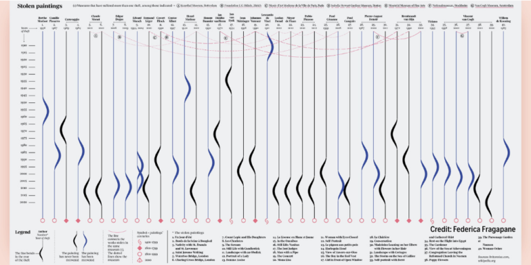
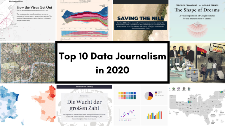
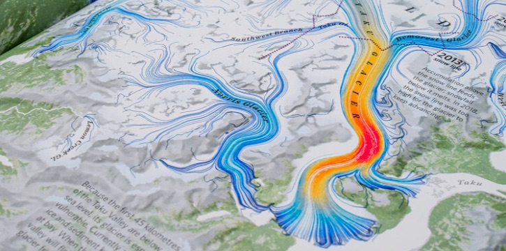
Accessibility Settings

color options

monochrome muted color dark

reading tools

isolation ruler

Tag

data visualization

215 posts
1854 Broad Street Cholera Outbreak Map

Data Journalism

Think You Know Your Data Visualization? Take GIJN’s Quiz to Find Out

From Wikileaks to the FinCEN files, huge stories have made use of data visualizations to engage their readers and simplify complicated topics. But while data journalism is a powerful tool for investigative journalists, the vast possibilities of this world are wasted if reporters cannot effectively communicate the data they have found to the reader. To test your knowledge, GIJN has created an annotated quiz so readers can assess their current knowledge and understand the mistakes we all make while creating data visualizations.

Data Journalism

Data Journalism Top 10: The Rise of Big Tech, India’s Bad Vaccine Data, Why Data Journalists Need Safeguards

Four of the world’s most influential technology companies are based on the US West Coast. Amazon, Apple, Facebook, and Google have had an enormous impact on our daily lives. But how did Big Tech get so big? Our NodeXL #ddj mapping from April 19 to April 25 found a piece by The Washington Post showing how the success of these behemoths has been fueled by hundreds of acquisitions of smaller companies over the past decade. In this edition, we also feature an investigation into faulty vaccine data publicized by the Indian government, a list of the world’s top 1,000 climate scientists by Reuters, and a look at Europe’s growing rail network.

Data Journalism

Data Journalism Top 10: Atlas of Emotions, Carbon Recyclers, Football Long Shots, COVID-19 Endgame, Mister Rogers’ Cardigans

To fight climate change, we need to protect sea life. Whales, plankton, and seagrasses have a key impact on the Earth’s carbon cycle. Our NodeXL #ddj mapping from to April 5 to April 11, which tracks the most popular data journalism stories on Twitter each week, found a piece by Reuters Graphics explaining how these species interact underwater as well as capture and transform carbon. In this edition, we also feature an atlas of emotions by Google Arts & Culture, a look at the COVID-19 endgame by the Financial Times, and some great board games to inspire data visualization enthusiasts.

Data Journalism

How the COVID-19 Pandemic Has Shaped Data Journalism

As COVID-19 cases surged throughout the past year, so did data visualizations. Data-minded scientists, journalists, health care providers, and philanthropists discussed how the pandemic and data journalism have shaped each other at a US symposium, and shared new visualization tools.

Data Journalism

Data Journalism Top 10: Mission to Mars, Myanmar’s Protesters, Sand Mining, Journalism in Russia

After going through “seven minutes of terror,” NASA’s Perseverance rover managed to successfully touch down on Mars last week. Our NodeXL #ddj mapping from February 15 to 21 found reporting by The Wall Street Journal and Al Jazeera, which offers more insight into the rover’s journey to the red planet. In this edition, we also feature a story about the boom in independent journalism in Russia, an analysis of the future of South Africa’s coal mining industry, and a critique of data visualization’s ability to fully convey the realities of large-scale tragedies.

Data Journalism

Data Journalism Top 10: Hawaii’s Disappearing Beaches, Stolen Paintings, Investigating Disappearances, Herd Immunity Calculator

Hawaii’s scenery can be breathtaking, with cliff-rimmed white-sand beaches and surf-worthy waves. But our NodeXL #ddj mapping (Dec. 28-Jan. 3) found ProPublica highlighting dramatic erosion of the island state’s beaches over the past century. Also in this edition, we feature an interactive graphic to calculate the time to achieve COVID-19 herd immunity based on the US vaccination rate, a global vaccine distribution tracker, Federica Fragapane’s visualization of stolen paintings, and a compilation of 2020’s best data visualization lists.

Data Journalism

Data Journalism Top 10 for 2020: COVID-19, Saving the Nile, Shape of Dreams, Visualizations for the Colorblind

For those unfamiliar with GIJN’s Top 10 Data Journalism roundup, each week we select the most popular data journalism items on Twitter. We do this by using NodeXL to map use of the terms #ddj and data journalism, and then add a bit of old-fashioned human curation to highlight the most compelling items. At the end of the year, we survey the entire period and pick the best from hundreds of tweets. This year — the year of the pandemic — in which the coronavirus dominated public conversation and news headlines, our mapping reflects that reality.

Data Journalism

Data Journalism Top 10: Scented Candles, COVID Risk Simulator, Trump’s Final Regs, Sigma Awards

Are scented candles a casualty of the coronavirus crisis? Our NodeXL #ddj mapping from November 23 to 29 found researcher Kate Petrova’s data analysis revealing that scented candles have suffered a blow in online reviews and a decrease in ratings, possibly linked to the coronavirus’ ability to affect people’s sense of smell. Elsewhere, Germany’s Zeit Online created a COVID-19 infection risk calculator, the COVID Tracking Project explained how holidays and weekends disrupt the recording and publishing of virus data, and Reuters analyzed the shortcomings of the coronavirus contact tracing system in England. Meanwhile, the Sigma Awards, which celebrate the world’s best data journalism, have opened for entries.

Data Journalism

Data Journalism Top 10: Simple Google Searches, COVID Contracts, Mining Indigenous Land, Nashville Hot Spots, Blackstone in Berlin

Have you ever noticed how your Google search results now appear with boxes of information extracted from the websites by the search engine? Our NodeXL #ddj mapping from November 9 to 15 found The Markup’s new “Simple Search” browser extension, which allows you to view the best results in the “traditional” Google search format. We also discovered a visualization of the connection between members of the ruling British Conservative Party and COVID-19 contracts, InfoAmazonia’s investigation into mining requests in protected Indigenous land in the Amazon, and German daily Der Tagesspiegel showing that the American private equity group Blackstone is a major private property owner in the German capital, Berlin.

Data Journalism

Data Journalism Top 10: Musical Taste by Politics, Podcasts, Polling Problems, COVID Tweet Analysis

The US presidential election dominated the Twitter chat waves last week. Our NodeXL #ddj mapping from November 2 to 8 found data journalists sharing live election results trackers by Bloomberg, The Washington Post, and The New York Times, while The Atlantic and Slate weighed in on the problems of polling. Elsewhere open source platform Mapbox is organizing an election mapping contest, and Lazer Lab created a dashboard to explore 29 million tweets related to COVID-19 shared by over half a million Americans.