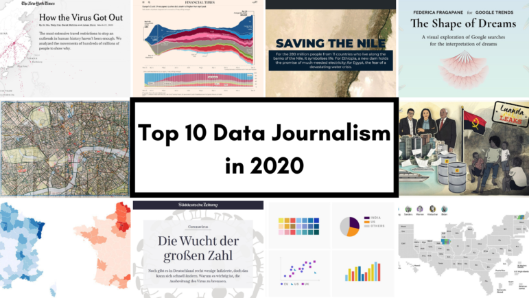
WEBINAR - Uncovering AI’s Human Cost: A Non-Technical Toolkit for Investigative Reporters
June 30, 2026 • 10:00
-
day
days
-
hour
hours
-
min
mins
-
sec
secs

Accessibility Settings

color options

monochrome muted color dark

reading tools

isolation ruler

Tag

data visualization

218 posts

Data Journalism

Data Journalism Top 10: Scented Candles, COVID Risk Simulator, Trump’s Final Regs, Sigma Awards

Are scented candles a casualty of the coronavirus crisis? Our NodeXL #ddj mapping from November 23 to 29 found researcher Kate Petrova’s data analysis revealing that scented candles have suffered a blow in online reviews and a decrease in ratings, possibly linked to the coronavirus’ ability to affect people’s sense of smell. Elsewhere, Germany’s Zeit Online created a COVID-19 infection risk calculator, the COVID Tracking Project explained how holidays and weekends disrupt the recording and publishing of virus data, and Reuters analyzed the shortcomings of the coronavirus contact tracing system in England. Meanwhile, the Sigma Awards, which celebrate the world’s best data journalism, have opened for entries.

Data Journalism

Data Journalism Top 10: Simple Google Searches, COVID Contracts, Mining Indigenous Land, Nashville Hot Spots, Blackstone in Berlin

Have you ever noticed how your Google search results now appear with boxes of information extracted from the websites by the search engine? Our NodeXL #ddj mapping from November 9 to 15 found The Markup’s new “Simple Search” browser extension, which allows you to view the best results in the “traditional” Google search format. We also discovered a visualization of the connection between members of the ruling British Conservative Party and COVID-19 contracts, InfoAmazonia’s investigation into mining requests in protected Indigenous land in the Amazon, and German daily Der Tagesspiegel showing that the American private equity group Blackstone is a major private property owner in the German capital, Berlin.

Data Journalism

Data Journalism Top 10: Musical Taste by Politics, Podcasts, Polling Problems, COVID Tweet Analysis

The US presidential election dominated the Twitter chat waves last week. Our NodeXL #ddj mapping from November 2 to 8 found data journalists sharing live election results trackers by Bloomberg, The Washington Post, and The New York Times, while The Atlantic and Slate weighed in on the problems of polling. Elsewhere open source platform Mapbox is organizing an election mapping contest, and Lazer Lab created a dashboard to explore 29 million tweets related to COVID-19 shared by over half a million Americans.

Data Journalism

Data Journalism Top 10: Black Voter Suppression, K-Pop, Data Privacy Rights, and Global Coronavirus Deaths

Personal data is big business, and not only for private firms. Our NodeXL #ddj mapping from September 21 to 27 finds a number of troubling investigations: Channel 4 News revealed that Donald Trump’s 2016 presidential campaign used personal data from Facebook and Cambridge Analytica to deter Black voters from casting their ballot; Consumer Reports found that companies were making it difficult for people to opt out of having their data sold despite a landmark California law that protects individual data rights; and Noteworthy and The Business Post highlighted a concerning lack of clear regulation surrounding access to, and use of, genetic and patient data by private firms.

Data Journalism

Data Journalism Top 10: Death and Wealth, Internet Privacy Tool, COVID Under Control, Dataviz Colors

“Death is the great equalizer,” or so the saying goes. But our NodeXL #ddj mapping from September 21 to 27 finds an investigation by The Boston Globe Spotlight team that proves otherwise: race and income influences how and when people die. In this Top 10 #ddj edition, we also found The Markup launching its new privacy tool, the Financial Times examining how Finland, and the cities of Madrid and New York City handled the pandemic, as well as a great guide by Datawrapper’s Lisa Charlotte Rost to choosing better colors for your charts.

Data Journalism

Data Journalism Top 10: Election Forecasts, The Sweatpants Era, Hong Kong Protests, DJ in Eastern Europe & Caucasus

One of the biggest issues that comes with visualizing election forecasts is how to incorporate uncertainty in a way that is understandable to readers. Our NodeXL #ddj mapping from August 10 to 16 finds FiveThirtyEight explaining their election forecast design process and considerations. Elsewhere, The New York Times Magazine has been digging into the collapse of the fashion industry, and the Hong Kong Free Press is teaming up with the Journalism and Media Studies Centre of The University of Hong Kong to expand its protest research archive.

New GIJN Online Series Starts September 2020

Since the start of the pandemic, GIJN has produced more than 40 free webinars in 7 languages designed for journalists covering the COVID-19 crisis. Come September, GIJN will expand its online offerings on a range of new topics, with continued coverage of the pandemic.

Data Journalism

Data Journalism Top 10: Measuring Mask Use, Parental Interruptions, Childbirth Woes, India’s Low Death Rate

How widespread is mask use in your country? Our NodeXL #ddj mapping from July 13 to 19 finds The New York Times mapping the odds of people encountering other mask wearers in the United States, two university professors quantifying the number of interruptions a parent suffers on average every hour while working from home, the Committee to Protect Journalists talking to data journalists about the struggles of reporting on COVID-19, and openDemocracy documenting cases of mistreatment of women in labor around the world since the pandemic started.

Data Journalism

Data Journalism Top 10: COVID-19 Racial Inequity, Cash for the Connected, Africa’s Silent Epidemic, Amazon Safety

The coronavirus pandemic has upended the lives of people around the world, but some communities are especially hard hit. Our NodeXL #ddj mapping from July 6 to 12 finds The New York Times analyzing data that reveals Black and Latino people have been disproportionately affected by COVID-19, The Washington Post highlighting that business relief funds for the pandemic have gone to the rich and well-connected, and Bloomberg looking at more than 120 US businesses that say the coronavirus helped force them into bankruptcy.

Data Journalism

10 Tips for Visualizing COVID-19 Data

In the latest webinar in the GIJN series on Investigating the Pandemic, an investigative reporter, a health data expert, and a world-renowned visualization professor shared insights on what newsrooms should consider when presenting COVID-19 information visually. An online audience of journalists from 46 countries heard that clear explanation and transparency were critical for all graphic formats.