Data Journalism
Data Journalism Top 10: Uber Files, A New Notre-Dame, Saudi Sportswashing, Boris Johnson’s Legacy
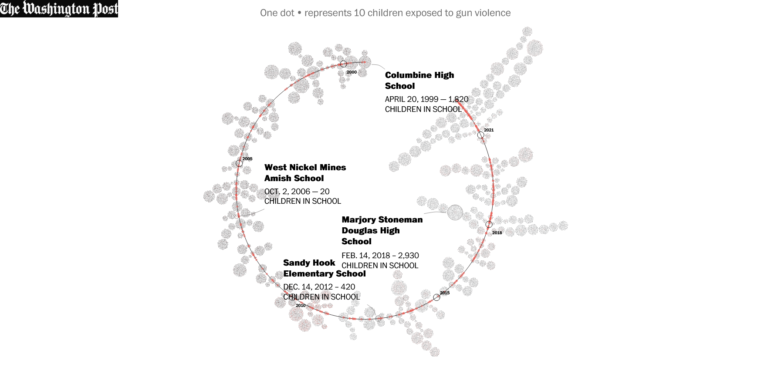
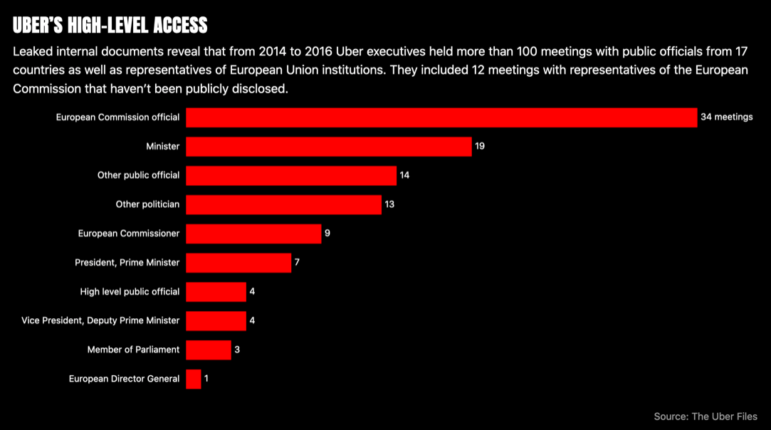
The Uber Files leak contains reams of data and documents that detail the inner workings of the ride-hailing company, and has led to a global investigation into the firm’s practices. Also in this week’s edition of the top 10 stories in data journalism, we look at the dubious legacy of the UK’s scandal-hit leader Boris Johnson, the reconstruction of Notre-Dame cathedral, and the widespread epidemic of US gun violence.