
Resource Tipsheet
Basic Data Journalism Tips for Editors
At the NICAR22 conference in Atlanta, Georgia, journalism trainer MaryJo Webster offered a series of basic tips for editors who have little to no data analysis skills.
At the NICAR22 conference in Atlanta, Georgia, journalism trainer MaryJo Webster offered a series of basic tips for editors who have little to no data analysis skills.
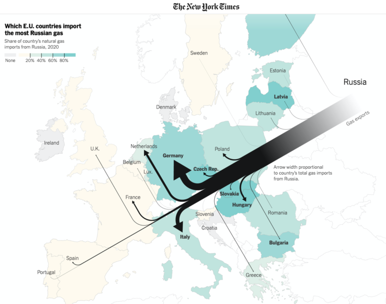
This week’s curation of the most popular data journalism stories on Twitter features a breakdown of Russia’s export ties to Europe, a global collaborative investigation led by Süddeutsche Zeitung and OCCRP into a Swiss bank leak, results from DataJournalism.com’s 2021 State of Data Journalism survey, and a New York Times report on the quadruple jump revolution in women’s figure skating.

Our weekly curation of the most popular data journalism stories on Twitter looks at the US transition from gas-powered to electric vehicles, the legacy of racially discriminatory housing practices, and an analysis of judging bias in Olympic ski jumping.
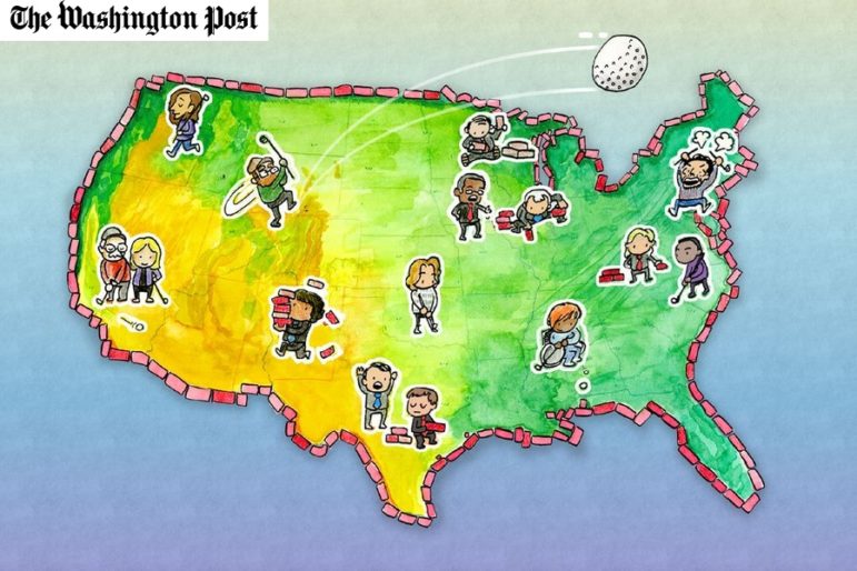
If you’re a word puzzle addict and active on Twitter, you’ll have come across the latest craze — Wordle. Al Jazeera Labs analyzed the puzzle’s word bank to give tips on how to tackle the game strategically. Our weekly NodeXL curation of the most popular data journalism stories on Twitter also features an analysis of shopping habits during the pandemic, an examination of vaccination rates among elite athletes, details on the scandal shaking UK politics, and an interactive mini-golf game illustrating how gerrymandering — the manipulation of electoral boundaries — plays out in various US states.
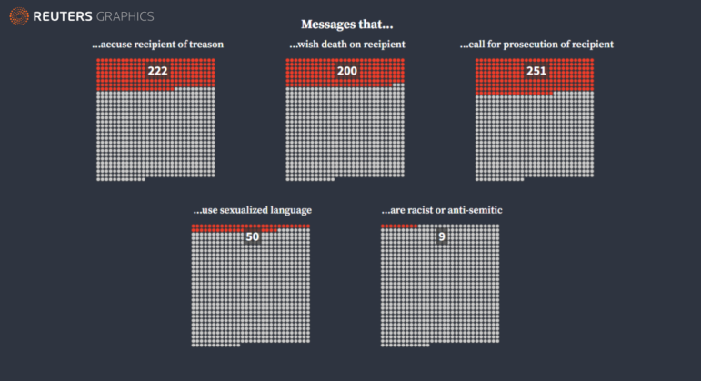
We have rolled into the third calendar year of the pandemic, but the debate about how journalists present data on the coronavirus continues to rage. Just six days into 2022, a spiral chart divided the data journalism community into two camps. Our weekly NodeXL analysis and curation of the most popular data journalism stories on Twitter also features an investigation into the prenatal testing industry, a visualization of death threats received by election staff, and an interactive map of Russian military bases near the Ukraine border.
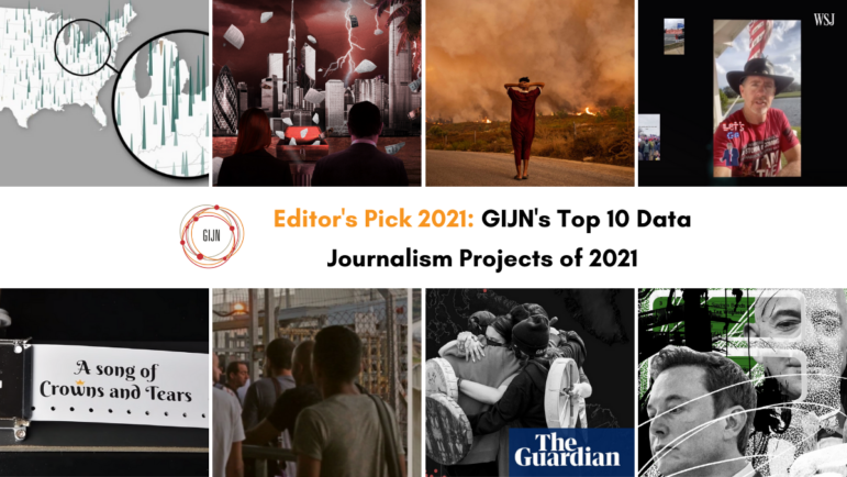
Throughout 2021, journalists have used data projects to interrogate the coronavirus pandemic, climate change, conflict, and tax evasion. Here we select our top 10 data journalism projects of the year, rounding up projects that gave a different perspective on global events and helped readers grasp complex matters through interactive storytelling.

Despite a backlash against the media in Latin America, investigative journalists have refused to stay silent. Here we highlight eight of the best investigative stories published in Spanish in the region this year, selecting those that prioritized collaboration, used innovative investigative methods and tools, and those that reached new audiences.

In a lightning round session at #GIJC21, a panel of leading reporters and editors needed just five minutes each to outline new tools and databases that any reporter can use to gather hard-to-find facts.

Since the start of the pandemic in early 2020, data-driven reporting on COVID-19 has gone through several phases, including infection trends and vaccination rates. Here, a leading Malaysia-based data journalism trainer shares five post-pandemic coverage areas where data reporting can be equally effective.

Since her arrival at Runrun.es, Lisseth Boon has conducted investigations on human rights violations, gold trafficking, illegal mining, and environmental crimes, many of them recognized with national and international awards. Her team has also worked with media platforms both inside and outside of Venezuela such as Consejo de Redacción and Connectas in Colombia, Convoca in Perú, and Mongabay. It has also participated in transnational collaborative projects such as the Panama Papers, Fincen Files, Swiss Connection, Lava Jato (Operation Car Wash), Vigila La Pandemia, and Tierra de Resistencia.