Data Journalism
GIJN’s Data Journalism Top 10: Mapping Wildfires, Insuring Climate Risk, Data Viz for Kids
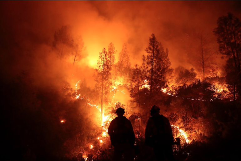
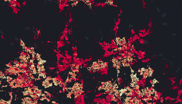
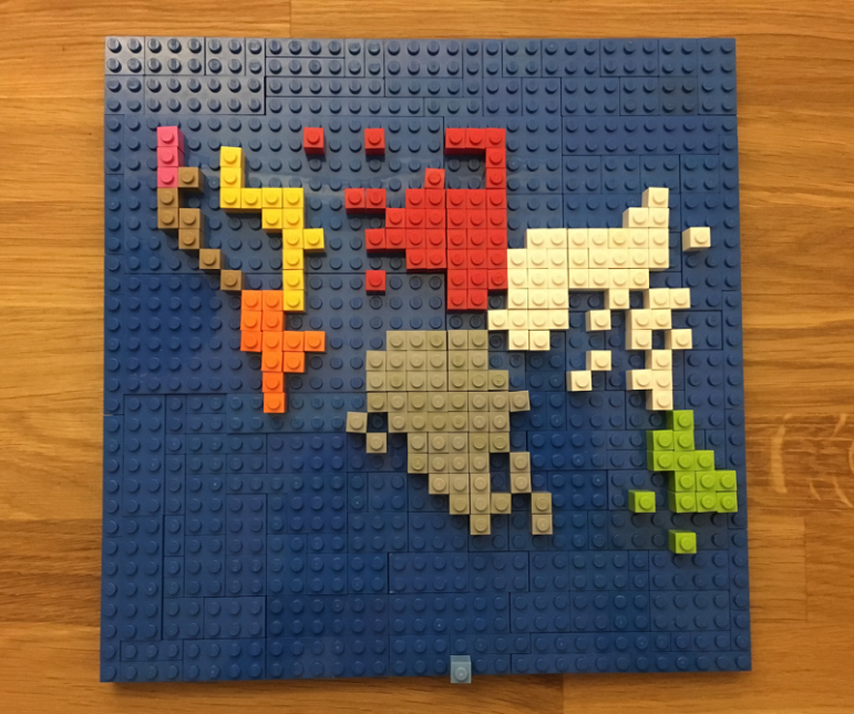
What’s the global data journalism community tweeting about this week? Our NodeXL #ddj mapping from December 3 to 9 finds @BuzzFeedNews mapping wildfire prone areas across America, @dwnews dissecting the value of insurance against climate change, the release of @infobeautyaward winners, and @jschwabish teaching fourth grade kids the wonders of data visualization in fun and inventive ways.