4 Common Angles Data Journalists Use to Tell Stories
Read this article in
This post was originally published by Paul Bradshaw in the Online Journalism Blog and is reprinted here with permission. Bradshaw leads the MA in Data Journalism at Birmingham City University.
In my data journalism teaching and training I often talk about common types of stories that can be found in datasets — so I thought I would take 100 pieces of data journalism and analyze them to see if it was possible to identify how often each of those story angles is used.
I found that there are actually broadly seven core data story angles. Many incorporate other angles as secondary dimensions in the storytelling (a change story might go on to talk about the scale of something, for example), but all the data journalism stories I looked at took one of these as its lead.
In the first of a two-part series I walk through how the four most common angles can help you identify story ideas, the variety of their execution, and the considerations to bear in mind.
Data Angle 1: Scale — ‘This Is How Big a Problem Is’
Perhaps the most common type of story found in data is the scale story: these are stories that identify a big problem, or the size of an issue which has become topical.
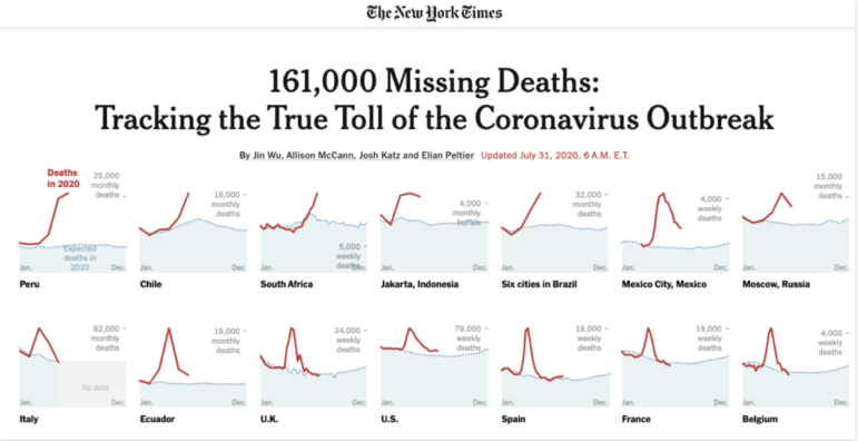
Image: Screenshot, The New York Times
At their most simple scale stories provide an update on new numbers being released: it could be the latest unemployment figures, the amount of crime, air pollution, money spent on some area, births, deaths, or marriages.
During the first months of the pandemic, for example, we had daily scale stories on the numbers of cases, deaths, and tests, among other things.
Examples of scale stories include Death Toll in UK Care Homes from Coronavirus May Be 6,000, Study Estimates, but also stories like Unduly Lenient Sentences Review Scheme ‘Inadequate,’ where the lead is based on reaction to the scale of an issue you have identified.
Sometimes scale is provided as background to a single-event story, as in Drone Causes Gatwick Airport Disruption (how many near misses are there?) or to a policy proposal, such as in New Drivers Could Be Banned from Driving at Night, Ministers Say (how many new drivers are under 19?).
Scale stories are one of the easier genres to write: in many cases no calculation is needed.
Indeed, the main work involved is likely to be in setting context to that scale — at its worst a scale story simply becomes a “big number” story (“A lot of money was spent on stuff” or “Something happens to a lot of people”), and the reader is left unclear whether this is actually newsworthy or just normal.
For that reason it’s important to put scale into context by using percentages or proportions (e.g. “one in five”) or comparisons and analogies (“The money spent on the scheme is the equivalent of the wages of 500 teachers”).
You might also bring in change and/or variation as a secondary angle: establishing historical context to the scale you’ve just outlined, or how that scale varies.
In the New York Times piece above, for example, the “true toll” (scale) of the coronavirus outbreak is immediately contextualized by charts which show how that has changed since the start of the year, in different parts of the country.
Data Angle 2: Change and Stasis — Things Are Going Up, Things Are Going Down, Things Aren’t Happening
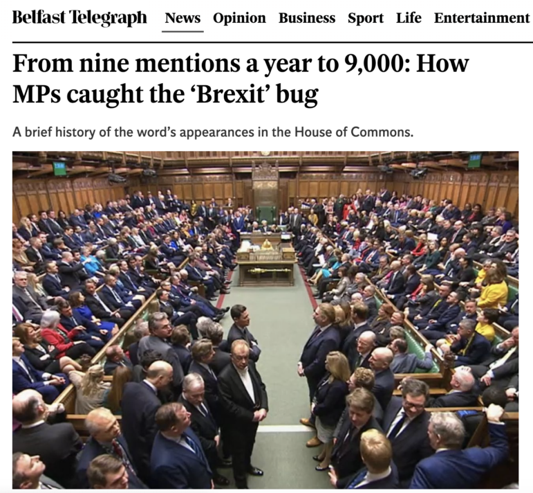
Image: Screenshot, Belfast Telegraph
Change stories are almost as common as scale stories — and probably more straightforward to pitch.
After all, change is inherently newsworthy and gives you the verb (“rises,” “plummets,” “[goes] up”) that you need in a headline.
Once you’ve identified some sort of change in your data it’s likely you will need further reporting to answer the “why?” question. Why are those numbers going up or down?
You might also add a secondary angle to your story which explores variation in that trend – the areas where those numbers have gone up, or dropped, the most and least.
This can help you direct your reporting on “Why?” because chances are that the areas affected most will be those most aware of the issue, and able to comment on it.
When reporting on change it’s important to be aware of two considerations: seasonality and margins of error.
Seasonality is the role that (typically predictable and normal, and therefore non-newsworthy) seasonal factors can play in numbers, such as the end of a financial year or school term, the release of new cars or simply changing temperatures. Year-on-year comparisons (this August compared to last August, for example) or seasonal adjustment is often used to prevent this effect.
The margin of error, meanwhile, is the range within which the real numbers actually lie. Because many datasets are based on samples, which are then generalized to the rest of the population being looked at, a margin of error (or confidence intervals) is used to indicate how accurate that generalization actually is. If any change is within that margin of error then we can’t really report that anything has changed.
A variation of the change story is the lack of change angle. This story on company insolvencies, for example, looks for change where you would expect it, but identifies the absence of any increase in companies going bust during the pandemic and seeks expert comment for this counterintuitive finding.
Data Angle 3: Ranking and Outliers — Who’s Best and Who’s Worst? Who’s Unusual and Why?
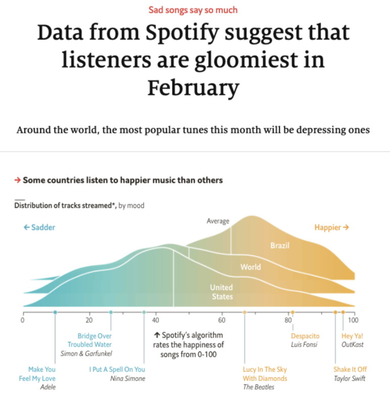
This article by The Economist is a “ranking” story because it identifies the “gloomiest” month. Image: Screenshot, The Economist
Ranking stories are all about who or what comes out worst or best in a dataset, or where a particular entity of interest (the local police force, schools or teams, or an industry if it’s the specialist press) sits in comparison to others.
Typical stories in this category might include “Local area one of worst areas for crime” or “Local schoolchildren get third-best results in the country.”
You might focus on the places “worst-hit,” as in The Parts of Birmingham in Top 10 UK Areas Worst-Hit by Universal Credit Advances, or you might look at where your sector compares to others, as in Construction Is Third-Most Dangerous UK Industry.
But ranking stories can also be about the best or worst times, places, or categories that a dataset “reveals.”
The Economist article above, for example, is about the top-ranked month for listening to gloomy songs. A Birmingham Live story, on the other hand, leads on The Most Common Crimes in Sandwell — And Where You’re Most Likely to Be a Victim.
The Economist, by the way, dedicated part of one data journalism newsletter to “How to compile an index:”
“How useful are such indices? Any ranking that isn’t built on objective criteria is open to criticism. Qualitative rankings are built on subjective measures. Perhaps ‘tolerable’ means almost the same to someone as ‘uncomfortable’ — whereas ‘intolerable’ might feel twice as bad as ‘undesirable?’ On ordinal scales the distance between these measures is subjective—and yet they have to be assigned a numerical score for the ranking to work.
“The Economist has been publishing its Big Mac index, a measure of currency valuations, since 1986. In 2011 we published the Shoe-Thrower’s index, which assessed the potential for unrest across the Arab world. And this year, we’ve created a global normalcy index, which is tracking countries’ recovery from COVID-19. An imperfect measure is better than having no means of comparison at all.”
Ranking stories need to be careful about context: an area may have the most crime, disease, or pollution simply because it also has the most people. Reporting dates can skew data, too: COVID case rates tended to peak on Tuesdays because the figures “include many deaths not reported over the weekend,” as FullFact pointed out.
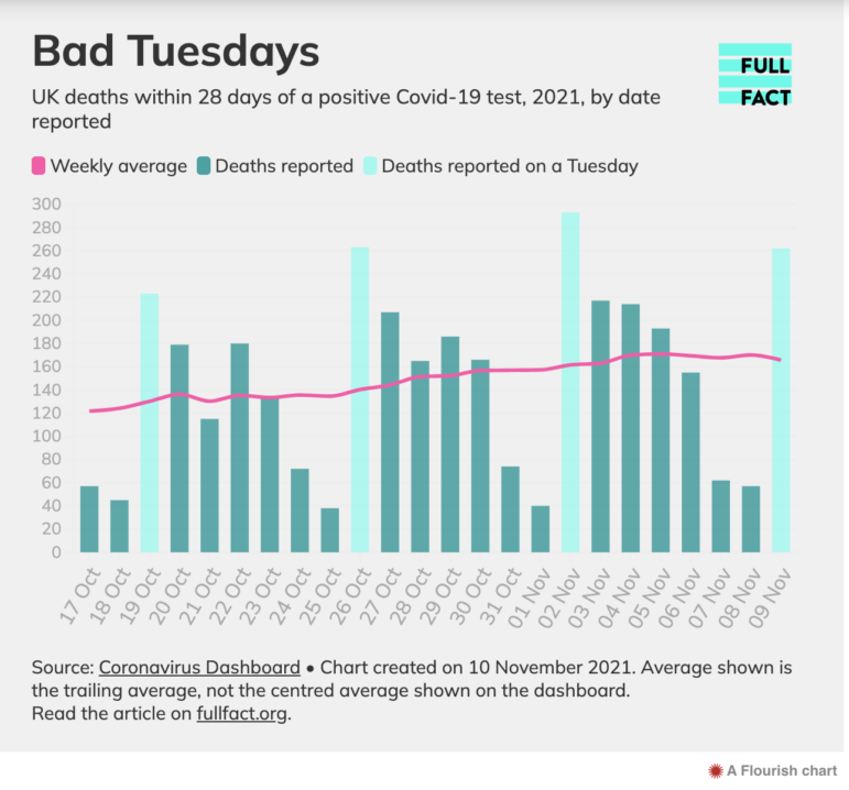
Image: Screenshot, FullFact.org
Data Angle 4: Variation — ‘Postcode Lotteries,’ Maps, and Distributions
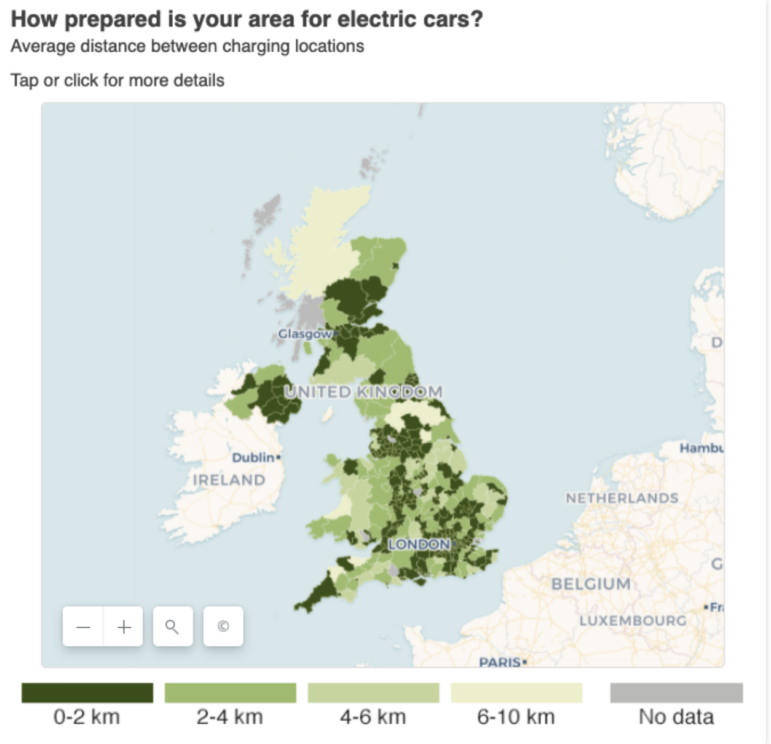
This BBC Shared Data Unit story by Aimee Stanton focused on the variation in access to electric car charging point. Image: Screenshot, BBC
Variation stories work best when we expect equal treatment, or when we seek to hold a mirror up to a part of life.
The classic example uses a choropleth map or heatmap to show how some parts of a country have less access to something, or more demand for something, than other parts.
The phrase “postcode lottery,” for example, reflects the sense that a person’s access to something that is supposed to be equally distributed is actually a game of chance.
The BBC data unit story IVF: NHS Couples ‘Face Social Rationing,’ for example, maps out how where you live in England can mean the difference between being able to access fertility treatment or not.
A variation story may be revealing that the unfairness exists — or, if people are aware of it, precisely how and where it plays out (particularly in their area).
Algorithmic accountability stories such as ProPublica’s Machine Bias series are often about variation and the unfairness that is revealed when an algorithm is unpicked: it may be people being sentenced differently, or given different insurance quotes, despite no meaningful difference between them on the dimensions that matter.
A variation story can equally be used to highlight areas of underserved demand, or lack of supply: one story that I worked on for the BBC Shared Data Unit about electric car charging points involved identifying how much infrastructure existed in the country, and where. The picture that the data painted provided a foundation for case studies and reaction.
In the second part of this series I look at the other three angles: exploratory stories; those that focus on data quality, existence, or absence; and angles about relationships. A version of the diagram is also available in Finnish.
Additional Resources
Data Journalism: The GIJN Collection
Honoring the Best in Data Journalism: Winners of the 2023 Sigma Awards
How Data Journalists Can Use Anonymization to Protect Privacy
 Paul Bradshaw leads both the MA in Data Journalism and the MA in Multiplatform and Mobile Journalism at Birmingham City University in the UK. He also works as a consultant data journalist in the BBC England data unit.

Investigating Latin America’s Global Reach Of Illicit Activities

Step-By-Step Guide for Journalists on the Basics of Google Sheets

Tipsheet for Using Ocean Data in Your Investigations

The Investigative Agenda for Climate Change Journalism

Turning the Threat to a Distant Glacier into a Local Story Through Data Visualization

One Name at a Time: How Die Zeit Built a Searchable Database of Nazi Party Members

Building a Multi-Agent AI System To Sift Through Thousands of Russian Social Media Posts
How The Washington Post Combined Data and Human Stories to Cover Hurricane Helene’s Aftermath

This work is licensed under a Creative Commons Attribution-NoDerivatives 4.0 International License
Republish our articles for free, online or in print, under a Creative Commons license.
Republish this article
This work is licensed under a Creative Commons Attribution-NoDerivatives 4.0 International License
Read Next
Climate Data Journalism
Turning the Threat to a Distant Glacier into a Local Story Through Data Visualization
New York Times climate and environmental graphics reporter Mira Rojanasakul discusses how her team visualized the sea level rise threat from the melting Thwaites Glacier in Antarctica.
Data Journalism
One Name at a Time: How Die Zeit Built a Searchable Database of Nazi Party Members
An online tool set up by the German newspaper Die Zeit, in cooperation with archives in Germany and in the United States, allows people to search several million Nazi Party membership cards.
How They Did It News & Analysis
Building a Multi-Agent AI System To Sift Through Thousands of Russian Social Media Posts
The system built by BBC Eye allowed a team of open source specialists and reporters to accelerate their investigation of Russian ultra nationalists and their political impact.
Data Journalism
How The Washington Post Combined Data and Human Stories to Cover Hurricane Helene’s Aftermath
From Storybench, Washington Post climate reporter Brady Dennis is interviewed about his immersive story on Hurricane Helene and the importance of combining data and human experience.