Data Journalism
Data Cleaning Tools and Techniques for Non-Coders
Understanding, organizing, and validating data directly affects the accuracy of stories. New tools make cleaning accessible to journalists without coding.
78 posts Search results for visualizing tools
Understanding, organizing, and validating data directly affects the accuracy of stories. New tools make cleaning accessible to journalists without coding.
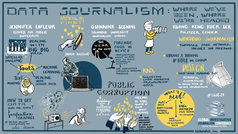
Data journalism has evolved from simple spreadsheet analysis of local government data to the spectacular tracking of the hidden wealth of oligarchs, autocrats, and corporate leaders from gigantic datasets. In a session at GIJC21, leading data journalists looked at this transition but also, at what is next.
This year, in our My Favorite Tools series, we asked 12 of the world’s top journalists what their go-to tools are. From VeraCrypt and OnionShare to Aleph and the Wayback Machine, here are GIJN’s favorites.
For our series on journalists’ favorite tools, we spoke with Sérgio Spagnuolo, founder and editor of the Brazilian data journalism agency Volt Data Lab. He has worked on disinformation and data verification before founding Volt, an independent journalism agency focused on investigating, analyzing, and visualizing data.
With fact checking organizations having already debunked thousands of falsehoods about COVID-19, investigative reporters are turning their focus to the people and the money behind deliberate disinformation surrounding the pandemic. In a series of interviews with GIJN, seven journalists shared the inside story on how they exposed the forces behind the lies, as well as key tips on the tools and techniques that aided their investigations.
In the latest webinar in the GIJN series on Investigating the Pandemic, an investigative reporter, a health data expert, and a world-renowned visualization professor shared insights on what newsrooms should consider when presenting COVID-19 information visually. An online audience of journalists from 46 countries heard that clear explanation and transparency were critical for all graphic formats.
The New York Times’ Privacy Project highlighted the alarmingly unregulated activity of location data companies collecting data from millions of smartphone users. As the coronavirus pandemic sheds further light on the uses and misuses of location tracking, here’s a deeper look at the project that visualized phones being tracked around the US, from the Pentagon and the White House to the streets of San Francisco.
For our series about journalists’ favorite tools, we spoke with Barbara Maseda, the founder and editor of Proyecto Inventario, an open data platform for journalists reporting on her native Cuba. She told GIJN about the investigative tools she uses to overcome the difficulties of data reporting in and about Cuba.
Once you’ve done your analysis, you may want to create graphs, charts, or maps to display your results. Here are some resources to help you display your data in visually appealing, reader-friendly formats. Flowing Data offers a plethora of tutorials that will help you visualize your data. You’ll learn how to make cartograms, upset plots, […]
What’s the global data journalism community tweeting about this week? Our NodeXL #ddj mapping from July 29 to August 4 finds a number of articles related to the climate crisis, including the BBC’s piece on tree planting and its interactive tool on temperatures across the world, as well as Alberto Cairo’s blog post on misleading charts created by climate deniers. We also found useful tips and tools: a data GIF maker by Google News Initiative, Datajournalism.com’s strategies for teaching data journalism, and Paul Bradshaw’s tutorial on how to extract numeric data from phrases.
What’s the global data journalism community tweeting about this week? Our NodeXL #ddj mapping from October 15 to 21 finds @Esri’s @AllenCarroll talking the power of maps in storytelling, @visualizingdata’s catalogue of charts and corresponding tools to help information designers, and @ericwilliamlin’s deep dive into the data of casting decisions in Shakespearean plays since the 1900s.
What’s the global data journalism community tweeting about this week? Our NodeXL #ddj mapping from May 28 to June 3 finds @washingtonpost’s alarming data on gun violence in American schools, @vlandham’s experiments with visualizing uncertainty and @GENinnovate with the latest data journalism trends displayed in the 2018 Data Journalism Awards entries.
At this year’s Highway Africa — the continent’s largest annual gathering of journalists — watchdog groups showcased a host of open data and accountability tools aimed squarely at Africa. Here are six of them, developed by Code4SA and presented by Wellington Radu of Media Monitoring Africa and Levi Kabwato of the Open Democracy Advice Centre.
The extractives sector (oil, gas, and mining) continues to be an important subject for journalists, particularly in developing countries. Revenues from oil, gas and mining contribute substantially to GDP and in many cases make up the bulk of government revenue. Indeed, among 29 nations that in 2011 were implementing the Extractive Industries Transparency Initiative (EITI), 10 reported extractives revenues totaling over one-quarter of their respective government budgets (six of which were actually over 50%).
Data storytelling newsrooms have found innovative approaches to navigate closed data regimes, political pressures, and resource gaps.
Our latest round-up of the best in data journalism also features stories on Xi Jinping’s military purge and climate change-fueled flooding in Pakistan.
Featuring books spanning four continents, these recommended reads provide a global perspective on data journalism.
We also highlight an analysis of whether flying has become less safe, an investigation into a Philippine reforestation program, and the numbers behind the Eurovision song contest.
GIJN, the new home of the Sigma Awards, is proud to announce the 2025 shortlist for the best data journalism projects and portfolios in the past year.
Data journalism in the Middle East has been driven by organizations that have produced collaborations and projects that combine innovative techniques with nuanced local knowledge.
In investigative journalism, connecting data points is often key to uncovering the truth. Aleph helps reporters search, organize, and analyze data, to better trace hidden connections.
At the 2024 Journalism Practitioners Forum conference (J-Forum) in Japan, watchdog reporters came together to discuss their successful stories and share skills.
Knowing where to look for data — and accessing it via scraping data from websites — can be a powerful force multiplier for investigative journalists.
Satellite images are powerful tools for discovery and analysis, plus provide vivid illustrations. Discover GIJN’s favorite resources.
In this week’s Top 10 in Data Journalism, GIJN looks into stories about Latin American deforestation, Twitter’s censorship compliance, and the toxic legacy of bankrupt coal mines in the US.
Бесплатные и условно бесплатные платформы и приложения, которые позволяют создавать простые и сложные дизайны на все случаи жизни, а также предоставляют коллекции стоковых изображений.
In Flourish’s recent webinar on effective elections and polling visualization, data journalist Mafe Callejón shared essential tips for building an interactive map from election results.