Image: Screenshot, Los Bosques Que Perdimos
Data Journalism Top 10: Latin America Deforestation, Twitter Censorship, and Bankrupt Coal Mines’ Toxic Legacy
Read this article in

Step-By-Step Guide for Journalists on the Basics of Google Sheets

Tipsheet for Using Ocean Data in Your Investigations

No Coding Required: A Step-by-Step Guide to Scraping Websites With Data Miner

GIJC23 – The Future of Data Journalism: New Analytical Tools, Data Visualization, and AI
Social media companies are no strangers to censorship requests from governments around the world. But the site Rest of World analyzed data that shows a steep increase in Twitter complying with such requests since Elon Musk purchased the company. This week, GIJN’s Data Journalism Top 10 also highlights stories on global warming shifting trees northward, 20 years of deforestation in Latin America and the Caribbean, the history of the papacy, and US coal mine companies allegedly using bankruptcy as a strategy to avoid paying for environmental damage.
Twitter Censorship Compliance
For tech-reporting nonprofit Rest of World, Russell Brandom analyzed Twitter’s self-reported data on government demands to remove content or produce private user data — and found that it’s complying with more government orders since Elon Musk’s takeover six months ago. Not only is Twitter now getting far more of these requests, it’s acquiescing to more of these censorship demands as well, fully complying with 808 out of 971 government requests — or 83% — since late October 2022. In the six months prior to Musk becoming CEO, however, Twitter had only fulfilled 280 out of 547 requests — or 51% — of government takedown and private info requests.
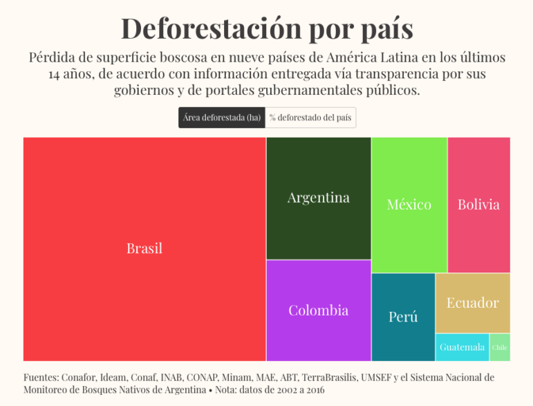
Latin America Deforestation
The Forests We Lost is an ambitious investigation of 20 years of deforestation in Latin America and the Caribbean, a collaboration by Mongabay LatAm, digital magazine Distintas Latitudes, and the LATAM Network of Young Journalists. The project’s goal is to centralize data on deforestation in the region and make it publicly accessible. The striking visual presentation combines text, standout infographics, audio, maps, and intricate botanical drawings. There is also a log that explains how they built the research.
Tree Species Migration
Global warming is shifting trees northward. For his Climate Lab column for The Washington Post, Harry Stevens took data from the US Forest Service on projected growing ranges under different warming scenarios for 900 species of trees — and created a tool that tells you where tree species are projected to move, how the trees growing in US cities could change, and which ones might disappear.
Charting Papal History
To mark Pope Francis’ recent visit to Hungary, the data team at Budapest-based investigative outlet Atlatszo created a visually engaging interactive package titled The Pope on the Road, bundling a trove of historic data on papal birthplaces, years served, and world travel. Pope John Paul II, for instance, visited 213 countries — and 85% of the 307 popes that have served were born in Italy. The project also features images created with AI tool Midjourney.
Bankrupt Mines’ Toxic Legacy
ProPublica and Mountain State Spotlight gathered a trove of state agency data on coal mines in Kentucky and West Virginia — including history, ownership, and environmental violations. The team found that “mines that have gone through multiple bankruptcies also tend to create more environmental damage.” Bankrupt mines leave behind damage and pollution, because in these cases cleaning it up has taken a back seat to paying off financial creditors. Read about the methodology here.
Discarded Recyclables
Every day, tons of food waste and food packaging are sent to the city dump in Bishkek, Kyrgyzstan. Peshcom, a community initiative focused on making cities more people-friendly, analyzed more than 6,400 products to find out which are packaged in the capital and which can be recycled. Among other discoveries, they found that most of the food packaging Bishkek residents send to the dump can be recycled instead.
Russian Military Digs In
Commercial satellite imagery has played a critical role in the war Russia is waging on Ukraine, from revealing Russia’s military buildup along Ukraine’s borders to the ongoing documentation of destruction caused by the conflict. Such data is also invaluable when it comes to tracking the movement of troops and military planning. Reuters journalists reviewed thousands of satellite images to draw a timeline and map the trenches that Russian troops have dug to fortify their positions in occupied territory.
Tracking Telegram Chatter
In October 2022, Ukrainian data site Texty published their investigation of 120 Russian Telegram channels posing as local news sources to prepare and justify the planned Russian occupation. Many of these channels are now defunct, but the notable exceptions — such as one serving Kharkiv that has 130,000 followers — and periodic attempts to revive and repurpose them with fake subscribers provide telling clues about Russia’s disinformation strategy.
Suspicious Nigerian Contracts
For Dataphyte, Olanrewaju Oyedeji used open source tools to investigate suspicious contracts and violations of procurement laws in Nigeria’s Ekiti state — which often exploited emergency guidelines during the COVID-19 epidemic. In Nigeria, businesses are registered with the Corporate Affairs Commission (CAC), but among other irregularities, Oyedeji found that many companies awarded lucrative contracts were not in the CAC registry, or were registered after the fact.
Visualizing Australia’s Proposed Tax Cuts
Australia’s government will lose an estimated AUD$243 billion (US$162 billion) in tax revenue in the decade after new, stage 3 income tax cuts kick in on July 1, 2024. ABC News Story Lab explains how the tax cuts ultimately benefit the rich instead of the poor and puts that staggering loss into perspective with a scrolling interactive.
GIJN’s Data Journalism Top 10 list is curated weekly. Send your suggestions to us.
 Alexa van Sickle is an associate editor at GIJN. She was previously a senior editor for the foreign correspondence magazine Roads and Kingdoms. She has also been an editor at the International Institute for Strategic Studies and a publisher at an international law non-profit in London. She lives in Vienna, Austria.
 Eunice Au is GIJN’s global team manager based in Budapest, Hungary. Previously, she was a Malaysia correspondent for Singapore’s The Straits Times, and a journalist at Malaysia’s New Straits Times. She has also written for The Sun, Malaysian Today, and Madam Chair.
Step-By-Step Guide for Journalists on the Basics of Google Sheets
Tipsheet for Using Ocean Data in Your Investigations
No Coding Required: A Step-by-Step Guide to Scraping Websites With Data Miner
GIJC23 – The Future of Data Journalism: New Analytical Tools, Data Visualization, and AI

Turning the Threat to a Distant Glacier into a Local Story Through Data Visualization

One Name at a Time: How Die Zeit Built a Searchable Database of Nazi Party Members

Visualizing a Trillion Dollars, India’s Warming Cities, Russian Mercenaries at Sea, and World Cup Player Physiques
‘Super’ El Niño Threat, Myanmar Villages Razed, California’s Billionaire Tax Bill, and South Africa’s Murder Rate

This work is licensed under a Creative Commons Attribution-NoDerivatives 4.0 International License
Republish our articles for free, online or in print, under a Creative Commons license.
Republish this article
This work is licensed under a Creative Commons Attribution-NoDerivatives 4.0 International License
Read Next
Climate Data Journalism
Turning the Threat to a Distant Glacier into a Local Story Through Data Visualization
New York Times climate and environmental graphics reporter Mira Rojanasakul discusses how her team visualized the sea level rise threat from the melting Thwaites Glacier in Antarctica.
Data Journalism
One Name at a Time: How Die Zeit Built a Searchable Database of Nazi Party Members
An online tool set up by the German newspaper Die Zeit, in cooperation with archives in Germany and in the United States, allows people to search several million Nazi Party membership cards.
Data Journalism Top 10
Visualizing a Trillion Dollars, India’s Warming Cities, Russian Mercenaries at Sea, and World Cup Player Physiques
Also highlighting how films portray Ukrainians, increasing tree cover in Spain, and how couples meet.
Data Journalism Top 10
‘Super’ El Niño Threat, Myanmar Villages Razed, California’s Billionaire Tax Bill, and South Africa’s Murder Rate
Also highlighting exploitation of journalists in Egypt, Argentina’s returning World Cup squad, and the strain on Singapore’s aging caregivers.