Data Journalism Top 10: Protesting the War, Russian Sanctions, Mapping Refugees, and NICAR Tips
Read this article in


Data teams across the globe are still focused on Russia’s invasion of Ukraine, with The Economist examining the anti-war protests that have brought Russian citizens into the streets. Others have looked at the impact of flight and airspace bans, or produced trackers to monitor and assess the sanctions imposed as a result of Russian President Vladimir Putin’s order to go to war. Our weekly NodeXL curation of the most popular data journalism stories on Twitter also finds critiques of maps depicting the flows of refugees, plus items on COVID-19 deaths in Spain, forest reserves in Malaysia, and resources from the 2022 NICAR conference.
#NoWar Protests in Russia
As the attacks on Ukraine intensify, back in Russia, citizens are protesting in the streets against the war. The Economist analyzed and geolocated Twitter and Instagram posts with the hashtag #нетвойнеI (Russian for “no war”) from February 24 to 27. It found anti-war tweets being shared by people across the country, in Russia’s 50 largest cities, and across 11 time zones. Data journalist Sondre Ulvund Solstad explains the piece in this thread.
Sanctions Tracker
Countries worldwide are imposing sanctions on Russian trade, financial sectors, and oligarchs, to protest Moscow’s attack on Ukraine. German nonprofit newsroom CORRECTIV, a GIJN member organization, published a live sanctions tracker, in English and in German, to monitor the mounting economic penalties. According to the tool, there roughly 1,300 sanctions were placed on Russia in the past two weeks. Reuters is also tracking sanctions against Russia on this page.
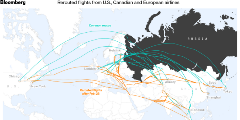
Closing the Skies
Russia is becoming a pariah in the skies, too, with a number of countries closing their airspace to Russian aircraft. Commercial airlines have also rerouted flight paths to avoid the dangerous airspace of Ukraine, often adding hours to flight times. Bloomberg mapped the countries imposing flight bans on Russia and used an animated image to show how commercial carriers have abandoned the skies over Ukraine. Also worth a look: Reuters and the Financial Times both illustrated examples of drastic flight route changes, and The Economist explained how they mapped the starkly empty commercial airspace above Ukraine.
Mapping Wars and Refugees
With data teams across the globe producing maps about Russia’s war on Ukraine, critiques have surfaced about how best to portray what’s happening on the ground. Historian Mateusz Fafinski wrote that coloring in parts of Ukraine with solid colors to illustrate Russian military advances gives the misleading impression that those regions are under Russia’s control. He proposed the use of lines and arrows instead to distinguish military movements from territorial control. Also interesting, cartographer Jules Grandin tweeted (in French) a series of historic maps and propaganda material, including one that depicted Russia as an octopus launching its tentacles to attack Europe.
Elsewhere, James Cheshire, a professor of geographic information and cartography, urged data teams to innovate when illustrating the numbers of refugees fleeing Ukraine. He critiqued the use of arrows which can be associated with military invasions, and shared some examples of different, less menacing, ways of visualizing the humanitarian crisis. One example is from The Economist, using small figure icons to show the flow of refugees and different-sized circles that correspond to the numbers of people involved. This critique by Cheshire isn’t new, The Correspondent published a piece in 2020 about how news maps “make us more negative about migrants.”
NICAR Resources
Missed out on the Investigative Reporters and Editors’ annual data journalism conference? Not to worry… Data analyst Sharon Machlis compiled resources from NICAR 2020, 2021, and 2022 in a searchable database. Also worth noting: Investigative reporter Tyler Dukes shared a collection of cheat sheets for remembering common commands and tips for data journalism work. And here’s a tweet by Matthew Ericson comparing NICAR then (2004) and now that’s making the rounds on Twitter.
Breaking the Axis
No fancy data journalism here, but The New York Times experimented with inverting the y-axis of a currency chart in order to show the decline in the Russian ruble’s value against the US dollar in the wake of Western sanctions. Useful reading: The Economist’s visual data journalist Sarah Leo explains when and how to break an axis — the practice of starting a numerical chart scale at a number other than zero.
COVID Victims as Silhouettes
Spain has seen 100,000 official coronavirus-related deaths. To help readers make sense of the deadly cost of the virus over the last two years, online news site elDiario.es visualized the deaths using silhouettes. If all those deaths had occurred in one city, the site showed how the pandemic would have wiped out the entire population in Roquetas de Mar or Santiago de Compostela.
Forest Reserves
In Malaysia, logging in forest reserves is allowed and approved by state governments for forest plantation projects, creating a type of managed forest in which trees are planted to maximize the production of timber. But according to a report by Macaranga, a journalism portal covering the environment and sustainability, natural forests are being cleared much faster than they can be regrown. Its charts show the increasing rate of logging in comparison to the declining rate of replanting, as well as which states are falling behind. The site also has a tool to visualize the 256,769 hectares of land cleared from Malaysia’s forest reserves since 2007 in relation to a reader’s neighborhood. This project is part of Pulitzer Center’s Rainforest Investigations Network initiative.
Declining Purchasing Power
Buying a car in the United States is more expensive than ever, and consumers are also suffering at the pumps with fuel prices nearly twice what they were early in the COVID-19 pandemic. To illustrate how costs have increased, The Wall Street Journal created an interactive tool to show readers how much more a car, a tank of gas, and tires, cost now compared to previous years.
Who Works the Most in Europe?
In the last two decades, countries in the European Union have tried to reduce the average number of hours worked in a week. Spanish digital paper El Confidencial charted the reductions in working hours in 30 countries over 20 years. It found that countries with more advanced economies work fewer hours and are better paid. Iceland, a non-EU country, has cut back the most: from an average of almost 45 hours work a week to 38.6. The piece is translated into English here.
Thanks again to Marc Smith and Harald Meier of Connected Action for gathering the links and graphing them. The Top Ten #ddj list is curated weekly.
 Eunice Au is GIJN’s program manager. Previously, she was a Malaysia correspondent for Singapore’s The Straits Times, and a journalist at the New Straits Times. She has also written for The Sun, Malaysian Today, and Madam Chair.
For a look at NodeXL’s mapping on #ddj and data journalism on Twitter, check out this map.

This work is licensed under a Creative Commons Attribution-NoDerivatives 4.0 International License
Republish our articles for free, online or in print, under a Creative Commons license.
Republish this article
This work is licensed under a Creative Commons Attribution-NoDerivatives 4.0 International License
Read Next

Data Journalism
One Name at a Time: How Die Zeit Built a Searchable Database of Nazi Party Members
An online tool set up by the German newspaper Die Zeit, in cooperation with archives in Germany and in the United States, allows people to search several million Nazi Party membership cards.

Data Journalism
How the Hindu Is Embedding AI Into Its Data Journalism
LLMs are quietly reshaping data journalism workflows at The Hindu, helping reporters process vast document sets, write scripts and build interactive tools.

Data Journalism
Developing a Data State Of Mind: Key Tips for Editors
Data is woven into how journalists cover everything from local government spending to global climate change patterns, but for editors without a specialist background, it can be daunting.

Data Journalism
2026 Sigma Awards for Data Journalism Open for Entries – Deadline Extended
The Sigma Awards celebrate the best data journalism from around the world. Submissions are now open for data projects published in 2025.