Data Journalism Top 10: Tonga’s Volcano, US Congress & Slavery, Mapping Ukraine, British Teeth
Read this article in


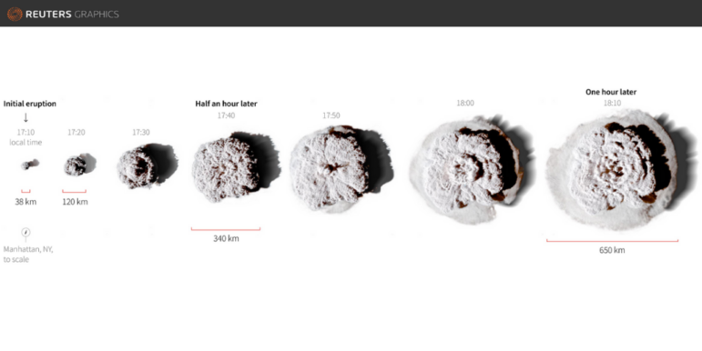
Illustrating the size of the ash cloud formed by the Hunga Tonga-Hunga Ha’apai volcano. Graphic by Reuters. Image: Screenshot
Many lawmakers who made up the historical ranks of the US Congress had a personal relationship with slavery, with more than 1,700 being slaveowners, according to an analysis by The Washington Post. The paper parsed census data and other historical records to compile the research into a searchable database. Our weekly NodeXL curation of the most popular data journalism stories on Twitter also features a visualization of the size of the Tonga volcanic eruption, an analysis of how Twitter is being used ahead of a high-stakes election in the Philippines, and a critique of maps used to illustrate the Russia-Ukraine border amid fears of a military incursion.
Congressional Slaveholders Database
More than 1,700 members of the United States Congress in the 18th, 19th, and 20th centuries had enslaved other human beings at some point. The Washington Post compiled an impressive and searchable database of these slaveholding leaders by combing through censuses and other historical documents, such as wills, journals, and plantation records. Find the data here. The project is a work in progress and readers are invited to contribute relevant evidence.
How Big Was the Tonga Eruption?
An underwater volcano off Tonga, a Polynesian country of more than 170 islands, erupted on January 15. Reuters superimposed the expanding cloud of volcanic ash recorded by space satellites onto well-known landmasses to illustrate just how massive the blast from the Hunga Tonga-Hunga Ha’apai volcano was. One hour after the explosion, the cloud measured 650 kilometers (400 miles) in diameter, wide enough to cover most of Spain. The team also looked at satellite images of the volcano before and after the eruption, as well as its impact on other coasts.
How Facebook Tracks You
Facebook offers an invisible tracking tool called a pixel that websites can embed to enable tracking. When you visit a website with the pixel installed, it can then send details of your interactions on the site to Facebook. That allows Facebook, in turn, to fine-tune its advertisement targeting. Data-driven investigative tech site The Markup launched a study — the “Facebook Pixel Hunt” — to uncover the scope of the pixel’s tracking, and is inviting readers to participate by installing a browser add-on.
Global Electricity Consumption
Do you know how much of your country’s electricity comes from renewable sources? Take a guess using the interactive slider created by Al Jazeera (at the story bottom). Journalists examined the production and consumption of electricity around the world and visualized the data in four graphs, including a global breakdown of current electricity sources, and a map of countries that consume the most electricity per capita.
Twitter Noise and Philippines Election
Political conversation on Twitter is heating up in the Philippines ahead of May’s election. While the electoral commission considered a petition to bar the presidential bid of Ferdinand Marcos Jr., the son of late dictator Ferdinand Marcos, a hashtag created by his supporters was trending. (The court went on to dismiss the petition.) Rappler, a digital media outlet known for its watchdog journalism, analyzed Twitter accounts using the hashtag #LabanMarcos and found that many of them were created in the last quarter of 2021. The majority, in fact, first appeared in October 2021 — the same month Marcos Jr. announced his intention to run for president. Rappler’s reporters accused those behind the accounts of “tweeting to make noise and drown out dissent.”
Climate Change: Cause and Effect
Der Tagesspiegel, a German daily, looked at which countries are causing the most damage to the environment, and the nations suffering the most from the consequences of climate change. It reports that wealthy nations, in particular, contribute a larger share of carbon dioxide emissions worldwide, while Africa, home to 14% of the world’s population, only produces about 3%. Meanwhile, 10 of the countries most affected by drought, which is exacerbated by climate change, are in Africa.
Pandemic Shopping
How did the shops on shopping streets across the UK fare during the coronavirus pandemic? Using a dataset with granular detail on British spending patterns, the Financial Times created an interactive map complete with localized charts that lets readers see how retail outlets in their local area did in the midst of lockdowns, decreased footfall, and a surge in online shopping. Reporter Chris Cook summarizes the piece in this tweet thread.
Spain’s Urban Environment
Online newspaper ElDiario looked at the evolution of towns and cities across Spain and mapped the construction age of more than 12 million buildings. The outlet published an interactive map in which readers can select their year of birth and find out how many flats, houses, and apartments were built before and after they were born. The information is presented with color-coded buildings and in 3-D. The headline figure from the data: 8.4 million properties have been built since 1992.
Mapping Contentious Borders
Trying to map politically sensitive areas can be tricky, and become a lightning rod for criticism. The Washington Post attempted to visualize and explain the longstanding conflict between Russia and Ukraine in four maps. The article — and two maps in particular — drew the ire of Ukrainians, cartographers, and rights activists. One map depicted the percentage of the population in Ukraine that identified Russian as their native language in a 2001 census. Readers questioned the map’s use of obsolete data, the misleading color scheme (which critics said gave the impression that everything on the blue side of the color scale was majority Russian,) and even the decision to map native Russian speakers in the region in the first place. Readers were unhappy that in another map the color used for Crimea was the same as Russia, which seemingly gives legitimacy to Russia’s annexation of Crimea in 2014. The Post has since revised one of the maps.
A Dental Crisis?
The BBC’s Shared Data Unit gave its data and research on the UK dental industry to publishers across the country, resulting in a spate of stories highlighting the country’s dental crisis. The data showed that almost 1,000 dentists had left the National Health Service last year, prompting the British Dental Association to warn that patients may have to wait up to two years for check-ups, and more than a year for root canal surgery. (Ouch!) Find the data and background research here.
https://twitter.com/petesherlock79/status/1485224161882562563
Thanks again to Marc Smith and Harald Meier of Connected Action for gathering the links and graphing them. The Top Ten #ddj list is curated weekly.
 Eunice Au is GIJN’s program manager. Previously, she was a Malaysia correspondent for Singapore’s The Straits Times, and a journalist at the New Straits Times. She has also written for The Sun, Malaysian Today, and Madam Chair.
For a look at NodeXL’s mapping on #ddj and data journalism on Twitter, check out this map.


This work is licensed under a Creative Commons Attribution-NoDerivatives 4.0 International License
Republish our articles for free, online or in print, under a Creative Commons license.
Republish this article
This work is licensed under a Creative Commons Attribution-NoDerivatives 4.0 International License
Read Next

Data Journalism News & Analysis
Lessons Learned: 10 Common Mistakes in Data Journalism
GIJN asked speakers and attendees in the NICAR conference hallways for the data journalism gaps they see, and for under-covered topic areas and under-used skills that newsrooms can address.

Data Journalism
10 Outstanding Data Projects Win the 2024 Sigma Awards
There were 52 data journalism entries from 22 countries in shortlist for the 2024 Sigma Awards. Here are the top 10 winning projects.

Tipsheet Data Journalism Reporting Tools & Tips
Tipsheet for Using Ocean Data in Your Investigations
Investigations into what happens on, under, and around the ocean can often be answered thanks to the vast amount of data available online.

Data Journalism Reporting Tools & Tips
Best Practices for Working With Mass Shootings Data
There can be confusion among journalists about “mass shootings” data, which leads to wildly different numbers and deeper confusion among audiences.