Data Journalism Top 10: Pace of Global COVID-19 Deaths, Who Can Work from Home, Visualizations for the Colorblind, Skin Tone and Sports
It is hard to comprehend the true impact of COVID-19 around the world. Our NodeXL #ddj mapping from June 29 to July 5 finds Reuters trying to visualize the alarming rate of deaths related to the pandemic, Datawrapper examining which employees can actually afford to work from home, and data journalist Carmen Aguilar García writing about using R programming language and automating repetitive data processes to keep up with the demand for pandemic news.
Pace of COVID-19 Deaths
According to a Reuters analysis of data from June 1 to 27, more than 4,700 people are dying around the world from COVID-19 or its linked illnesses every 24 hours on average. That equates to one death every 18 seconds. The team visualized that in the time it takes to read a story on their site, and as a clock ticks towards the 24-hour mark.
Who Can Work from Home?
David Wendler, a user interface designer from Berlin, dug into data on the employment situation in Germany. He found that employees in the information and communication, energy supply, or education sectors were able to work from home far more than employees in accommodation and food services, water supply and waste management, or human health and social work.
R and Automation for Pandemic Projects
Carmen Aguilar García writes about her experience working on coronavirus visualizations as a solo data journalist. She talks about the benefits and pitfalls of using R programming language and automating repetitive processes to create COVID-19 charts. She also peppered her article with several funny xkcd comics that data journalists are sure to commiserate with.
Visualizations for Colorblind Readers
How can you make sure colorblind readers understand your visualizations? Lisa Charlotte Rost, from Datawrapper, writes a three-part series on helping readers tell different colored elements apart. This includes using labels, interactivity, symbols, and colorblind-safe color palettes. Here are parts one, two, and three.
Visualizing Population Density
Using data from the World Bank, designer Federica Fragapane visualized the population density for 40 countries with a population of more than 10 million.
Skin Tone and Sports Commentary Bias
A study conducted by Danish research company RunRepeat, in association with the Professional Footballers’ Association for England and Wales, revealed significant bias in football commentary. It discovered that football commentators are six times more likely to be describing a player of darker skin tone when talking about power, while lighter skin tone players are regularly praised for their intelligence and work ethic.
From Data Journalism to AI
José Miguel Túñez-López, Carlos Toural-Bran, and Ana Gabriela Frazão-Nogueira explore how artificial intelligence is beginning to occupy the journalism field, with data mining making it possible to generate algorithms that automate the once-human field of information management.
https://twitter.com/IntlMediaCenter/status/1218865437477240832
Global API Directory
APIs (Application Programming Interface) can be a useful data source for data journalists. And today, the APIs of many social network platforms or technology giants can be found publicly. Data Journalism Turkey recommends this API directory, which lists APIs for YouTube, Flickr, Foursquare, and more.
How Kyrgyzstan Copies Russian Laws
In Kyrgyzstan it is rumored that the parliament and government copy and paste Russian laws. Kyrgyz news organization Azattyk Media, a regional newsroom of Radio Free Europe, analyzed 1,277 bills and found that 40% have similarities with Russian bills. A total of 17 bills were almost complete copies and in one, 92% of the words were copied from a Russian law.
Bolsonaro’s Staff Turnover and Salary Increases
Brazilian daily Folha De S.Paulo analyzed documents relating to the 28 years that the country’s current president — Jair Bolsonaro — spent as a federal deputy. The documents reveal an intense and unusual turnover of his advisers and a strange doubling, tripling, and even quadrupling of their salaries.
Thanks again to Marc Smith of Connected Action for gathering the links and graphing them. The Top Ten #ddj list is curated weekly.
 Eunice Au is GIJN’s program coordinator. Previously, she was a Malaysia correspondent for Singapore’s The Straits Times, and a journalist at the New Straits Times. She has also written for The Sun, Malaysian Today, and Madam Chair.
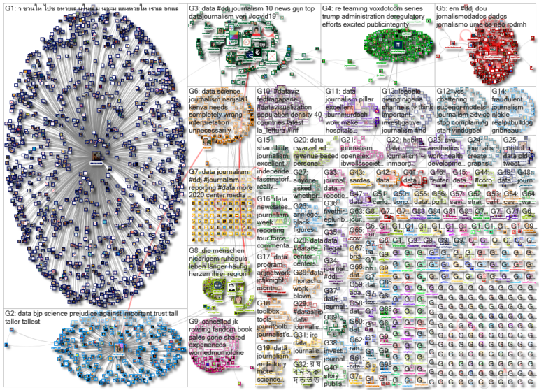
For a look at NodeXL’s mapping on #ddj and data journalism on Twitter, check out this map.

Tipsheet on Partnering with Civil Society Organizations and Non-Governmental Organizations

AI Accountability Reporting Guide

Guide to Mapping Analysis Using QGIS

Open Source Databases by Country

How Data Journalism Is Changing the Face of Africa

Data-Driven Journalism: Roundup of Recent Standout Stories

Data Journalism Top 10: A Scorched Earth, Hot French Baby Names, and Women’s World Cup Stars to Watch
Data Journalism Top 10: Everest’s Deadly Legacy, Paris Metro Pollution, Migrant Worker Struggles in Singapore

This work is licensed under a Creative Commons Attribution-NoDerivatives 4.0 International License
Republish our articles for free, online or in print, under a Creative Commons license.
Republish this article
This work is licensed under a Creative Commons Attribution-NoDerivatives 4.0 International License
Read Next
Africa Focus Data Journalism
How Data Journalism Is Changing the Face of Africa
Data journalism in Africa has made a powerful impact, from holding leaders accountable to refuting myths around domestic violence. But the field faces formidable challenges.
Case Studies Data Journalism GIJC23
Data-Driven Journalism: Roundup of Recent Standout Stories
The best of modern data journalism tells powerful stories that test assumptions. At GIJC23, two experts discussed strong recent investigations and what makes them stand out.
Data Journalism Data Journalism Top 10
Data Journalism Top 10: A Scorched Earth, Hot French Baby Names, and Women’s World Cup Stars to Watch
This week’s column features stories on the record-breaking global heat, popular French baby names, Russia’s war dead, and the likely breakout stars of the 2023 FIFA Women’s World Cup.
Data Journalism Data Journalism Top 10
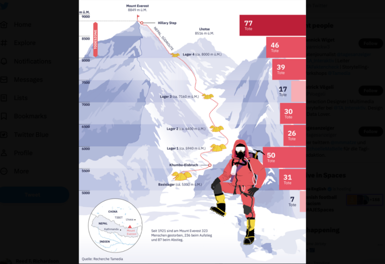
Data Journalism Top 10: Everest’s Deadly Legacy, Paris Metro Pollution, Migrant Worker Struggles in Singapore
This week, GIJN’s Top 10 in Data Journalism examines why the world’s tallest mountain has become increasingly deadly for those trying to climb it, pollution in Paris metro stations, US laws expanding gun access one year after the Uvalde mass shooting, and migrant worker struggles in Singapore.