Accessibility Settings

color options

monochrome muted color dark

reading tools

isolation ruler

Tag

data visualizations

9 posts

Data Journalism

My Favorite Tools: Indian Journalist and Data Designer Gurman Bhatia

For GIJN’s My Favourite Tools series, we spoke with Indian journalist and information designer Gurman Bhatia. She has worked at the Hindustan Times in Delhi and been a part of the award-winning team at Reuters Graphics, where she worked on visualizations for topics as diverse as election fraud in India, use of force during protests in Hong Kong, and bushfires in Australia.

Data Journalism

My Favorite Tools: Alberto Cairo on Data Visualization

For our series on journalists’ favorite tools, we spoke to Alberto Cairo, head of visualization at the University of Miami’s Institute for Data Science and Computing. Cairo shared several user-friendly tools and core principles to help investigative reporters shape their data visually to create new insights for audiences.

Data Journalism

Data Journalism Top 10: Pace of Global COVID-19 Deaths, Who Can Work from Home, Visualizations for the Colorblind, Skin Tone and Sports

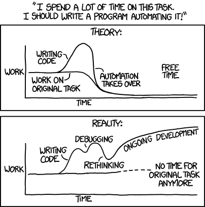
It is hard to comprehend the true impact of COVID-19 around the world. Our NodeXL #ddj mapping from June 29 to July 5 finds Reuters trying to visualize the alarming rate of deaths related to the coronavirus pandemic, Datawrapper examining which employees can actually afford to work from home, and data journalist Carmen Aguilar García writing about using R programming language and automating repetitive data processes in order to keep up with the demand for pandemic news.

Data Journalism

Data Journalism Top 10: Social Distancing, Coronavirus Clusters, Flattening the Curve, Trump Cherry-Picks Data

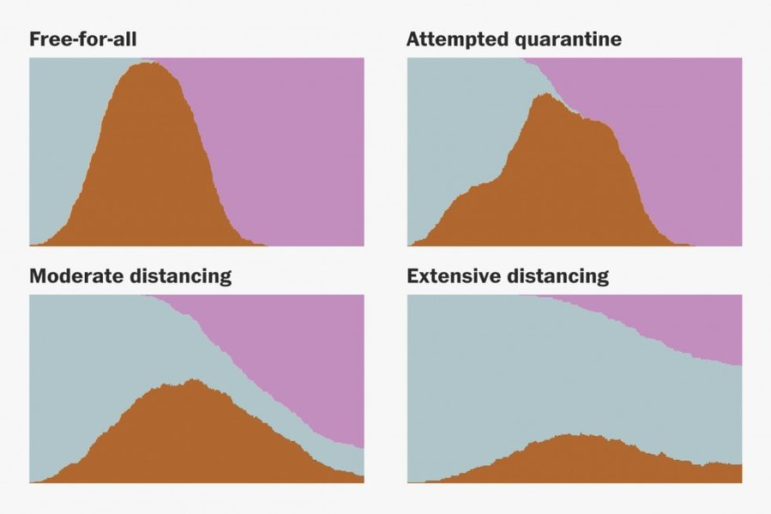
The novel coronavirus is very much dominating the Twitter chatter among the global data journalism community this week. Our NodeXL #ddj mapping from March 9 to 15 finds The Washington Post simulating different social distancing scenarios and their effects on slowing the spread of COVID-19, South China Morning Post highlighting research into a cluster case, Süddeutsche Zeitung charting the exponential growth in countries with high infection rates, and The New York Times spotlighting the jobs which put workers at the greatest risk of contracting the virus.

Data Journalism

GIJN’s Data Journalism Top 10: Australia’s Deadly Wildfires, Sigma Awards, Best of Data Viz 2019

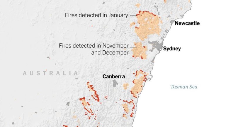
What’s the global data journalism community tweeting about this week? Our NodeXL #ddj mapping from December 30, 2019 to January 5, 2020 finds The New York Times examining Australia’s brutal fire season, the launch of The Sigma Awards to honor outstanding data journalism, Der Tagesspiegel analyzing the major changes across the globe in the past decade, and inspiring best-of data visualization lists by Nathan Yau, Pew Research Center, ZEIT ONLINE, the Los Angeles Times and the Financial Times.

Data Journalism

GIJN’s Data Journalism Top 10: Thanksgiving Travel, Visualization Art, Bad Charts, Dataharvest

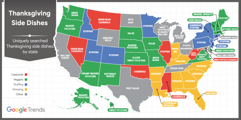
What’s the global data journalism community tweeting about this week? Our NodeXL #ddj mapping from November 18 to 24 finds Google Trends mapping the busiest places and times for Thanksgiving, Al Jazeera profiling the work of data journalist Mona Chalabi and her hand-drawn visualizations, the Tow Center for Digital Journalism examining the use of machine learning and artificial intelligence in journalism, and the Investigative Reporting Workshop collating useful public datasets in one place.

Data Journalism

This Week’s Top Ten in Data Journalism

What’s the global data journalism community tweeting about this week? Our NodeXL #ddj mapping from October 9 to 15 has @RTSinfo looking into flight sharing platform @Wingly_UK, while @srfdata finds millions of fake @instagram followers, @jwyg charts the growth of all Internet sites, and @nytimes collaborates with @AmstatNews to promote critical thinking and data literacy.

Data Journalism

Top Ten #ddj: The Week’s Most Popular Data Journalism Links

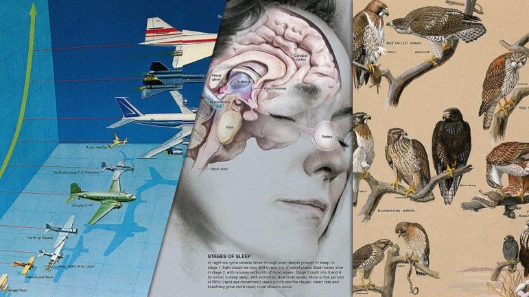
Here are the hottest data journalism tweets for Jan 23-29, per our NodeXL mapping: 100 Years of infographics (@NatGeoMag); Trump’s wall size (@thetruesize); Women’s March (@womensmarch); journocoding (@journocode); dataset viz 25 ways (@flowingdata); dataviz stocktake (@eagereyes); & more.