
Resource Database
Resources on Sports
From documents on anti-doping and sanctioned athletes, to information about corruption and match-fixing, resources for those investigating the world of sport.
From documents on anti-doping and sanctioned athletes, to information about corruption and match-fixing, resources for those investigating the world of sport.

This week’s column features stories on the record-breaking global heat, popular French baby names, Russia’s war dead, and the likely breakout stars of the 2023 FIFA Women’s World Cup.

Our NodeXL mapping from July 19 to 25, which tracks the most popular data journalism stories on Twitter each week, found imaginative data-driven coverage of the Olympics by The Washington Post, The New York Times, and other major outlets. In this edition, we also feature a piece by Reuters Graphics on how a Chinese lake has been decimated by sand mining, a cross-border investigation into the billion Euro business of elder care, and a deep dive into TikTok’s secretive algorithm by The Wall Street Journal.
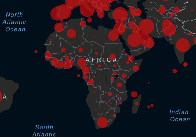
It is hard to comprehend the true impact of COVID-19 around the world. Our NodeXL #ddj mapping from June 29 to July 5 finds Reuters trying to visualize the alarming rate of deaths related to the coronavirus pandemic, Datawrapper examining which employees can actually afford to work from home, and data journalist Carmen Aguilar García writing about using R programming language and automating repetitive data processes in order to keep up with the demand for pandemic news.
What is the best way into the COVID-19 story? Pick an angle. No matter what your beat is, the pandemic is seeping into almost every story. In response, the Kampala-based African Centre for Media Excellence (ACME) created a running list of story ideas on COVID-19 which stretches across beats: from agriculture and food to the economy, education, religion, sports, and arts and entertainment.
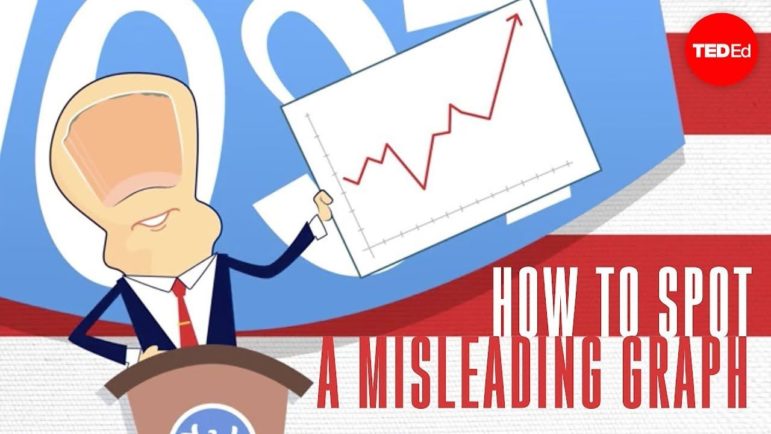
What’s the global data journalism community tweeting about this week? Our NodeXL #ddj mapping from January 27 to February 2 finds The New York Times and Der Tagesspiegel tracking the spread of the Wuhan coronavirus, TED-Ed educating viewers about how graphs can be manipulated to mislead readers, and a baseball fan watching every Houston Astros home game in 2017 to log each time they banged a trash can as part of a sign-stealing scandal.
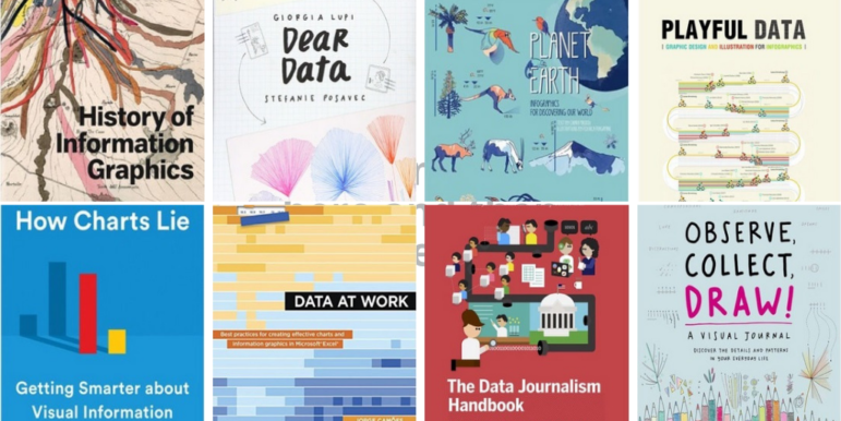
What’s the global data journalism community tweeting about this week? Our NodeXL #ddj mapping from July 15 to 21 finds Information Is Beautiful’s sharing its gallery of must-read data visualization books, Datajournalism.com highlighting pitfalls in creating charts, the FT analyzing the age of Wimbledon players, and WDR scrutinizing Germany’s opera repertoire.

What’s the global data journalism community tweeting about this week? Our NodeXL #ddj mapping from Oct 8 to 14 finds 25 inspirational data visualizations collated by @VismeApp, a @nytimes op-ed by climate scientists warning of the future dangers of heat and humidity combined, @FT maps of New York’s glut of luxury residences and @ejcnet with veteran data journalists on web scraping.

John Schrag had known for a while about an unexamined pool of data that could shed new light on the issue of concussions in high school sports. The executive editor of a newspaper in Oregon, his first instincts were to keep the story in-house and garner all the glory, but he quickly realized the only way the story would see the light of day was through collaboration.