How The New York Times Visualized Global Trends in White Extremist Attacks

Credit: NYT
In April 2019, The New York Times published an interactive article on white extremist killings from New Zealand to Norway to the United States. Using maps and a timeline to plot the data, the Times’ Weiyi Cai and Simone Landon revealed the troubling frequency and, in some cases, strange connections between the events.
Storybench spoke with Cai about her role in the article’s creation. She currently works as a graphics/multimedia editor at the Times and has previously worked at Reuters and The Washington Post.
Can you tell me about the inspiration behind this story?
We decided to do this analysis in the wake of the Christchurch shooting in New Zealand. That shooting had recently killed over 50 people. At that point, we hadn’t done a very systematic analysis of the shootings and that recent event was when we decided to do it. We found that there was a growing trend of nationalists, extremists, and racially inspired attacks and saw this as an opportunity to [see] if there were any patterns. We started with data from the Global Terrorism Database and sorted through all the information to tag cases of white extremism. We then filtered out and read all the cases to make a judgment call for ourselves of whether it was the attack we were looking at was a case of white extremism.
So, we only included attacks by white perpetrators and then did specific data analysis to select for those who have specific ideologies behind their attacks: anti-Muslim, anti-immigrant, neo-Nazi, right-wing, neo-fascist, anti-semantic, Ku Klux Klan, anti-Sikh, xenophobic, or racist ideologies. We ended up with a couple of hundred cases from the past few years and that’s what we based our analysis on.
How did you pitch this to the newsroom?
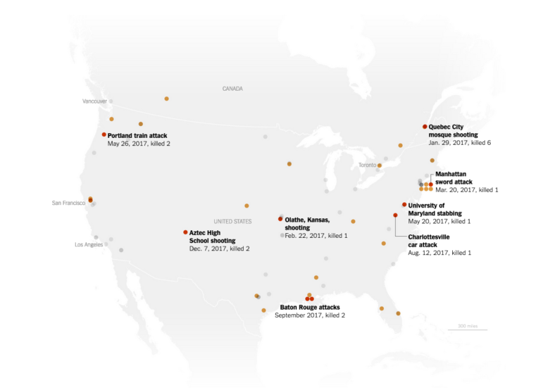
It wasn’t exactly a hard pitch; it was more a conversation about how to write the article correctly. There was already interest in the story because of recent attacks. The conversation we had was regarding the attention that we’re giving to these attackers. We didn’t want to profile these people and give them more attention than the event deserves and already has. Instead, we wanted to show the alarming pattern that these attackers were inspired by each other, as depicted in the second graphic with red and gray circles [see below]. These attacks go all the way back to the 2011 Norway attacks where the attacker killed more than 70 people. The arrows show the connections and inspirations drawn from earlier attacks. A number of attackers are inspired by online communities. This was another aspect we wanted to show people.
How did you create the timeline graphic?
The first step was a lot of research and reading of old and new news articles to find traces of possible connections or references to each other. Some of them do reference past attacks in their manifestos. After that, we sketched out all the different attacks and who is included. Then we selected for attacks that were deadly (where at least one person was killed) and created the graphic based on our sketch in Adobe Illustrator.

Credit: NYT
Can you walk me through the decision process behind the use of the scrolling map graphic? Why did you choose to use this graphic instead of maybe a timeline?
There was a ton of information to unpack, and it would be a lot to show a big map and write five or six paragraphs below. By that point, people would forget what the graphic looked like and there would be some confusion in understanding which attack is being referred to since there are many dots on each map. If you don’t walk readers through the dots, the dots will lose their meaning. By doing a scrolling graphic, we’re able to isolate specific attacks and discuss the timeline of each one while highlighting the area they were located.
We are also able to tell readers which attacks inspired others and group them. Even though they were all carried out by white extremists, the motivation for each was not the same. For example, we were able to group attacks on places of worship and discuss those specifically. We picked a few of these groups to walk readers through their retaliations and then show the related attacks that were motivated by the previous one. It’s not fair to show all of them in one big map. It’s more interesting for readers to visualize the types of attacks that take place and categorize them.
How were the scrolling graphics created?
We made the maps using online QGIS map-making software, and then put dots where each attack occurred. After, I brought them into Illustrator to categorize each dot by color and then used a tool provided by The New York Times interface. If I don’t have this tool available, like when I was at Reuters, I’ve used ScrollMagic, which is a popular JavaScript library for making scrolling graphics.
How did the design evolve?
We didn’t know what we wanted to highlight at the beginning, but we did know we wanted to start out by categorizing by region because the attacks in America are very different from the attacks in Europe. And this is why we have the very first graphic readers see being the three globes, which hints at the three regions we wanted to dive into in the reading: North America, Europe, and Australia.

Credit: NYT
Was there any point when you were writing this that you thought you may be potentially inspiring future attacks?
Yes absolutely. That was a concern; we don’t want to glorify or inspire people to be on the list.
What editorial decisions were made to avoid that?
We never use anyone’s name for cases that aren’t already well-known to give less prominence to the attackers. That was a big decision. Some names are very well known, so it doesn’t help to avoid it. It makes it harder and more convoluted to write about cases [based on] simply their time and location, but at the same time I think it’s worth it to keep the attackers out of the spotlight.
Another decision we made editorially is to not use any pictures from the scenes, and keep the visualization very simple, straightforward, and even mechanical almost, just to keep it in the same tone as the story. Style-wise, the map is just grey and red, and there’s no room for any sort of extraneous interpretation. These were the conversations we had and decisions we made.
 Mihir Patil is a journalism student at Emory University. This story was originally published by Storybench, a publication by Northeastern’s School of Journalism that takes an “under the hood” look at the latest in digital storytelling, from data visualization and investigative journalism to virtual reality and digital humanities. It is reproduced here with permission.
Reporter’s Guide to Investigating Cryptocurrency

Tipsheet on Partnering with Civil Society Organizations and Non-Governmental Organizations

AI Accountability Reporting Guide

Guide to Mapping Analysis Using QGIS
Editor’s Pick: 2022’s Best Investigative Stories in French
Safe Haven: Investigative Reporters Seek Time Out to Rest and Recuperate

Taking the Pulse of the Global IJ Community: Democracy, Press Freedom, and Threats to Journalism

How iFact Is Transforming Investigative Reporting in the Republic of Georgia

This work is licensed under a Creative Commons Attribution-NoDerivatives 4.0 International License
Republish our articles for free, online or in print, under a Creative Commons license.
Republish this article
This work is licensed under a Creative Commons Attribution-NoDerivatives 4.0 International License
Read Next
Case Studies News & Analysis
Editor’s Pick: 2022’s Best Investigative Stories in French
Geographical diversity, the stories’ impact and uniqueness, the risks taken, and the techniques used were some of our criteria for selecting the strongest French language investigations of the year, selected by GIJN French Editor Alcyone Wemaëre, GIJN Francophone Africa Editor Maxime Domegni, GIJN French Assistant Editor Moran Kerinec, and Africa Assistant Editor Aïssatou Fofana.
News & Analysis
Safe Haven: Investigative Reporters Seek Time Out to Rest and Recuperate
Investigative journalists face a range of threats — from physical attacks to legal challenges — and sometimes the toll becomes just too much. Hear from two reporters who took time out to rest, recover, and recoup.
News & Analysis
Taking the Pulse of the Global IJ Community: Democracy, Press Freedom, and Threats to Journalism
Attendees to GIJC21’s plenary session were asked three questions about the challenges to democracy in their countries, and the role of journalism in upholding or weakening democratic values and institutions. The poll results reflect the threats faced by reporters around the world, from disinformation, fake news, and extremism.
News & Analysis
How iFact Is Transforming Investigative Reporting in the Republic of Georgia
When Nino Bakradze was growing up in Georgia in the ’90s, the country was embroiled in a civil war and a post-USSR economic crisis. In a media landscape dominated by state TV, investigative journalism just didn’t happen. The situation hadn’t changed much when she graduated, so she set up iFact to turn the tables. GIJN’s Alexandra Tyan spoke to the team.