Data Journalism Top 10: Humanizing COVID Deaths, Coronavirus Searches, Climate Change Songs, Brazil’s Cursing Cabinet
The devastating consequences of the coronavirus pandemic can easily get lost in the mass of numbers presented. To provide a better sense of the devastating impact, journalists have attempted to humanize the data. Our NodeXL #ddj mapping from May 18 to 24 finds The New York Times creating a moving tribute to the lives lost to COVID-19; Schema Design, the Google News Initiative, and Axios visualizing the top coronavirus-related Google search trends; The Atlantic revealing that the US’s Centers for Disease Control and Prevention is conflating the results of two different types of coronavirus tests; and Elana Levin Schtulberg showing how to use Datawrapper to recreate images with charts.
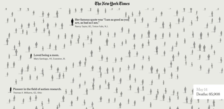
A Portrait of Lives Lost to COVID-19
Nearly 100,000 lives have been lost to the novel coronavirus in the US during this pandemic. The New York Times put together snippets describing the lost individuals, which were gathered from obituaries in local newspapers across the country. From April Dunn, a 33-year-old advocate for disability rights, to 91-year-old Romi Cohn, who saved 56 Jewish families from the Gestapo during World War II, the piece is a moving tribute that makes readers feel the immensity of the disease’s impact.
COVID-19 Search Trends
Curious what are the most common queries about COVID-19? Schema Design, the Google News Initiative, and Axios created this visualization that explores some of the top coronavirus-related Google search trends in the US between January 20 and April 24 of this year. The data are restricted to search queries that began with the questions “How to ___” or “What is/are ___.” The results showed that “as the severity of the outbreak became apparent, our growing need for information mirrored the escalating health crisis.”
Conflating Coronavirus Test Results
According to a report by The Atlantic, the US Centers for Disease Control and Prevention is combining the results of two different types of coronavirus tests: viral and antibody tests. This conflation distorts important metrics and provides the country with an inaccurate picture of the state of the pandemic.
Cholera Map That Changed the World
Data journalists are probably familiar with John Snow’s famous map of cholera outbreaks in 19th century London. This blog post, written by Simon Rogers in 2013, has resurfaced due to the current coronavirus pandemic. Rogers explains how Snow’s map gave future data journalists a model of how to map a disease.
Climate Songs
As global temperatures keep rising, references to climate change in popular songs are also increasing. The New York Times looked at lyrics from all artists who have appeared on any of Billboard’s domestic charts in the past two decades and found at least 192 references to climate change. Start your climate song journey with Smash Mouth, who warned us in 1999 that the ice was getting pretty thin. Journalist Kendra Pierre-Louis shared some behind-the-scenes details from this article in a tweet thread.
Designing Better Graphics
A chart by the Georgia Department of Public Health has been attracting ridicule on Twitter. Alberto Cairo, Knight Chair in Visual Journalism at the University of Miami and the author of “How Charts Lie,” proposes a way to improve the chart.
https://twitter.com/AlbertoCairo/status/1263076211649056768
Recreating Images with Charts
Apparently Datawrapper is not just a tool to create maps, charts, and tables. Elana Levin Schtulberg shows that Datawrapper can also be used to recreate photographs and images. Check out her post on recreating a photo of Natalie Portman using a line chart, Johannes Vermeer’s “Girl with a Pearl Earring” as a scatterplot, and Audrey Hepburn as a split bar chart.
Expletive-Ridden Brazilian Cabinet Meeting
Brazilian daily newspaper Folha De S. Paulo analyzed a two-hour video of a Brazilian cabinet meeting and found it full of expletives. The video was released as part of an inquiry into claims that the country’s president Jair Bolsonaro tried to meddle in an investigation into his son (in Portuguese). The Associated Press also covered part of this story.
Charts: Changing Hues
Designer Lisa Charlotte Rost invites data journalists to discuss whether to differentiate categories in a visualization using a variation of hues or graduating lightness of the same color. Join in the discussion here.
Mastering Data for Business Journalism
No matter how you cover business — in text or on short social media posts, through video or podcasts — data journalism should be in your toolkit. Freelance journalist Erik Sherman wrote a beginner’s guide to using data for economic reporting for Datajournalism.com.
Thanks again to Marc Smith of Connected Action for gathering the links and graphing them. The Top Ten #ddj list is curated weekly.
 Eunice Au is GIJN’s program coordinator. Previously, she was a Malaysia correspondent for Singapore’s The Straits Times, and a journalist at the New Straits Times. She has also written for The Sun, Malaysian Today, and Madam Chair.
For a look at NodeXL’s mapping on #ddj and data journalism on Twitter, check out this map.

Basic Data Journalism Tips for Editors

My Favorite Tools: Venezuela’s Lisseth Boon on Design and Data Visualization

Document of the Day: Visual Vocabulary

Tipsheet on Partnering with Civil Society Organizations and Non-Governmental Organizations

Turning the Threat to a Distant Glacier into a Local Story Through Data Visualization

Making Trillions Make Sense: How Reuters Visualized the AI Economy

Summer Reading List for Data Journalists: For Those Who Believe in the Power of Storytelling with Numbers

From Data to Storytelling: Concept and Design Tips from the Financial Times’ John Burn-Murdoch

This work is licensed under a Creative Commons Attribution-NoDerivatives 4.0 International License
Republish our articles for free, online or in print, under a Creative Commons license.
Republish this article
This work is licensed under a Creative Commons Attribution-NoDerivatives 4.0 International License
Read Next
Climate Data Journalism
Turning the Threat to a Distant Glacier into a Local Story Through Data Visualization
New York Times climate and environmental graphics reporter Mira Rojanasakul discusses how her team visualized the sea level rise threat from the melting Thwaites Glacier in Antarctica.
Data Journalism
Making Trillions Make Sense: How Reuters Visualized the AI Economy
How do you make a trillion dollars feel real to someone who has never seen that much money? Vineet Khare and Mayank Bhatt faced that very challenge for their data-driven investigation into AI investment.
Data Journalism
Summer Reading List for Data Journalists: For Those Who Believe in the Power of Storytelling with Numbers
Featuring books spanning four continents, these recommended reads provide a global perspective on data journalism.
Data Journalism
From Data to Storytelling: Concept and Design Tips from the Financial Times’ John Burn-Murdoch
The chief data reporter for the Financial Times discusses how he considers the use of text, color, and annotation to aid visual storytelling through charts and graphics.