
Data Journalism Top 10: Hidden COVID-19 Deaths, Post-Lockdown Traffic, Pandemic Data Overload, Wealth Inequality
What will life be like after the coronavirus lockdown measures are relaxed in our countries? Our NodeXL #ddj mapping from April 27 to May 3 finds German news outlets ZDF heute and RBB24 looking into pedestrian traffic in Germany post-quarantine, the Financial Times and New York Times finding that COVID-19 death tolls may be much higher than officials report, and the Africa Centres for Disease Control and Prevention setting up a dashboard to track statistics related to the coronavirus across the region.
Could the Death Toll Be 60% Higher?
According to the Financial Times’ analysis of overall fatalities during the pandemic in 14 countries, the death toll from COVID-19 may be almost 60% higher than the official reported statistics. To find the number of excess fatalities, the FT compared deaths from all causes during the outbreak in these countries in March and April 2020 and compared the data to the average number of deaths for the same period between 2015 and 2019.
Undercounting COVID-19 Deaths
The New York Times is also looking at the undercount in coronavirus-related deaths, highlighting how the virus has led to a pattern of deaths unlike anything seen in recent years. Data from the United States Centers for Disease Control and Prevention reveal that the total number of deaths in seven American states from March 8 to April 11 was nearly 50% higher than the normal trend in previous years.
Post-Lockdown Traffic
Department stores in almost all German federal states have been allowed to reopen since April 20, and the pedestrian and vehicle traffic has been brisk. News program ZDF heute examined traffic data measured by street laser scanners to determine the actual increase in pedestrians in large cities. (In German.)
https://twitter.com/Huwendiek/status/1254809273118404611
Mobility Data during the Pandemic
While Germany was still in lockdown, one woman pointed out on Twitter that people in the country had been going wherever they wanted since Easter, despite the restrictions. Now, broadcaster RBB24 has the evidence to support that claim through its analysis of anonymized mobile location tracking data.
Pandemic Data Overload
Data journalists have toiled during the pandemic to explain complex COVID-19 data to the public. In this Data Overload webinar organized by the Berkman Klein Center for Internet and Society, Boston Globe data journalist Todd Wallack, ProPublica health journalist Caroline Chen, and Washington Post graphics assignment editor Armand Emamdjomeh discuss the challenges that journalists face in obtaining, analyzing, and explaining data about the current pandemic.
COVID-19 in Portugal, by Municipality
How is the COVID-19 pandemic evolving in Portugal? National newspaper Público is collecting data from the country’s 308 municipalities so readers can compare the situation between them using the filter in the interactive visualization.
Africa COVID-19 Tracker
The Africa Centres for Disease Control and Prevention has set up a dashboard to track COVID-19 statistics across the region, including the number of cases, deaths, and recoveries. The site also provides information on best health practices during the pandemic.
Wealth Inequality, Visualized
Get ready to scroll, scroll, and scroll, through this seemingly never-ending yet mind-blowing visualization that shows the vast disparity of wealth between the general population and the mega-rich.
A Philosophy of Visualization
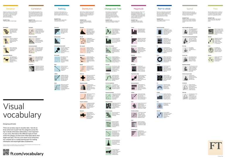
Amsterdam University Press just released the book “Data Visualization in Society.” The publication is a collection of chapters from data scholars and professionals who discuss the “forms, uses, and roles of data visualization in society.” You can read the foreword by data visualization expert Alberto Cairo here, and buy the book here.
https://twitter.com/AlbertoCairo/status/1257301534565478400
Book: Better Data Visualizations
The book “Better Data Visualizations: A Guide for Scholars, Researchers, and Wonks,” by economist Jonathan Schwabish, is now available for pre-order on Amazon and other booksellers. The book “details essential strategies to create more effective data visualizations.”
https://twitter.com/LaughlinPaul/status/1256210539425955840
Thanks again to Marc Smith of Connected Action for gathering the links and graphing them. The Top Ten #ddj list is curated weekly.
 Eunice Au is GIJN’s program coordinator. Previously, she was a Malaysia correspondent for Singapore’s The Straits Times, and a journalist at the New Straits Times. She has also written for The Sun, Malaysian Today, and Madam Chair.


