Data Journalism Top 10: Social Distancing, Coronavirus Clusters, Flattening the Curve, Trump Cherry-Picks Data
The novel coronavirus is dominating Twitter chatter among the global data journalism community this week. Our NodeXL #ddj mapping from March 9 to 15 finds The Washington Post simulating social distancing scenarios and their effects on slowing the spread of COVID-19, the South China Morning Post highlighting research into a cluster case, Süddeutsche Zeitung charting exponential growth in countries with high infection rates, and The New York Times spotlighting jobs that put workers at greatest risk of contracting the virus.
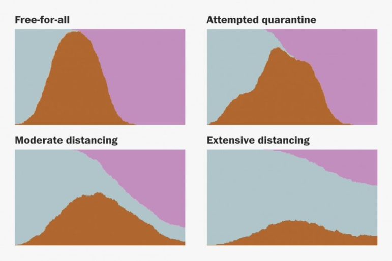
How to Slow the Spread of COVID-19
This Washington Post piece emphasizes the importance of social distancing measures in slowing down the spread of the coronavirus. By using bouncing balls, it simulates what could happen in four movement scenarios: a free-for-all, attempted quarantine, moderate social distancing, and extensive social distancing. The simulations were done with Canvas API and the charts are made in SVG with D3.js.
https://twitter.com/kumailn/status/1239570646050279424
How COVID-19 Spread in a Bus
According to the South China Morning Post, a group of researchers from Hunan province investigating a COVID-19 cluster case discovered that a bus passenger managed to infect fellow travelers sitting 4.5 meters away. This is further than the official “safe distance” of one to two meters advised by authorities. The article also advocates the wearing of masks for the public, which is at odds with advice by other medical experts about the masks’ effectiveness in prevention of infection.
Flattening the Curve
German daily Süddeutsche Zeitung charted the increase in number of cases in countries with high rates of infection, such as South Korea, Italy, France and Germany, to show a trend of exponential growth in cases, and to emphasize the importance of “flattening the curve” — diminishing the rate at which new cases occur. If the spread of the novel coronavirus is not slowed down with countermeasures, more than a million people in Germany could be infected with the virus by mid-May, they report. More coronavirus-related data stories are listed here. (In German.)
Jobs with Greatest Risk of Exposure
Which jobs put workers at the greatest risk of contracting the coronavirus? The New York Times tried to figure that out by calculating risk levels of various jobs using O*NET, a database maintained by the Department of Labor that describes various physical aspects of different occupations. Hint: it’s not a great time to be a dentist or paramedic.
Trump Cherry-Picking Charts
Alberto Cairo, Knight Chair in Visual Journalism at the University of Miami, blogs about how US President Donald Trump conveniently cherry-picked statistics to suggest that stock markets experienced a rapid recovery after his press conference on the coronavirus. Cairo explains how the chart shown by Trump is misleading and only a small part of the big picture.
Rates and Proportions in Charts
Business analytics and data visualization expert Kaiser Fung critiques a chart from Ars Technica that confuses rates and proportions. He explains the problem and suggests a way to improve the chart.
Data Analysis in Your Browser
If you’re interested in Python, R, or JavaScript, check out some online tools and services recommended by Alex Richards, assistant professor at Syracuse University, at NICAR20.
Lost Parts of Berlin
The historic city of Berlin-Cölln used to hold more than 1,200 buildings, but most of them were demolished or bombed. Only 85 remain. On the occasion of the hundredth birthday of Greater Berlin, Der Tagesspiegel dug into map archives to compare the current Berlin to the old city before the Second World War.
Drop in Brazil’s Social Benefits
Núcleo Jornalismo analyzes available official data on Brazil’s Bolsa Família social benefits program to see how it has developed under President Jair Bolsonaro’s tenure. It found a 7.3% drop in the number of families benefiting from the program.
https://twitter.com/sergiospagnuolo/status/1234820294281396225
Data Journalism Course (In Russian)
Need a data journalism course in Russian? Strelka Institute for Media, Architecture and Design is organizing one from March 27 to April 12 for journalists, bloggers, analysts, and media managers who do not know programming, but who want to create stories based on data. Applications will be accepted until March 23.
Thanks again to Marc Smith of Connected Action for gathering the links and graphing them. The Top Ten #ddj list is curated weekly.
 Eunice Au is GIJN’s program coordinator. Previously, she was a Malaysia correspondent for Singapore’s The Straits Times, and a journalist at the New Straits Times. She has also written for The Sun, Malaysian Today, and Madam Chair.
For a look at NodeXL’s mapping on #ddj and data journalism on Twitter, check out this map.

Document of the Day: Visual Vocabulary

AI Accountability Reporting Guide

Guide to Mapping Analysis Using QGIS

Open Source Databases by Country

How Data Journalism Is Changing the Face of Africa

Data-Driven Journalism: Roundup of Recent Standout Stories
Data Journalism Top 10: Everest’s Deadly Legacy, Paris Metro Pollution, Migrant Worker Struggles in Singapore
Data Journalism Top 10: Bats and the Next Pandemic, China’s Electric Battery Dominance, and Brazil’s Healthcare ‘Holes’

This work is licensed under a Creative Commons Attribution-NoDerivatives 4.0 International License
Republish our articles for free, online or in print, under a Creative Commons license.
Republish this article
This work is licensed under a Creative Commons Attribution-NoDerivatives 4.0 International License
Read Next
Africa Focus Data Journalism
How Data Journalism Is Changing the Face of Africa
Data journalism in Africa has made a powerful impact, from holding leaders accountable to refuting myths around domestic violence. But the field faces formidable challenges.
Case Studies Data Journalism GIJC23
Data-Driven Journalism: Roundup of Recent Standout Stories
The best of modern data journalism tells powerful stories that test assumptions. At GIJC23, two experts discussed strong recent investigations and what makes them stand out.
Data Journalism Data Journalism Top 10
Data Journalism Top 10: Everest’s Deadly Legacy, Paris Metro Pollution, Migrant Worker Struggles in Singapore
This week, GIJN’s Top 10 in Data Journalism examines why the world’s tallest mountain has become increasingly deadly for those trying to climb it, pollution in Paris metro stations, US laws expanding gun access one year after the Uvalde mass shooting, and migrant worker struggles in Singapore.
Data Journalism Data Journalism Top 10
Data Journalism Top 10: Bats and the Next Pandemic, China’s Electric Battery Dominance, and Brazil’s Healthcare ‘Holes’
GIJN’s weekly, curated look at the Top 10 in Data Journalism highlights bats and predicting the location of the next pandemic, China’s electric battery dominance, and mapping out Brazil’s healthcare “holes.”