Data Journalism Top 10: COVID-19 Data Viz, Brazil President’s Tweets, Beach Erosion, India’s Influencers, London by Bike, Syllabi


What’s the global data journalism community tweeting about this week? Our NodeXL #ddj mapping from March 2 to 8 finds a list of COVID-19 data visualizations selected by health activist Joel Selanikio, Folha De S. Paulo analyzing Brazilian President Jair Bolsonaro’s tweets, VoxEurop highlighting the disappearing world beaches due to climate change, and Davis Vilums mapping every central London street over four years by cycling.
Coronavirus Data Viz
Health and tech activist Joel Selanikio put together a selected list of data visualizations on his blog regarding the COVID-19 outbreak. His aim is to offer a sense of the pace and scale of the outbreak progression outside China. Berliner Morgenpost is also mapping cases in Germany and Europe. And don’t miss the great dashboard at Johns Hopkins University’s Center for Systems Science and Engineering.
Analyzing Bolsonaro’s Tweets
By analyzing Brazilian President Jair Bolsonaro’s tweets, the daily Folha De S.Paulo found two different personality patterns. One, which posts content from a Samsung Galaxy, prioritizes institutional communication and dissemination of ministers’ messages, while the other, which posts from an iPhone, prefers clash and controversy.
https://twitter.com/_danielmariani/status/1236624276679208963
Climate Crisis Impact: Disappearing Beaches
According to a new study by the Joint Research Center (JRC) of the European Commission, almost half of the world’s sandy beaches will be close to extinction by 2100 due to climate-driven coastal flooding and human interference. VoxEurop mapped the erosion of Europe’s beaches in the best climate scenario.
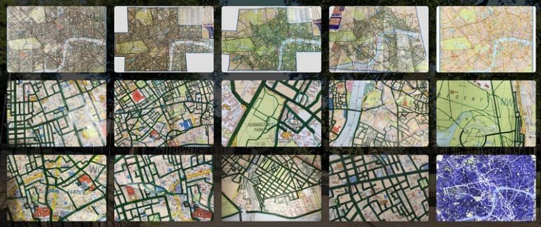
Mapping Central London by Cycling
Davis Vilums got bored cycling the same 25 minutes route to work everyday and started getting creative. He decided to visit not only every main road but every single accessible mews, yard, park trail, and path in central London, and record his journeys on the Endomondo app. It took him four years but he did it!
Germany: Evolution of Political Language
The newspaper Süddeutsche Zeitung analyzed transcripts from German parliament proceedings and, using machine learning, detected changes in the discourse of certain topics over time. The analysis showed when members of parliament paid least attention to climate change and how the discussion of refugees and migration shifted to the right. Read a summary in this Twitter thread, and find out how they did the analysis here (in German), and here (in English).
Free Pew Center Survey Data
Want to play with data? The Pew Research Center makes its survey data available to the public for secondary analysis after a period of time. Find interesting insights into American politics and policy, internet and technology, religion and public life, journalism and media, and more.
Humanitarian Data Fellowship
The United Nations Office for the Coordination of Humanitarian Affairs’ Centre for Humanitarian Data will host its third class of Data Fellows in The Hague in June and July 2020. The 2020 Fellows will focus on three areas: Data Storytelling (Education), Predictive Analytics, and Statistics (Mosaic Effect). The fellowship program is residential. Apply here.
India’s Influencers
Researchers Somya Sagarika, Dibyendu Mishra, and Joyojeet Pal wanted to find out the most “listened to” Twitter accounts among Indian journalists. In preliminary research, they started by mapping the 50 politicians, scholars, lawyers, and public commentators that were most-followed by journalists. All the data was gathered using the Twitter Public API. Read more here.
US Newspapers Circulation Data
Joshua Benton, director of the Nieman Journalism Lab, shared data on American newspaper circulation, which offered some insights into media ownership and struggling local newspapers. See the spreadsheet here, and read his analysis in this Twitter thread.
Data Journalism Syllabi
Looking to obtain a data journalism degree? The Investigative Journalism Education Consortium gathered a list of syllabi from computer-assisted and data journalism courses from around the world.
Thanks again to Marc Smith of Connected Action for gathering the links and graphing them. The Top Ten #ddj list is curated weekly.
 Eunice Au is GIJN’s program coordinator. Previously, she was a Malaysia correspondent for Singapore’s The Straits Times, and a journalist at the New Straits Times. She has also written for The Sun, Malaysian Today, and Madam Chair.
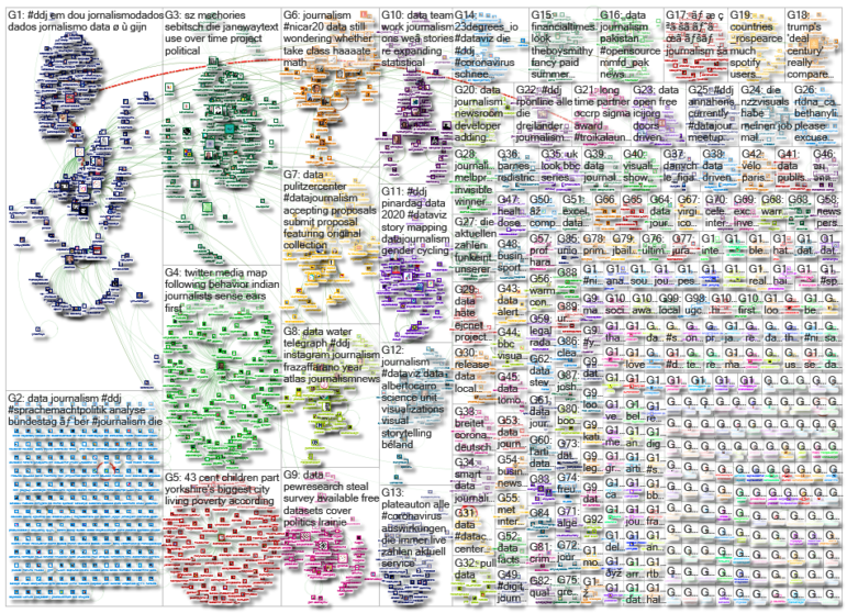
For a look at NodeXL’s mapping on #ddj and data journalism on Twitter, check out this map.

This work is licensed under a Creative Commons Attribution-NoDerivatives 4.0 International License
Republish our articles for free, online or in print, under a Creative Commons license.
Republish this article
This work is licensed under a Creative Commons Attribution-NoDerivatives 4.0 International License
Read Next

Africa Focus Data Journalism
How Data Journalism Is Changing the Face of Africa
Data journalism in Africa has made a powerful impact, from holding leaders accountable to refuting myths around domestic violence. But the field faces formidable challenges.

Data Journalism Reporting Tools & Tips
Step-By-Step Guide for Journalists on the Basics of Google Sheets
Knowing how to use spreadsheets is a crucial skill, as it allows you to find potential stories in large amounts of data and to think critically about how to use it.

Data Journalism News & Analysis
Lessons Learned: 10 Common Mistakes in Data Journalism
GIJN asked speakers and attendees in the NICAR conference hallways for the data journalism gaps they see and for under-covered topic areas newsrooms can address.
Data Journalism Methodology
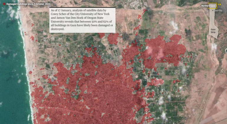
Mapping Conflict: Using Satellite Radar Data to Track the War Damage in Gaza
Gaza’s urban landscape has changed profoundly since the start of Israel’s military campaign. Researchers Jamon Van Den Hoek and Corey Scher have been mapping the impact.