GIJN’s Data Journalism Top 10: Coronavirus Outbreak, Misleading Graphs, Smartphone Tracking, Trash Can Banging, Mexico Murders
What’s the global data journalism community tweeting about this week? Our NodeXL #ddj mapping from January 27 to February 2 finds The New York Times and Der Tagesspiegel tracking the spread of the Wuhan coronavirus, TED-Ed educating viewers on misleading graphs, and a baseball fan watching every 2017 home game of the Houston Astros baseball team to log each time they banged a trash can as part of a sign-stealing scandal.
How Bad Will Coronavirus Get?
How worried should we be about the 2019-novel coronavirus? The New York Times answers six key questions about the virus, including how contagious and deadly it is, how long it takes for infected people to show symptoms, and how effective the current public health measures are. It also visualized how fast the virus can spread, and compared its fatality rate in a chart with other infectious diseases.
Tracking the Spread of Coronavirus
Since the 2019-novel coronavirus was first discovered in Wuhan, China, in December last year, it has now spread to at least 26 countries. Der Tagesspiegel used publicly available facts to try to reconstruct how the pathogen spread so quickly from ground zero.
Digging into the Smartphone Tracking Industry
Last year, The New York Times got hold of a gigantic dataset that contained billions of location data from 12 million smartphone users, and showed how connecting that data to real names and people was child’s play. The Data Visualization Society spoke to Stuart A. Thompson, graphics editor for The New York Times Opinion, about the behind-the-scenes process of that investigation into the smartphone tracking industry.
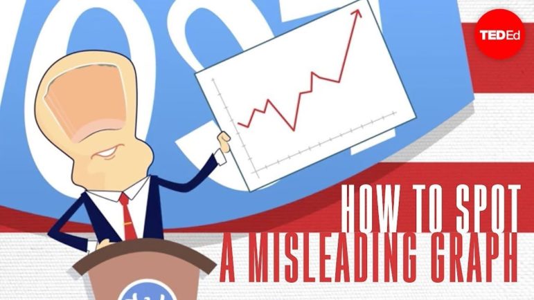
Misleading Graphs
In a TED-Ed video from 2017, Lea Gaslowitz explains the various ways that graphs can be manipulated to mislead readers. She offers tips to spot such manipulations, such as distorted scales, cherry picking data, and leaving out the relevant context.
https://twitter.com/AlbertoCairo/status/1221855337675968512
Baseball Sign-Stealing Scandal Used Trash Cans
The Houston Astros’ sign-stealing scandal rocked the baseball world when it was exposed in 2019 — an illegal scheme using electronics to steal opposing catchers’ signs and then tip off their own batters to what pitch was coming by banging on trash cans in the dugout. Tony Adams, a fan of the Astros, logged every bang of a trash can from every Astros home game with available video in 2017. He discovered there were bangs before at least 1,100 of the 8,200 pitches. The data can be found at signstealingscandal.com.
Exploiting Water Resources
An investigation by Mexicanos Contra la Corrupción y la Impunidad shows how water — a national public resource — is bought, sold, and exploited in Mexico as if it were an abundant private good. The project dives into the failures in the concession system since 1992. (In Spanish.)
Women, LGBTIQ Rights Data Fellowship
OpenDemocracy is offering a six-month, full-time data journalism fellowship starting in March that will be focused on women’s and LGBTIQ rights. The fellow will be paid a stipend of $2,100 per month and will be expected to dedicate 40 hours a week to related research, reporting, data entry, data analysis, and other tasks for at least two major investigative projects. Deadline: February 16, 2020.
Homicides in Mexico
From 2015 to 2019 , more than 120,000 case files were opened for homicides in Mexico. The latest figures show that the trend is far from declining. El Universal visualizes the trend by state and municipality. (In Spanish.)
Mapbox Elections Launched
Mapbox recently launched Mapbox Elections, a resource to help individuals, journalists, and organizations cover the elections, analyze the results, and build modern maps to display it all.
Data Journalism Podcast (Brazil)
Colaboradados, a Brazilian data journalism podcast, looks back on the episodes it has produced over the past year. From interviews with big names in data such as Natalia Mazotte to talking Python with Professor Fernando Masanori, you can listen to all the episodes here and see a summary in this Twitter thread. (In Portuguese.)
Thanks again to Marc Smith of Connected Action for gathering the links and graphing them. The Top Ten #ddj list is curated weekly.
 Eunice Au is GIJN’s program coordinator. Previously, she was a Malaysia correspondent for Singapore’s The Straits Times, and a journalist at the New Straits Times. She has also written for The Sun, Malaysian Today, and Madam Chair.
For a look at NodeXL’s mapping on #ddj and data journalism on Twitter, check out this map.

Guide to Mapping Analysis Using QGIS

Basic Data Journalism Tips for Editors

My Favorite Tools: Venezuela’s Lisseth Boon on Design and Data Visualization

Document of the Day: Visual Vocabulary

Turning the Threat to a Distant Glacier into a Local Story Through Data Visualization

Making Trillions Make Sense: How Reuters Visualized the AI Economy

Summer Reading List for Data Journalists: For Those Who Believe in the Power of Storytelling with Numbers

From Data to Storytelling: Concept and Design Tips from the Financial Times’ John Burn-Murdoch

This work is licensed under a Creative Commons Attribution-NoDerivatives 4.0 International License
Republish our articles for free, online or in print, under a Creative Commons license.
Republish this article
This work is licensed under a Creative Commons Attribution-NoDerivatives 4.0 International License
Read Next
Climate Data Journalism
Turning the Threat to a Distant Glacier into a Local Story Through Data Visualization
New York Times climate and environmental graphics reporter Mira Rojanasakul discusses how her team visualized the sea level rise threat from the melting Thwaites Glacier in Antarctica.
Data Journalism
Making Trillions Make Sense: How Reuters Visualized the AI Economy
How do you make a trillion dollars feel real to someone who has never seen that much money? Vineet Khare and Mayank Bhatt faced that very challenge for their data-driven investigation into AI investment.
Data Journalism
Summer Reading List for Data Journalists: For Those Who Believe in the Power of Storytelling with Numbers
Featuring books spanning four continents, these recommended reads provide a global perspective on data journalism.
Data Journalism
From Data to Storytelling: Concept and Design Tips from the Financial Times’ John Burn-Murdoch
The chief data reporter for the Financial Times discusses how he considers the use of text, color, and annotation to aid visual storytelling through charts and graphics.