GIJN’s Data Journalism Top 10: Australia’s Deadly Wildfires, Sigma Awards, Best of Data Viz 2019
What’s the global data journalism community tweeting about this week? Our NodeXL #ddj mapping from December 30, 2019 to January 5, 2020 finds The New York Times examining Australia’s brutal fire season, the launch of The Sigma Awards to honor outstanding data journalism, Der Tagesspiegel analyzing the major changes across the globe in the past decade, and inspiring best-of data visualization lists by Nathan Yau, Pew Research Center, ZEIT ONLINE, the Los Angeles Times and the Financial Times.
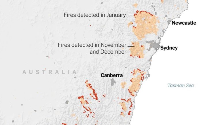
Australia’s Deadly Wildfires
Devastating wildfires have swept across millions of acres of land in Australia since October 2019, destroying homes, displacing thousands of residents, and killing at least 25 people. The New York Times mapped the hotspots and highlights several contributing factors that make Australia’s 2019 fire season exceptionally brutal.
https://twitter.com/oz_f/status/1213066657150582786
Launch of The Sigma Awards
The Sigma Awards, which recognizes outstanding data journalism, has just been launched in the wake of the Data Journalism Awards’ death. There will be nine prizes for six categories. Data teams from around the world can submit their work until February 3. Read more about the launch of the awards here.
Flowingdata’s Favorite Data Viz in 2019
Statistician Nathan Yau’s ten favorite data visualization picks in 2019 showcase an array of amazingly creative projects. From presenting gerrymandering via a font type to personifying data through a comic and chart combination, it is a list that will inspire you to think out of the box for your graphics.
A Decade of Change
The world has changed fundamentally in the past decade, with major developments in communication, climate, energy, transport, warfare, and power. Using graphics and satellite images, Der Tagesspiegel produced a detailed and insightful look at what has changed over the past 10 years and by how much. (In German.)
The Economist’s Graphs in One PDF
The Economist collated 61 of its print graphics articles into one PDF. To download it, you’ll need to sign up for a free account or subscribe to the magazine.
https://twitter.com/AlbertoCairo/status/1210182976971165697
Pew Research Center’s Favorite Data Viz
What makes for a successful graphic? Pew Research Center says good visualizations must have a clear takeaway, engage readers and display layers of information beyond the immediate point that first catches the eye. They highlight five of their favorite graphics in 2019, with notes on their design process.
Zeit Online’s Best Data Viz in 2019
What the German parliament debated, where the rent burden was highest, and how many people left East Germany: These are just some of the topics covered by Zeit Online’s best data visualizations in 2019. (In German.)
LA Times’ 50 Best Data and Graphics Journalism
From visual stories to interactive games, the Los Angeles Times’ data and graphics department produced an interesting body of work last year. Check out 50 examples of how the team merged the sciences of statistics and computer programming with the arts of reporting, writing, and editing.
Germany’s Rail Network
Are there any differences between the rail networks in East and West Germany? Is it true that rail development in the East has fallen behind the West? To find out, Der Spiegel examined train timetable data and spoke to experts. (In German.)
https://twitter.com/sixtus/status/1212009970771910656
Financial Times’ Best Charts in 2019
The Financial Times’ picked 10 of its best visual journalism stories last year, covering a range of topics from extreme weather patterns to signs of a growing surveillance society.
Thanks again to Marc Smith of Connected Action for gathering the links and graphing them. The Top Ten #ddj list is curated weekly.
 Eunice Au is GIJN’s program coordinator. Previously, she was a Malaysia correspondent for Singapore’s The Straits Times, and a journalist at the New Straits Times. She has also written for The Sun, Malaysian Today, and Madam Chair.
For a look at NodeXL’s mapping on #ddj and data journalism on Twitter, check out this map.

Guide to Mapping Analysis Using QGIS

My Favorite Tools: Venezuela’s Lisseth Boon on Design and Data Visualization

Document of the Day: Visual Vocabulary

Three “Musts” for Today’s Investigative Journalist

From Toxic Supply Chains in Africa to Baltic Sabotage to Stolen Children in Syria: 10 Data Projects Win 2026 Sigma Awards

‘Remarkable Diversity’…‘Confronting Some of the Most Urgent Issues of Our Time’: Announcing the 2026 Sigma Awards Shortlist

2026 Sigma Awards for Data Journalism Open for Entries – Deadline Extended

Looking Back on Five Years: How the Sigma Awards Have Rallied and Inspired Data Journalism Excellence

This work is licensed under a Creative Commons Attribution-NoDerivatives 4.0 International License
Republish our articles for free, online or in print, under a Creative Commons license.
Republish this article
This work is licensed under a Creative Commons Attribution-NoDerivatives 4.0 International License
Read Next
Data Journalism
From Toxic Supply Chains in Africa to Baltic Sabotage to Stolen Children in Syria: 10 Data Projects Win 2026 Sigma Awards
Ten outstanding data-driven journalism projects were chosen from among the 31 finalists – 26 individual projects and five portfolios — by a diverse prize committee of 17 judges.
Data Journalism
‘Remarkable Diversity’…‘Confronting Some of the Most Urgent Issues of Our Time’: Announcing the 2026 Sigma Awards Shortlist
GIJN announces the 31 finalists for the 2026 Sigma Awards for excellence in data journalism, which attracted a record-breaking 543 entries from 84 different countries.
Data Journalism
2026 Sigma Awards for Data Journalism Open for Entries – Deadline Extended
The Sigma Awards celebrate the best data journalism from around the world. Submissions are now open for data projects published in 2025.
Data Journalism
Looking Back on Five Years: How the Sigma Awards Have Rallied and Inspired Data Journalism Excellence
After five years and 2,875 project entries from more than 100 countries, the Sigma Awards have become a catalyst for innovation and forever changed the face of data journalism.