
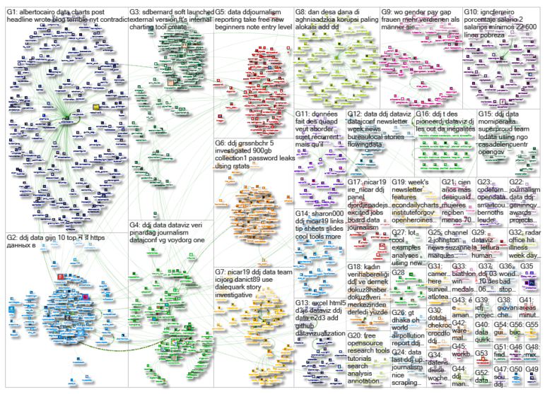
GIJN’s Data Journalism Top 10: New Tools for Chartmaking and Sonification, 3D Data, Hedgehog Maps, Editable Spreadsheet Images
What’s the global data journalism community tweeting about this week? Our NodeXL #ddj mapping from March 4 to 10 finds a host of intriguing tools and feature releases: @FinancialTimes‘ chartmaking tool, @datavized‘s data sonification tool, and a new feature on @Microsoft‘s Excel app that converts printed tables into editable spreadsheets, plus @alice_corona on building 3D data experiences and @alyssafowers coining the term “hedgehog maps.”
Create Charts. Fast.
Last week, The Financial Times soft-launched FastCharts, a chart-maker touted as simpler-to-use than Excel or Google Sheets. The idea to create this tool for the newsroom came about when the FT realized that it took too long to create one simple chart for the web and its print equivalent.
Make Beautiful Music With Data
Just launched: TwoTone, an open-source data sonification tool created by Datavized Technologies with the support of the Google News Initiative. TwoTone turns your data into music. It could open a new world of possibilities to make data accessible for the visually impaired. Google’s Data Editor Simon Rogers writes about the tool here.
Building 3D Data Experiences
Data journalist Alice Corona writes a two-part article about data “physicalizations.” She highlights the participatory nature of 3D data experiences for audiences and offers several examples to inspire journalists to create their own data-driven news installations. Read Part 1 and Part 2.
Introducing the Hedgehog Map
Alyssa Fowers, a PhD student studying statistics, research methods and data viz at the University of Miami, just coined a term for maps using arrows to indicate change: hedgehog maps. She cites US election maps as an example, where the base of the arrows show the location of the change, the length depicts the magnitude of the change and the angle indicates the direction.
Turn Pictures of Tables into Editable Spreadsheets
Good news! Excel mobile app users will soon be able to take photos of printed data tables and convert them to fully editable tables in the app. The feature is powered by image recognition technology.
NICAR19 Data Blitz
The annual NICAR gathering is the mother of all data journalism conferences. Sponsored by our pals at Investigative Reporters and Editors, the annual event wrapped last weekend after four days of sharing datasets, GitHub repos, tools and knowledge. Check it out: There’s lots to digest in Sharon Machlis’s collection of tipsheets and IRE’s collection of session materials from the conference.
Pitch the Next #PanamaPapers
The International Consortium of Investigative Journalists is known for its massive cross-border investigations by large collaborative teams of some of the best investigative journalists in the world. Now you can help: ICIJ is reaching out to the public for more world-changing stories. Send in your pitches!
Google Data Studio
Are you late to the Google Data Studio party? In January, the Data Studio team released a number of new features including interactive charts, search filters and the ability to embed external content.
When Headlines Contradict Data
Alberto Cairo, Knight Chair in Visual Journalism at the University of Miami, calls out The New York Times for publishing a headline on migration records in the United States that was misleading and contradicted its own data.
https://twitter.com/albertocairo/status/1103307262498619394
Investigating Data Using R and Spark
SRF Data reporter Timo Grossenbacher writes a detailed breakdown of how he investigated a 900 GB+ dataset of Swiss password leaks. He describes his process from pre-processing to filtering and searching using R and Spark, and finally his analysis. Some advice and a funny cat GIF are included.
Thanks, once again, to Marc Smith of Connected Action for gathering the links and graphing them.
 Eunice Au is GIJN’s program coordinator. Previously, she was a Malaysia correspondent for Singapore’s The Straits Times, and a journalist at the New Straits Times. She has also written for The Sun, Malaysian Today and Madam Chair.
For a look at Marc Smith’s mapping on #ddj on Twitter, check out this map.

Guide to Mapping Analysis Using QGIS

Basic Data Journalism Tips for Editors

My Favorite Tools: Venezuela’s Lisseth Boon on Design and Data Visualization

Document of the Day: Visual Vocabulary

From NICAR25, Four Free Cutting Edge and Time-Saving Investigative Data Tools

Best Practices for Working With Mass Shootings Data
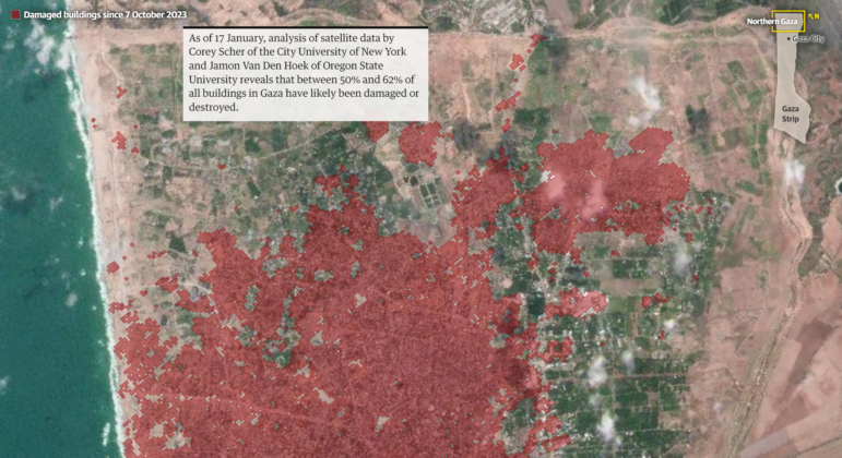
Mapping Conflict: Using Satellite Radar Data to Track the War Damage in Gaza
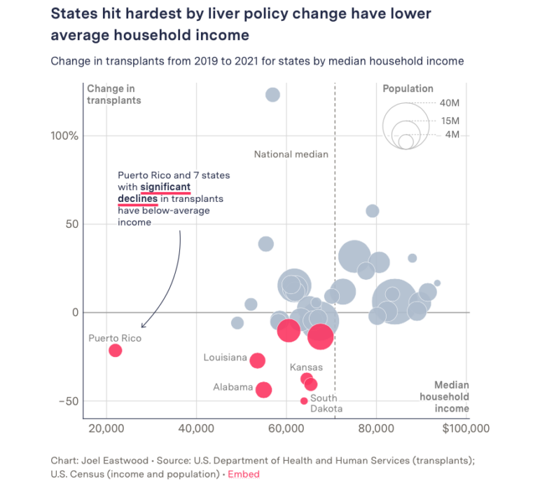
Data Journalism Top 10: Organ Donations, EU Drug Use, Layoffs Language, and Russian Censorship

This work is licensed under a Creative Commons Attribution-NoDerivatives 4.0 International License
Republish our articles for free, online or in print, under a Creative Commons license.
Republish this article
This work is licensed under a Creative Commons Attribution-NoDerivatives 4.0 International License
Read Next
Data Journalism Reporting Tools & Tips
From NICAR25, Four Free Cutting Edge and Time-Saving Investigative Data Tools
GIJN shares some of the no-cost, easy-to-use data tools that NICAR25 conference panelists described as surprisingly useful but unknown by investigative reporters.
Data Journalism Reporting Tools & Tips
Best Practices for Working With Mass Shootings Data
There can be confusion among journalists about “mass shootings” data, which leads to wildly different numbers and deeper confusion among audiences.
Data Journalism Methodology
Mapping Conflict: Using Satellite Radar Data to Track the War Damage in Gaza
Gaza’s urban landscape has changed profoundly since the start of Israel’s military campaign. Researchers Jamon Van Den Hoek and Corey Scher have been mapping the impact.
Data Journalism Data Journalism Top 10
Data Journalism Top 10: Organ Donations, EU Drug Use, Layoffs Language, and Russian Censorship
GIJN’s weekly curation of the most popular data journalism stories on Twitter features a look the impact of changes to organ donation rules in the US, drug usage in Europe based on wastewater analysis, a text analysis of layoff memos written by tech industry chief executives, and an examination of protests across Russia in 2022.