GIJN’s Data Journalism Top 10: Visualizing the 2018 News Cycle, the History of Football and Sacked Coaches
What’s the global data journalism community tweeting about this week? Our NodeXL #ddj mapping from January 21 to 27 finds @schemadesign and @GoogleTrends teaming up to visualize news cycles in 2018, the @washingtonpost‘s flyover tour of the entire US-Mexico border, and two football-related visualizations: @ftblsm‘s history of football and @NZZ‘s analysis of whether football coaches Jose Mourinho and Julen Lopetegui should have been sacked.
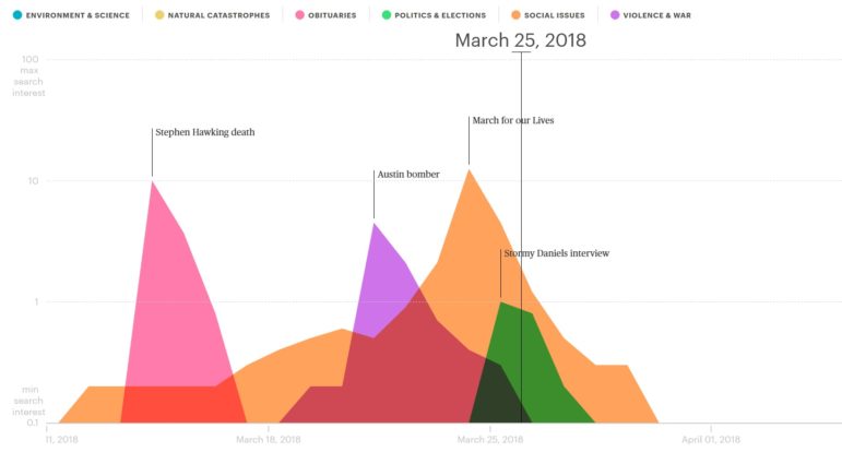
Mapping Media Attention Span
How long do significant news events stay in public consciousness? “The Lifespan of News Stories” visualization, a collaboration between Schema Design and Google Trends, shows the level of public attention to 2018 events by measuring a story’s “Google search interest” over time.
Bird’s Eye View of US-Mexico Border
“BUILD A WALL & CRIME WILL FALL,” tweeted US President Donald Trump a few days ago. In the midst of the debacle over Trump’s promise to build a wall along the US-Mexico border, the Washington Post’s interactive flyover above the entire border, published in October last year, is as relevant as ever.
Golf, Public Parks and Vineyards in Switzerland
How do the Swiss use their land? Tribune de Genève mapped out the land used for housing and infrastructure, farms, forests and more in Switzerland. Did you know Swiss golf courses take up more space than public parks? And their vineyards cover more land than all public buildings and their adjoining land?
Open Data in Schools
Little attention is usually given to the use of open data in the field of education. However, more and more European societies have acknowledged this potential and have started projects to introduce open data in the school curriculum, including Northern Ireland, Germany and Switzerland. This article in also available in Turkish.
Health Investment in Brazil
Multimedia journalist Cristian Weiss analyzed investments in health by each municipality in the state of Santa Catarina in southern Brazil. His mapping shows which states invested, from the most to the least. Municipalities in the smallest cities, with less than 5,000 inhabitants, usually spent almost twice the national average amount on the health of each citizen.
Visualizing the History of Football
Computational designer Carlo Zapponi and football writer Francesco Mistrulli published a visual essay last month on the careers of almost all the football players from 1920 to today. (For you Yanks out there, we’re talking about soccer here.) Zapponi now explains the process of how they built the story and adapted it for mobile. They also included an exploratory tool where you can search across their entire database of more than 100,000 footballers to see your favorite player’s career visualized.
Bad Luck or Bad Coach?
Recently, Jose Mourinho was fired by Manchester United and Julen Lopetegui was sacked by Real Madrid. But were the football teams’ poor performance due to bad luck or a bad coach? Neue Zürcher Zeitung analyzed the statistics to see if the two sackings were justified.
Producing the Data Journalism Handbook
Jonathan Gray and Liliana Bounegru, editors of the Data Journalism Handbook 2.0 beta version, talked to the European Journalism Centre about the process of producing the book. From capitalizing on snowballing leads to categorizing readers to ensuring diversity in the content and contributors, it was a collaborative journey. Read the first 21 chapters here and a preview of all chapters here. The full version is slated to be released this September.
Eurasian Data Storytelling Contest
Civic tech organization ForSet is organizing a Eurasian Data Stories contest. The competition is open to data storytellers from 20 countries: Armenia, Azerbaijan, Belarus, China, Georgia, Hungary, Iran, Kazakhstan, Kyrgyzstan, Moldova, Mongolia, Poland, Romania, Russia, Slovakia, Tajikistan, Turkey, Turkmenistan, Ukraine and Uzbekistan. Winners get either €1,000 or a free entrance to DataFest Tbilisi 2019.
Tagesspiegel Innovation Lab Launch
Tagesspiegel’s creative and innovative data journalism projects are no stranger to our weekly Top 10 #ddj roundups. This year, it is upping its game by launching the Tagesspiegel Innovation Lab, which will focus on data-driven reporting. The interdisciplinary team, headed by Hendrik Lehmann, is staffed with software developers, editors and artificial intelligence experts.
Thanks, once again, to Marc Smith of Connected Action for gathering the links and graphing them.
 Eunice Au is GIJN’s program coordinator. Previously, she was a Malaysia correspondent for Singapore’s The Straits Times, and a journalist at the New Straits Times. She has also written for The Sun, Malaysian Today and Madam Chair.
For a look at Marc Smith’s mapping on #ddj on Twitter, check out this map.

Guide to Mapping Analysis Using QGIS

Basic Data Journalism Tips for Editors

My Favorite Tools: Venezuela’s Lisseth Boon on Design and Data Visualization

Document of the Day: Visual Vocabulary

Making Trillions Make Sense: How Reuters Visualized the AI Economy

Summer Reading List for Data Journalists: For Those Who Believe in the Power of Storytelling with Numbers

From Data to Storytelling: Concept and Design Tips from the Financial Times’ John Burn-Murdoch

Data Don’ts: Expert Tips to Avoid Misleading Audiences With Numbers

This work is licensed under a Creative Commons Attribution-NoDerivatives 4.0 International License
Republish our articles for free, online or in print, under a Creative Commons license.
Republish this article
This work is licensed under a Creative Commons Attribution-NoDerivatives 4.0 International License
Read Next
Data Journalism
Making Trillions Make Sense: How Reuters Visualized the AI Economy
How do you make a trillion dollars feel real to someone who has never seen that much money? Vineet Khare and Mayank Bhatt faced that very challenge for their data-driven investigation into AI investment.
Data Journalism
Summer Reading List for Data Journalists: For Those Who Believe in the Power of Storytelling with Numbers
Featuring books spanning four continents, these recommended reads provide a global perspective on data journalism.
Data Journalism
From Data to Storytelling: Concept and Design Tips from the Financial Times’ John Burn-Murdoch
The chief data reporter for the Financial Times discusses how he considers the use of text, color, and annotation to aid visual storytelling through charts and graphics.
Data Journalism
Data Don’ts: Expert Tips to Avoid Misleading Audiences With Numbers
At a NICAR 2025 panel, data journalism experts discussed nuanced number errors that watchdog reporters often make that can confuse readers and disrupt story angles.