Data Journalism
Data Journalism Top 10: Beirut Blast, Predicting Crime, US Election Simulators, and COVID in Ukraine
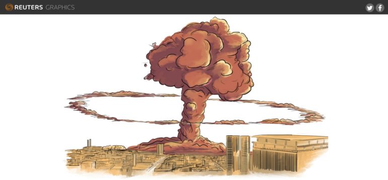
What was the magnitude of the Beirut port blast and how did it compare to other infamous explosions in history? Our NodeXL #ddj mapping from August 31 to September 6 finds Reuters illustrating just how powerful last month’s blast was in relation to the Chernobyl disaster and other explosions. The Tampa Bay Times highlighted how a county sheriff’s office is using an algorithm to supposedly predict and intercept the criminals of the future, while The New York Times used satellite maps to show how physical and political geographies interact across the United States. ESPN has been looking into the potential of people in college football crowds to become COVID-19 super-spreaders, and Slate analyzed the overuse of the word “murmur” in the popular Twilight novel series.

