Accessibility Settings

color options

monochrome muted color dark

reading tools

isolation ruler

Tag

Data Journalism Handbook

8 posts

Reporting Tools & Tips

GIJN Bookshelf: A Dozen Books for Muckrakers in 2021

At GIJN we’re fortunate to come across various books and reports on the state of the news media and great investigative reporting. Here are 12 of the more interesting recent volumes we’ve found that investigative journalists might want to pick up in 2021, as well as a novel written by an investigative reporter for a little light relief.

Data Journalism

Data Journalism Top 10: Beauty Biz Bias, Suez Blockage, Facebook Fail, Migrants at the Border, Europe’s Theaters

For nearly a week, a giant container ship stranded in the Suez Canal blocked one of the busiest trade routes in the world. The Ever Given, a Rotterdam-bound vessel, was finally freed from the shoreline on Monday, and international media have closely followed the story and the consequences of the blockage. Our NodeXL #ddj mapping from March 22 to 28, which tracks the most popular data journalism stories on Twitter, found a visual story by the Reuters Graphics team that illustrated how the incident affected global trade. In this edition, we also feature an examination of bias in the beauty industry by The Pudding, a look into how the pandemic changed society by Al Jazeera, and a guide to drawing data visualizations by DataJournalism.com.

Data Journalism

GIJN’s Data Journalism Top 10: Visualizing the 2018 News Cycle, the History of Football and Sacked Coaches

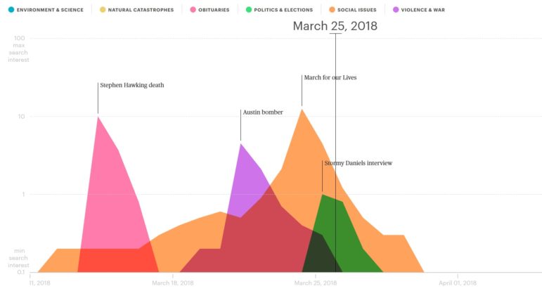
What’s the global data journalism community tweeting about this week? Our NodeXL #ddj mapping from January 21 to 27 finds @schemadesign and @GoogleTrends teaming up to visualize news cycles in 2018, the @washingtonpost’s flyover tour of the entire US-Mexico border and two interesting football-related visualizations: @ftblsm’s history of football and @NZZ’s analysis of whether football coaches Jose Mourinho and Julen Lopetegui should have been sacked.

Data Journalism

GIJN’s Data Journalism Top 10: Mapping Wildfires, Insuring Climate Risk, Data Viz for Kids

What’s the global data journalism community tweeting about this week? Our NodeXL #ddj mapping from December 3 to 9 finds @BuzzFeedNews mapping wildfire prone areas across America, @dwnews dissecting the value of insurance against climate change, the release of @infobeautyaward winners, and @jschwabish teaching fourth grade kids the wonders of data visualization in fun and inventive ways.

Data Journalism

GIJN’s Data Journalism Top 10: London’s Murder Hotspots, Hungary’s Media Monopoly, Data Journalism’s Fallacies

What’s the global data journalism community tweeting about this week? Our NodeXL #ddj mapping from November 26 to December 2 finds @VRCCrimCam mapping London’s medieval murder hotspots, @geckoboard illustrating common data fallacies to avoid, @ddjournalism teases the beta launch of the Data Journalism Handbook 2.0, and @GoogleNewsInit displays its data journalism courses.

Data Journalism

Data Journalism’s Top Ten

What’s the global data journalism community tweeting about this week? Our NodeXL #ddj mapping from July 31 to August 6 has @nytimes charting increasingly hot summers, @qz on Wannacry ransomware hackers cashing out their ill-gotten gains and @tagesanzeiger mapping lightning prone areas in Switzerland.

Data Journalism

Data Journalism’s Top Ten

What’s the global data journalism community tweeting about this week? Our NodeXL #ddj mapping from July 24 to 30 has @qz comparing the cost of Trump’s golf trips to transgender healthcare, @visualisingdata sharing a chart-making directory and graphics guru @EdwardTufte applying Ezra Pound’s 23 “don’ts” for writing poetry to design.

Data Journalism

Top Ten #ddj: The Week’s Most Popular Data Journalism Links

What’s the data-driven journalism crowd tweeting? Here are the top ten links for Oct. 29-Nov. 9: visualizing the refugee crisis (@lucify_); MOOC: infographics & dataviz (@utknightcenter); learn timelines and timemaps (@SchoolOfData); #ddj Arabic handbook (ddjournalism); Slopegraphs (@EdwardTufte).