
GIJN’s Data Journalism Top 10: Deadly Cycling Cities, GIFs with a Bang and Sustainable Development


What’s the global data journalism community tweeting about this week? Our NodeXL #ddj mapping from July 2 to 8 finds @MarieSegger‘s tips on highlighting data journalism using GIFs, @edebourgoing’s digging into data anomalies, @jplusplus_‘s news finding bot service, @nicolaskb’s deadliest cities for cyclists, and Kepler.gl’s data-driven mapping tool.
GIFs with a Bang
Data and social media fellow at The Economist, Marie Segger, shares lessons on how to showcase data journalism using GIFs on social media.
How do you make data journalism stand out on social media? Check out the lessons for showcasing data journalism on social media https://t.co/Lc2hgX1U2K #ddj #dataviz #socialmedia pic.twitter.com/CtXpt6I4Rr
— DataViz.my (@datavizmy) July 2, 2018
Finding Leads in a Data Haystack
Newsworthy is a news service which automatically finds news leads in large amounts of statistical data by picking out overarching trends or anomalies that stand out from the norm. The tool earned a place on the Data Journalism Awards 2018 shortlist for its innovation in data journalism.
We interviewed @jensfinnas to know more about Newsworthy, a news service that finds newsleads in large amounts of statistical data. #ddj @jplusplus_https://t.co/rhxgNupB8E
— Evangéline (@edebourgoing) July 4, 2018
Data-Driven Mapping Tool
Are you a map enthusiast, data scientist or developer? Create cool data-driven maps with Kepler.gl, a powerful open source geospatial analysis tool for large-scale data sets. Here’s a short tutorial (in Turkish) on how to use the tool.
https://t.co/JuM9iBNSlH, The Pretty Cool Newest kid on the #GIS #dataviz block.
Developed internally @Uber and now #opensource
Example:
Huge wave of asylum applications in 2016, video: https://t.co/vMsiO9sHEkhttps://t.co/55pRZzEYux Source: UNHCR #Refugees pic.twitter.com/pNxzHca50O— Rutger Hofste (@rutgerhofste) July 10, 2018
Dangerous Cities for Cyclists
Data journalist Nicolas Kayser-Bril looked at the number of casualties for every million bicycle rides in Berlin, London, Paris, Barcelona and Helsinki. Can you guess which city is the most dangerous for cyclists?
Ever since I moved to Berlin, I wondered if cycling here was more dangerous than in Paris.
I looked for data and can give you the answer ⬇️⬇️⬇️https://t.co/2UOBfDIHdB
— Nicolas Kayser-Bril (@nicolaskb) July 3, 2018
After Basic DataViz
So you’ve covered the basics of visualization. Where do you go from there? Nathan Yau offers the next steps to take to actually work with the data that’s been dug up. This piece was originally written in 2013 but is enjoying a resurgence on Twitter.
good points on where to go next… once your’e ok with visualisation https://t.co/3c63USL0OB
— miska knapek (@miskaknapek) July 5, 2018
Visualizing Amalgamation Paradoxes and Ecological Fallacies
Inspired by an article and talk by data scientist Heather Krause, data visualization expert Alberto Cairo has been searching for examples of amalgamation paradoxes and ecological fallacies. Here, he recreated Krause’s charts with more recent data using INZight.
New post: Visualizing amalgamation paradoxes and ecological fallacies (h/t @datassist): https://t.co/Vr0SgCOais#dataviz #infographics #ddj pic.twitter.com/w9ZTEf880o
— Alberto Cairo (@albertocairo) July 4, 2018
Sustainable Development Goals Tracker
Our World in Data’s Sustainable Development Goal Tracker is newly improved to track 17 goals, 169 targets and 232 indicators. Gaps in the data availability remain and users of the trackers are invited to notify the team of data they might have missed.
We just launched the ‘Sustainable Development Goals-Tracker’https://t.co/VI7MR23VVL
The overview below shows for which of the 232 SDG-Indicators there is data available (in green) and for which there is none (red).
If you know data that we were not aware of please let us know. pic.twitter.com/YceO8VHJSD— Max Roser (@MaxCRoser) July 5, 2018
Berliner Morgenpost’s Infographics Collection
Together with Webkid, the Berliner Morgenpost’s interactive team compiled some of Berliner Morgenpost’s most interesting visualizations, infographics, maps and organizational charts in one portfolio. See charts on the paper’s travel trends, favorite sports, startups’ scene and more.
? We’ve built a portfolio page for the beautiful infographics by @BMgrafik https://t.co/20119ImE8S pic.twitter.com/Z9B2p1zQ92
— webkid (@webk1d) July 5, 2018
Data-driven Investigative Stories
UCD Data Journalism, a data journalism studio run by the students and participants of Data Journalism CPD program at University College Dublin, has just updated its portfolio with some new data-driven investigative stories.
We have just published a number of new data stories from UCD Data Journalism. Check them out here: https://t.co/EIMA6RohAQ #ddj #ddjucd @UCD_iSchool pic.twitter.com/VRxWYi9zgA
— Data News Lab (@datanewslab) July 5, 2018
Data Fellowship in Eastern Europe
The International Center for Journalists is seeking an individual with strong background in data journalism for a one-year ICFJ Knight Fellowship to promote data-driven reporting techniques in Central and Eastern Europe. The successful fellow will work with the Organized Crime and Corruption Reporting Project .
@ICFJKnight wants to support a new Fellow in #EasternEurope & #CentralEurope. Are you an experienced data journalist with an interest in investigative reporting? Apply now and work with @OCCRP. https://t.co/UFGfggbOxK #ddj pic.twitter.com/QSlp02NYP8
— ICFJ (@ICFJ) July 3, 2018
Thanks, once again, to Marc Smith of Connected Action for gathering the links and graphing them.
 Eunice Au is GIJN’s program coordinator. Previously, she was a Malaysia correspondent for Singapore’s The Straits Times, and a journalist at the New Straits Times. She has also written for The Sun, Malaysian Today and Madam Chair.
For a look at Marc Smith’s mapping on #ddj on Twitter, check out this map.

This work is licensed under a Creative Commons Attribution-NoDerivatives 4.0 International License
Republish our articles for free, online or in print, under a Creative Commons license.
Republish this article
This work is licensed under a Creative Commons Attribution-NoDerivatives 4.0 International License
Read Next

Data Journalism News & Analysis
From Space to Story in Data Journalism
Over the past 10 years satellite imagery has become an important component of data journalism. In the next 10, it will likely evolve further, from a tool used primarily for illustrating stories to an integral part of research and investigative reporting.

Data Journalism
10 Outstanding Data Projects Win the 2024 Sigma Awards
There were 52 data journalism entries from 22 countries in shortlist for the 2024 Sigma Awards. Here are the top 10 winning projects.
Data Journalism Methodology
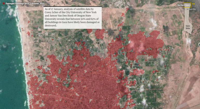
Mapping Conflict: Using Satellite Radar Data to Track the War Damage in Gaza
Gaza’s urban landscape has changed profoundly since the start of Israel’s military campaign. Researchers Jamon Van Den Hoek and Corey Scher have been mapping the impact.

Data Journalism Data Journalism Top 10
Trump’s Disappearing Donors, Tracking the Mars Rover, and the Ongoing Wars in Gaza and Ukraine
Our column of the best in data journalism also features stories on AI’s ability to forecast the weather, analyzing the Argentine president’s Tweetstorms, and apathetic EU voters.