This Week’s Top Ten in Data Journalism
 What’s the global data journalism community tweeting about this week? Our NodeXL #ddj mapping from Sept. 18 to 24 has datavizproject‘s Wikipedia of Data Visualization, the state of data journalism by @googlenewslab, a fun Dear Data Postcard Kit by @giorgialupi and @stefpos to share with your data penpal, and German election data stories by @dwnews, @tagesspiegel and @br_data.
Wikipedia for #Dataviz
You have one dataset, and countless ways to visualize it. Bar chart? Tree graph? The dreadful pie chart? The Data Viz Project has more than 150 types of visualizations, neatly categorized and easily searchable, to show you what data visualizations could work for your dataset.
Nice!@FastCoDesign: @jeppem @ferdiocom about their https://t.co/2pfLUuodo7https://t.co/iXiKZ20JdM
— Yuri Engelhardt (@YuriEngelhardt) September 21, 2017
Data Journalism in 2017
Google News Lab, in collaboration with PolicyViz, conducted a series of 56 in-depth interviews in the U.S., UK, Germany and France, and an online survey of more than 900 journalists to better understand how journalists use data to tell stories. Read the full report here.
“Data is a good way of getting to the truth of things. In this post-truth era, this work is increasingly important.” https://t.co/yM1PFveROG pic.twitter.com/8EsPrCkT4c
— Corrie Davidson (@CorrieDavidson) September 21, 2017
Sparkline Font Tutorial
Last week’s Top Ten #ddj highlighted design studio After the Flood’s AtF Spark font to turn numbers into graphics. Paul Bradshaw wrote this tutorial on how to use the font if you’re not already familiar with web fonts and other technicalities of web design.
This new font allows you to create charts out of text. Here’s how to use it: https://t.co/oFzrVuN3gu #ddj #dataviz pic.twitter.com/2dNmKCmB0M
— Paul Bradshaw (@paulbradshaw) September 22, 2017
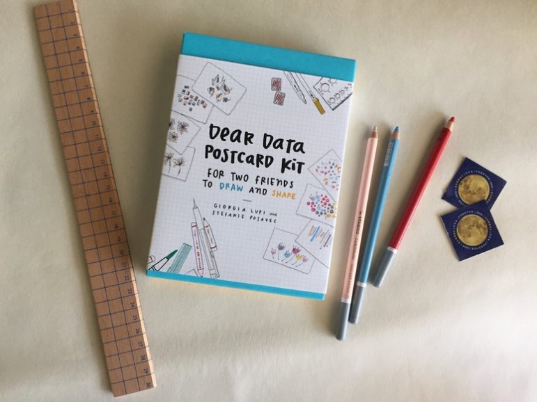
Dear Data Postcard Kit
Information designers and Dear Data co-authors Giorgia Lupi and Stefanie Posavac’s Dear Data Postcard Kit was released last week. The kit guides you and your data penpal to become creative information artists with a series of 20 ready-to-make postcards complete with prompts and an engagingly illustrated instruction booklet that shows how postcards can be both artistic expression and correspondence.
Ready to start drawing your days with a friend? Tomorrow our Dear Data Kit will be released! https://t.co/FIPZxx1UGb @PAPress #deardata pic.twitter.com/YEn5UNHLjy
— Dear Data (@_deardata) September 18, 2017
Unreported Political Donations
German political parties have received over 200 million euros in donations over the last four years, but only 13 million was immediately reported. A Deutsche Welle investigation shows how firms systematically hide party donations.
Who is financing Germany’s political parties? Great data investigation by @BenWernerKnight & @giannagruen https://t.co/JIesef4JkZ #Wahl2017 pic.twitter.com/rUTBjqPWMQ
— Rachel Stewart (@RachelStewart04) September 22, 2017
Changing Landscape of Berlin Votes
Take a tour of the streets of Berlin and discover how neighborhoods voted in German elections since 1990 in this interactive map by Tagesspiegel.
Este mapa es impresionante.
Voto en federales desde 1990 a 2013 en Berlin.
Miren el salto de 2005 a 2009https://t.co/pqhYWqvHhx pic.twitter.com/xKAsaRRamy— Franco Delle Donne (@fdelledonne) September 1, 2017
Residence Affects Voting Behaviour
The participation rate of electoral voting in Germany has declined over the past few decades, although there was a slight increase in 2013. Nuremberg was the German city with the lowest rate at the last election: 66.9%. BR Data shows how where one resides is related to voting behavior.
Was der Wohnort mit der Wahlbereitschaft zu tun hat. Unsere Analyse am Beispiel Nürnberg: https://t.co/0EBgBz9SWc #btw17 #ddj pic.twitter.com/1Lo4CXQAZW
— BR Data (@br_data) September 20, 2017
Burning Issues in Swiss Votes
The Swiss go to polls about four times a year in nationwide votes. Using data compiled by the Centre for Research on Direct Democracy, swissinfo.ch analyzed the most popular voting themes since Switzerland’s first constitution in 1848.
600+ national votes in 168 yrs, a visual recap of the main themes in ?? ballots https://t.co/gG7MTOCn02 #dataviz #ddj #CHvote #deardemocracy pic.twitter.com/RMJzB1ti21
— Duc Quang Nguyen (@duc_qn) September 22, 2017
Prejudice: Urban Versus Rural
Zeit Online’s cool interactive feature on popular prejudices of urban city dwellers and rural residents is now available in English. They tackle beliefs such as: the social fabric of countryside residents is tighter knit compared to city folks, the bigger the city the fewer worries people have about immigration integration, and that people in large cities are worldlier.
Is there a rural-urban divide in #Germany? Check your prejudice: https://t.co/jRR7FU1BuT #dataviz #btw17 pic.twitter.com/ft3VYiT9q1
— Sascha Venohr (@venohr) September 23, 2017
Average British Politicians
Technologist Giuseppe Sollazzo used machine learning to figure out what an average UK member of parliament looks like. The result depicts a white male. This is not surprising, given than only 208 out of 650 MPs are women, less than a third of the total.
The Face of British Politics. Machine learning reveals average face of Members of Parliament https://t.co/vs9ipCKDIU pic.twitter.com/Y6SWQHoF8W
— Paul Kirby (@paul1kirby) September 17, 2017
Thanks, once again, to Marc Smith of Connected Action for gathering the links and graphing them.
For a look at Marc Smith’s mapping on #ddj on Twitter, check out this map.


Document of the Day: Visual Vocabulary

Nils Mulvad – The story behind the data

AI Accountability Reporting Guide

Guide to Mapping Analysis Using QGIS

Using Data Sources to Track Harmful Climate Crisis-Fueled Algal Blooms
Data Journalism Top 10: A Year of War in Ukraine, Russian Casualties, Trans Identities, Unexpected NBA Performances

Data Journalism Top 10: Pandora Papers, Data Podcasts, and COVID-19 in Scottish Care Homes
Why Dynamic Data Visualization Is Key to Covering Climate Change

This work is licensed under a Creative Commons Attribution-NoDerivatives 4.0 International License
Republish our articles for free, online or in print, under a Creative Commons license.
Republish this article
This work is licensed under a Creative Commons Attribution-NoDerivatives 4.0 International License
Read Next
Data Journalism Reporting Tools & Tips
Using Data Sources to Track Harmful Climate Crisis-Fueled Algal Blooms
For the SEJ’s Reporter’s Toolbox: datasets and sources useful for tracking the harmful impact of climate change-fueled algal blooms.
Data Journalism Data Journalism Top 10
Data Journalism Top 10: A Year of War in Ukraine, Russian Casualties, Trans Identities, Unexpected NBA Performances
GIJN’s weekly look at the best in data journalism examines one year of war in Ukraine, Russian casualty totals, trans coverage in the French media, and the most unexpected performances in NBA history.
Data Journalism
Data Journalism Top 10: Pandora Papers, Data Podcasts, and COVID-19 in Scottish Care Homes
Tracking the most popular data journalism stories on Twitter from September 27 to October 3, we found a series of articles based on discoveries from the Pandora Papers offshore leak. In this edition, we also feature reporting on the damage caused by the eruption of the volcano on La Palma, data journalism podcasts, and a roundup of the German election results.
Data Journalism
Why Dynamic Data Visualization Is Key to Covering Climate Change
As calls for change grow louder in light of the latest IPCC (Intergovernmental Panel on Climate Change) report and in the run up to COP26 conference in Glasgow this November, it’s time to focus on how data visualization can help people grasp the challenges that lie ahead.