
GIJN’s Data Journalism Top 10: New York’s Luxury Homes, Climate Dangers, Inspiring Data Viz


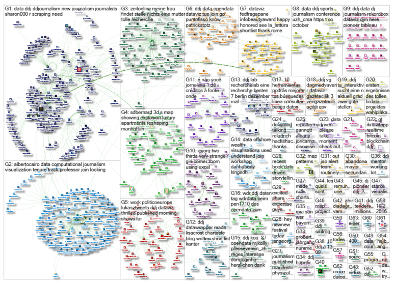
What’s the global data journalism community tweeting about this week? Our NodeXL #ddj mapping from Oct 8 to 14 finds 25 inspirational data visualizations collated by @VismeApp, a @nytimes op-ed by climate scientists warning of the future dangers of heat and humidity combined, @FT maps of New York’s glut of luxury residences and @ejcnet with veteran data journalists on web scraping.
Inspirational Dataviz
Intricate and inspirational, this list of 25 best data visualizations of 2018 curated by Visme are true works of art. Pore over these amazing and diverse visualizations, including @STcom’s Marvel Cinematic Universe, James Round’s Many Moons of Jupiter, @SCMPgraphics’ Crazy Rich Asians, and more.
Killer Combo: Heat and Humidity
Climate scientists discuss the dangers of the combination of heat and humidity, which could be so extreme that the evaporation of human sweat won’t sufficiently cool our bodies, leaving even healthy adults at risk of death from overheating. They further warned that about 11 million people are projected to be at risk of suffering heat and humidity past the limit of human tolerance at least once by 2080.
Manhattan’s Penthouse Pileup
Manhattan’s stock of unsold luxury homes is piling up but a new crop of ultra high-end high-rise residences are in the works. Could the city be faced with a glut of prime property? The Financial Times mapped the location and prices of future luxury residential high rise buildings in Manhattan.
Aging Bridges
The Baltimore Sun provides a snapshot of bridges in Baltimore and its surrounding areas. The bridges are color-coded by condition: good, fair and poor. It also discusses what the rating of bridges means and the challenges of rehabilitating them.
Web Scraping Essentials
Web scraping has become an integral skill for data journalists. Conversations with Data has pulled together some useful tips from veterans Paul Bradshaw, Peter Aldhous, Mikołaj Mierzejewski, Maggie Lee, Gianna-Carina Grün and Erika Panuccio, to show you how it’s done.
https://twitter.com/TWallack/status/1050152489713106947
Economist Gets On Open Data Bandwagon
The Economist announced that it will start publishing data behind its stories on GitHub. It is kickstarting its open data commitment with the release of the data behind its Big Mac Index, an interactive currency comparison tool based on the prices of burgers in any two countries.
https://twitter.com/beckbessinger/status/1050325636181622784
Meet the Investigator
ICIJ’s Meet the Investigators series profiles Helena Bengtsson, data chief at SVT, Sweden’s public broadcasting network. Bengtsson looks at big datasets as if she were interviewing a person. And she is old-fashioned when it comes to scraping: she uses PERL, a tool which has been abandoned by most, in favor of Python.
R for Journalists
See how much you can do in just a few lines of code with these excerpts from Sharon Machlis’s new book Practical R for Mass Communication and Journalism.
Sports Data Journalism Conference
The University of Zurich’s Center for Research in Sports Administration (CRSA) will host a sports, data and journalism conference on October 25, 2018. The conference provides a platform for experts from research, media and industry to discuss the use of data science in sports. Speakers will include behavioral scientist Chris Anderson, Tamedia’s data journalism lead Barnaby Skinner and CRSA board member Ulrich Woitek.
https://twitter.com/anil_oezdemir/status/1049972073425235968
Infographics MOOC (Spanish)
EducaciOnline (UOC) is offering a MOOC (massive open online course), “Introduction to Infographics and Data Visualization.” The course is divided into four modules over four weeks and is taught in Spanish.
Thanks, once again, to Marc Smith of Connected Action for gathering the links and graphing them.
 Eunice Au is GIJN’s program coordinator. Previously, she was a Malaysia correspondent for Singapore’s The Straits Times, and a journalist at the New Straits Times. She has also written for The Sun, Malaysian Today and Madam Chair.
For a look at Marc Smith’s mapping on #ddj on Twitter, check out this map.

This work is licensed under a Creative Commons Attribution-NoDerivatives 4.0 International License
Republish our articles for free, online or in print, under a Creative Commons license.
Republish this article
This work is licensed under a Creative Commons Attribution-NoDerivatives 4.0 International License
Read Next

Data Journalism News & Analysis
From Space to Story in Data Journalism
Over the past 10 years satellite imagery has become an important component of data journalism. In the next 10, it will likely evolve further, from a tool used primarily for illustrating stories to an integral part of research and investigative reporting.

Data Journalism
10 Outstanding Data Projects Win the 2024 Sigma Awards
There were 52 data journalism entries from 22 countries in shortlist for the 2024 Sigma Awards. Here are the top 10 winning projects.
Data Journalism Methodology
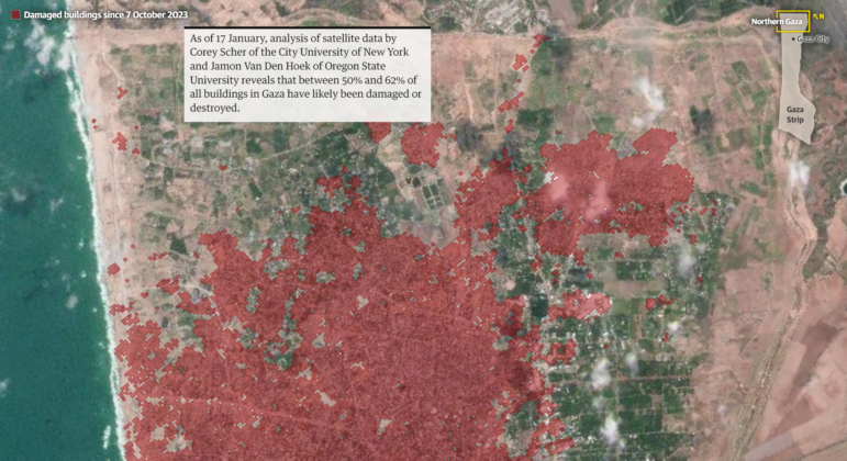
Mapping Conflict: Using Satellite Radar Data to Track the War Damage in Gaza
Gaza’s urban landscape has changed profoundly since the start of Israel’s military campaign. Researchers Jamon Van Den Hoek and Corey Scher have been mapping the impact.

Data Journalism Data Journalism Top 10
Trump’s Disappearing Donors, Tracking the Mars Rover, and the Ongoing Wars in Gaza and Ukraine
Our column of the best in data journalism also features stories on AI’s ability to forecast the weather, analyzing the Argentine president’s Tweetstorms, and apathetic EU voters.