Reporting Tools & Tips
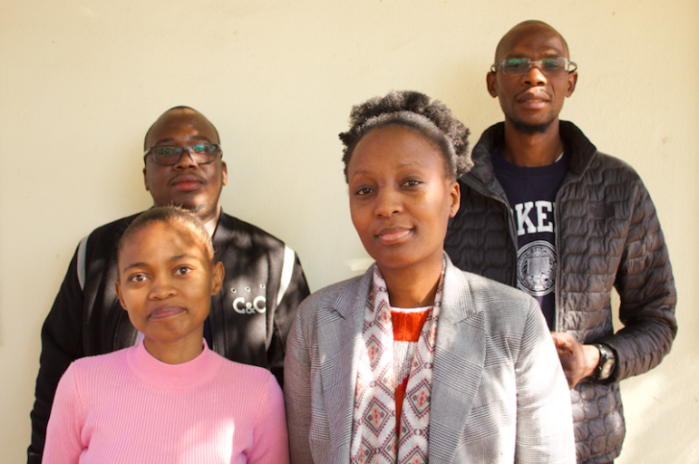
My Favorite Tools: Joel Konopo
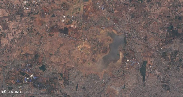
For our series about journalists’ favorite tools, we spoke with Joel Konopo of Botswana’s INK Centre for Investigative Journalism. He told GIJN’s Olivier Holmey all about how he uses satellite images to expose corruption, Cryptomator to encrypt sensitive files, and lots more.