Accessibility Settings

color options

monochrome muted color dark

reading tools

isolation ruler

Tag

open data

59 posts

Data Journalism

GIJN’s Data Journalism Top 10: New York’s Luxury Homes, Climate Dangers, Inspiring Data Viz

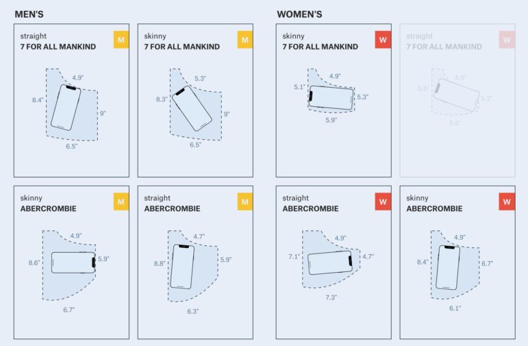
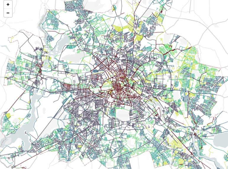
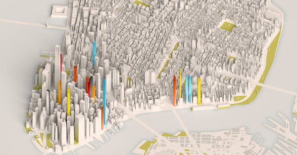
What’s the global data journalism community tweeting about this week? Our NodeXL #ddj mapping from Oct 8 to 14 finds 25 inspirational data visualizations collated by @VismeApp, a @nytimes op-ed by climate scientists warning of the future dangers of heat and humidity combined, @FT maps of New York’s glut of luxury residences and @ejcnet with veteran data journalists on web scraping.

Data Journalism

GIJN’s Data Journalism Top 10: Egyptian Bots, Pocket Inequality, Loner Jobs and Knife Emergencies

What’s the global data journalism community tweeting about this week? Our NodeXL #ddj mapping from Aug 13 to 19 finds @puddingviz proving that women’s pockets are inferior to men’s once and for all, @vizzuality pondering the impact cartographers have on our understanding of the world by presenting nocturnal activity in daytime maps, @InfoTimes_ discovering the bots behind the political debate in Egypt and @hnrklndbrg’s visualizations on everything from loner jobs to knife emergency room visits.

Data Journalism

GIJN’s Data Journalism Top 10: Faking Climate Change Data and in WEB Du Bois’ Black Americ

What’s the global data journalism community tweeting about this week? Our NodeXL #ddj mapping from Aug 6 to 12 finds @sciam profiling a new color scale for the color blind, @EDudinskij’s fun dissertation on dataviz in science fiction movies, @morgenpost using satellite imagery to show the consequences of droughts, and @gregladen and Grant Foster calling bull on a climate change denier’s flawed graphs.

Data Journalism

GIJN’s Data Journalism Top 10: Footballers’ Salaries, Google Trends and Gender Bias with Pudding

What’s the global data journalism community tweeting about this week? Our NodeXL #ddj mapping from July 9 to 15 finds @morgenpost’s interactive slider showing how fast a German national footballer earns your monthly salary, tons of interesting Google search data in its @GoogleTrends data store, @durand101 and @puddingvizgender exposing bias in the UK House of Commons and @EdjNet offering a search engine for 800,000 EU datasets.

Data Journalism

GIJN’s Data Journalism Top 10: Democratic Data, Berlin’s Bicycles and Cricket Crazy

What’s the global data journalism community tweeting about this week? Our NodeXL #ddj mapping from April 16 to 22 finds @camellia_will debating the future of data portals, @DLeonhardt using hard data to show whether Democratic or Republican presidents have been more fiscally responsible and @morgenpost mapping bicycle thefts hotspots in Berlin.

Data Journalism

This Week’s Top 10 in Data Journalism

What’s the global data journalism community tweeting about this week? Our NodeXL #ddj mapping from February 26 to March 4 finds @morgenpost setting Germany’s poll data to music, @A_agadjanian showing Google Trends data on people’s general interest in gun control a week after deadly shootings in the US and @puntofisso rounding up an interesting list of #ddj and #opendata newsletters.

Data Journalism

This Week’s Top 10 in Data Journalism

What’s the global data journalism community tweeting about this week? Our NodeXL #ddj mapping from February 5 to 11 finds @flowingdata’s tips to visualizing missing or incomplete data, statistics of women’s challenges in journalism by @abraji and @generonumero and a cool income inequality interactive by @EconomicPolicy.

Data Journalism

This Week’s Top 10 in Data Journalism

What’s the global data journalism community tweeting about this week? Our NodeXL #ddj mapping from January 22 to 28 finds a gorgeous data visualisation of German streets by @zeitonline, a detailed data analysis of Roger Federer’s tennis career by @srfdata and a look at eight alternatives in redistricting US voting boundaries by @FiveThirtyEight.

Data Journalism

This Week’s Top Ten in Data Journalism

What’s the global data journalism community tweeting about this week? Our NodeXL #ddj mapping from November 27 to December 3 has @journocode’s festive data-driven advent calendar with tutorials and interviews, @FT mapping cities at risk of natural disasters affecting property prices, and a #VisualizationUniverse by Google News Lab and Adioma.