Data Journalism
GIJN’s Data Journalism Top 10: Egyptian Bots, Pocket Inequality, Loner Jobs and Knife Emergencies
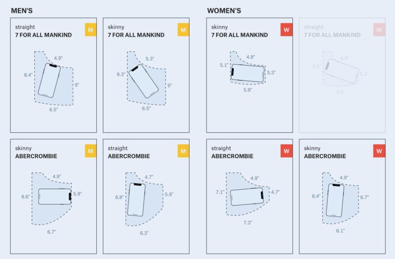
What’s the global data journalism community tweeting about this week? Our NodeXL #ddj mapping from Aug 13 to 19 finds @puddingviz proving that women’s pockets are inferior to men’s once and for all, @vizzuality pondering the impact cartographers have on our understanding of the world by presenting nocturnal activity in daytime maps, @InfoTimes_ discovering the bots behind the political debate in Egypt and @hnrklndbrg’s visualizations on everything from loner jobs to knife emergency room visits.