Data Journalism
GIJN’s Data Journalism Top 10: DRC’s Election Fraud, San Francisco’s Interactive Art, Ultimate Data Viz List
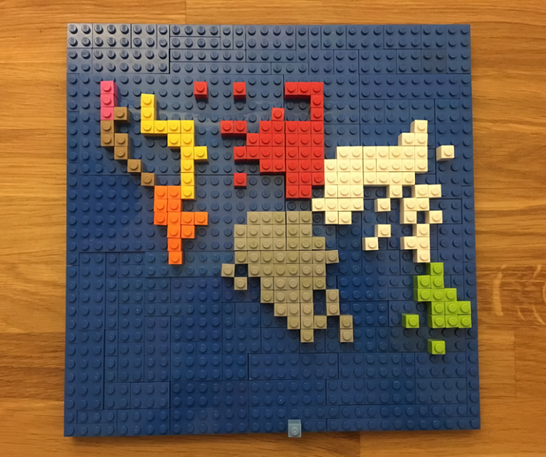
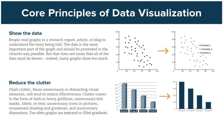
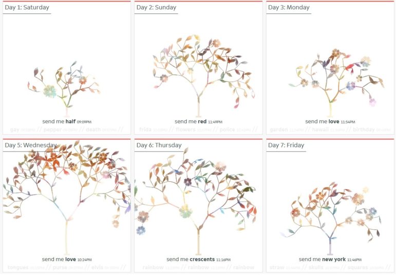
What’s the global data journalism community tweeting about this week? Our NodeXL #ddj mapping from January 14 to 20 finds a @FinancialTimes exposé of possible electoral fraud in Congo, @sxywu’s beautiful visualization of interaction data between a museum and the public, and @maartenzam’s the ultimate data visualization list to end all lists.