
GIJN’s Data Journalism Top 10: History of Infographics, Colorism in Fashion, Weather Trends
What’s the global data journalism community tweeting about this week? Our NodeXL #ddj mapping from April 22 to 28 finds an interesting breakdown of colorism in fashion by @puddingviz, a series of gorgeous maps on US natural disasters and extreme weather trends by @PostGraphics, a preview of a history book on infographics by @srendgen, and @UpshotNYT‘s recap of its best articles from the past five years.
Investigating Colorism in Fashion
Ethnic diversity in the fashion industry might be improving, but representation of dark-skinned women is still lagging behind. Data scientist Malaika Handa investigates the problem of colorism and tokenism in fashion by looking at 19 years of Vogue magazine covers.
Mapping Wicked Weather
No place in the United States is particularly insulated from natural disasters and extreme weather phenomena. In this gorgeous series of maps, Tim Meko highlights where flash floods, tornadoes, hurricanes, heat waves, cold snaps, wildfires, lightning strikes and earthquakes tend to strike. Read about his map-building process here.
History of Infographics
Visualization strategist Sandra Rendgen gives a short preview of her upcoming book “History of Information Graphics,” which will be released this month. In it, she looks at how the field of infographics and data visualization has changed and expanded in the last century, with contributions from David Rumsey, Michael Friendly, Michael Stoll and Scott Klein.
Five Years at The Upshot
To celebrate its five-year anniversary, The Upshot — The New York Times’ data-driven reporting and analysis team — showcased a selection of its most enlightening and successful stories since inception. The glorious list covers a wide range of topics, ranging from electorate issues to gender bias, medical maladies to income inequality, and more.
EIJC19 & Dataharvest
Check out the program for the European Investigative Journalism Conference & Dataharvest happening May 16 to 19 in Mechelen, Belgium. It’s chock full of juicy sessions such as tracking weapons, investigating corporate lobbying and covering religious sects.
Putting Data in Context
Data is typically collected by institutions for internal purposes and not intended to be used by journalists or others. In this piece, Catherine D’Ignazio explains how understanding that context is important and provides some examples of how not knowing the who, what, when, where, why and how of the data’s collection can lead to incorrect reporting.
White, Male and Over 60
A recent census in England of councillors (called city council members in the US) showed that a large proportion are white, male and over 60, and this makeup doesn’t look likely to change in upcoming local elections. The BBC analyzed potential candidates and found that there are almost 1,000 candidates named either David or Dave, compared to 151 candidates called Sue, the most popular female name.
Data Journalism Research
Ilo Aguiar, a PhD researcher in digital media, compiled a list of 12 academic papers on data journalism in Portugal and Brazil published in 2018. (In Portuguese.)
Python & Plotly
Plotly Express, launched in March, is a Python visualization library for rapid data exploration. It’s a wrapper around Plotly.py that exposes a simple syntax for complex charts.
DataViz Survey
As part of his research, Rodrigo Cunha, a professor at Brazil’s Federal University of Pernambuco, is conducting a survey on the relationship between readers and data professionals in digital journalism. Take five minutes to fill it in, if you please.
https://twitter.com/cunhares/status/1120728291797872641
Thanks, once again, to Marc Smith of Connected Action for gathering the links and graphing them. The Top Ten #ddj list is curated weekly.
 Eunice Au is GIJN’s program coordinator. Previously, she was a Malaysia correspondent for Singapore’s The Straits Times, and a journalist at the New Straits Times. She has also written for The Sun, Malaysian Today and Madam Chair.
For a look at Marc Smith’s mapping on #ddj on Twitter, check out this map.

Basic Data Journalism Tips for Editors

My Favorite Tools: Venezuela’s Lisseth Boon on Design and Data Visualization

Document of the Day: Visual Vocabulary
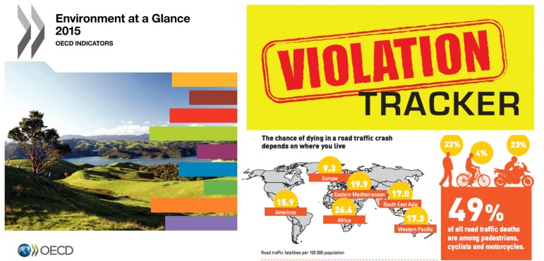
Research Desk: Violation Tracker, Road Safety, Biz Regs

Turning the Threat to a Distant Glacier into a Local Story Through Data Visualization

Making Trillions Make Sense: How Reuters Visualized the AI Economy

Summer Reading List for Data Journalists: For Those Who Believe in the Power of Storytelling with Numbers

From Data to Storytelling: Concept and Design Tips from the Financial Times’ John Burn-Murdoch

This work is licensed under a Creative Commons Attribution-NoDerivatives 4.0 International License
Republish our articles for free, online or in print, under a Creative Commons license.
Republish this article
This work is licensed under a Creative Commons Attribution-NoDerivatives 4.0 International License
Read Next
Climate Data Journalism
Turning the Threat to a Distant Glacier into a Local Story Through Data Visualization
New York Times climate and environmental graphics reporter Mira Rojanasakul discusses how her team visualized the sea level rise threat from the melting Thwaites Glacier in Antarctica.
Data Journalism
Making Trillions Make Sense: How Reuters Visualized the AI Economy
How do you make a trillion dollars feel real to someone who has never seen that much money? Vineet Khare and Mayank Bhatt faced that very challenge for their data-driven investigation into AI investment.
Data Journalism
Summer Reading List for Data Journalists: For Those Who Believe in the Power of Storytelling with Numbers
Featuring books spanning four continents, these recommended reads provide a global perspective on data journalism.
Data Journalism
From Data to Storytelling: Concept and Design Tips from the Financial Times’ John Burn-Murdoch
The chief data reporter for the Financial Times discusses how he considers the use of text, color, and annotation to aid visual storytelling through charts and graphics.